


Postmo: turning shaders into a design material
As a photographer, I kept wondering what some photographs would look like in a graphic design if they could move. Postmo grew out of that question. It is a browser editor where live shaders, type, images and video share one canvas and export as a video, an image or a self-contained web page. I designed it end to end and shipped it at postmo.dev, with an AI coding agent as the programmer and tester.
Role · Product designer: product, interaction, visual and design system
Build · AI coding agent (Claude Code) as programmer and tester, directed and reviewed by me
Timeline · September to October 2026
Platform · Desktop web (editor) · mobile web (intro site)
Status · Live at postmo.dev
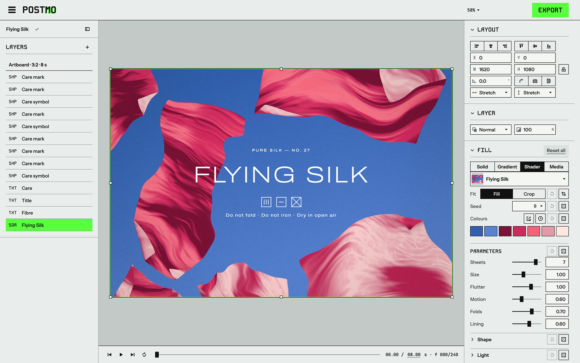
The editor with the Flying Silk template open: layers on the left, the shader's Fill settings on the right.
​​​​​​​Try Postmo on desktop ↗
Context
I am a photographer as well as a designer, and I look at a lot of photography online. Some photos have a strong atmosphere: light through leaves on a plaster wall, a street reflected in a rain puddle, trees pulled into streaks by a slow shutter from a moving car. With some of them I wondered whether a graphic design would look different if the picture moved.
That led to a practical question: could a browser composite an image like that and render it live, with the motion under the designer's control? The project started as Motion Poster, and most of its built-in shaders began from a photograph. Each one was built so its default look reads like the photo, and its colours, pattern and speed can all be changed from there.
As the editor grew beyond posters, the name became Postmo. It joins poster and motion in one word, which is why the MO in the wordmark carries a green trail, and it also reads as a short form of postmodern. Postmo is a browser editor for designers who already work in online design tools.

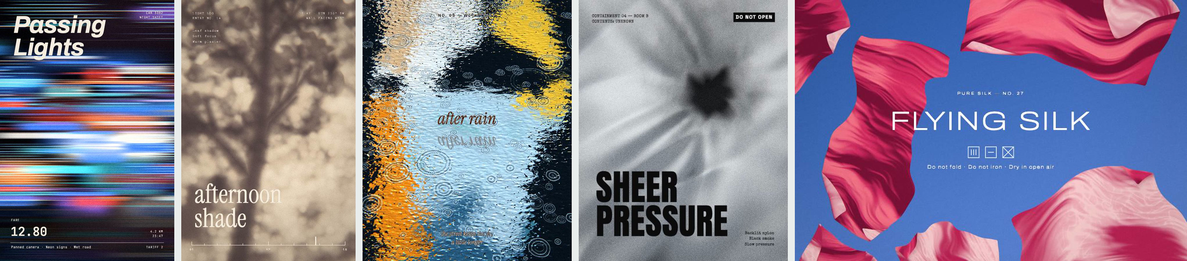
Five templates whose shaders started from a photograph: Passing Lights, Afternoon Shade, After Rain, Sheer Pressure and Flying Silk.
​​​​​​​The system
The canvas in Postmo is full of colour and movement, so the interface around it had to stay plain. I set up a design system at the start of the project, before building any of the interface, and every screen was built from it: colour and type tokens, spacing, line weights, a short brand book and a set of core components.
The idea was an instrument printed on paper: cool grey paper, black ink lines, small technical labels, and one fluorescent green that appears only where you are meant to act.

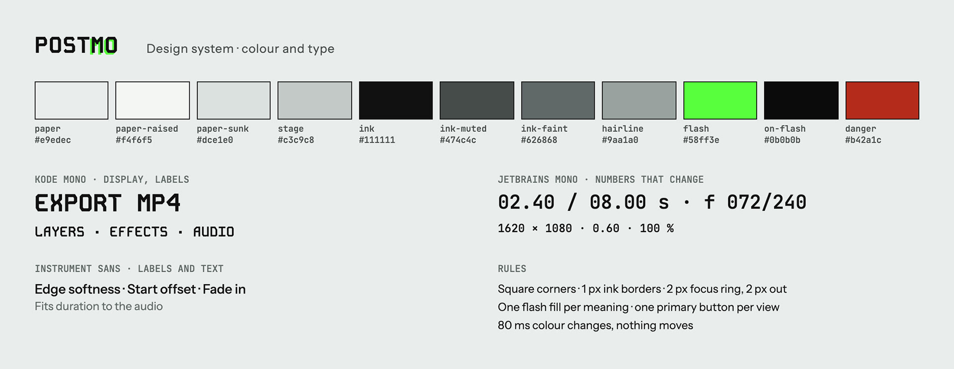
The colour tokens and the three typefaces. The colour values have not changed since the first day.
​​​​​​​Colour and type
Panels sit on paper, and the canvas sits on a separate neutral grey, the stage, so the paper's slight tint does not change how you judge the design's colours. Text is ink, at 16:1 on paper. The faintest grey passes 4.5:1 only on the two lightest backgrounds, so it is only allowed there. The one accent, a green called flash, is always a solid fill (the selected layer, the primary button, a selected card) and never text or a line.
Kode Mono, a geometric monospace with 45° cut corners, sets labels and section titles. JetBrains Mono sets numbers that change, so the digits line up while you drag. Instrument Sans sets everything else.
Shape and behaviour
Corners are square, controls have a 1 px ink border, and motion is limited to an 80 ms colour change. Each view has at most one primary button, and disabled controls turn grey but stay in place.

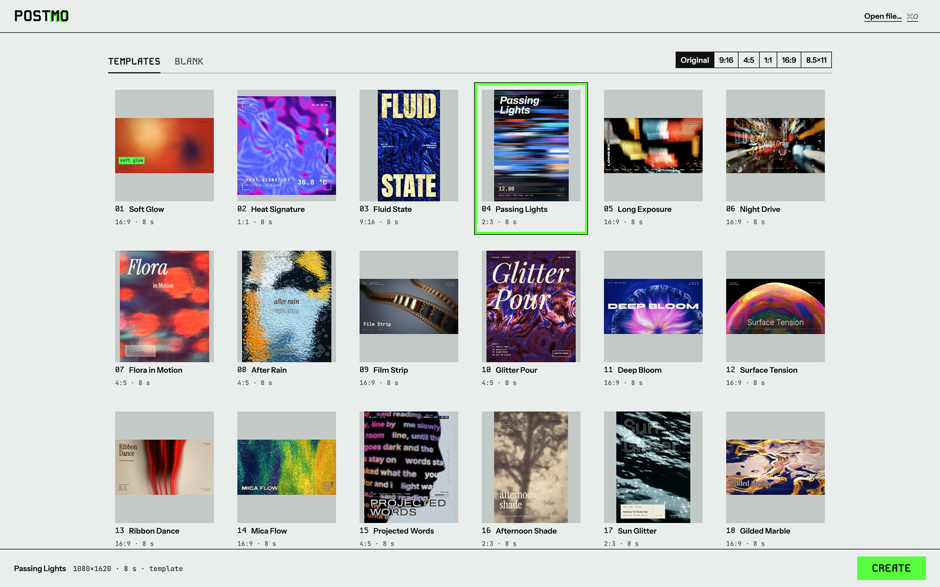
The start page: a selected card gets a green border, and CREATE is the only primary button.
​​​​​​​Icons
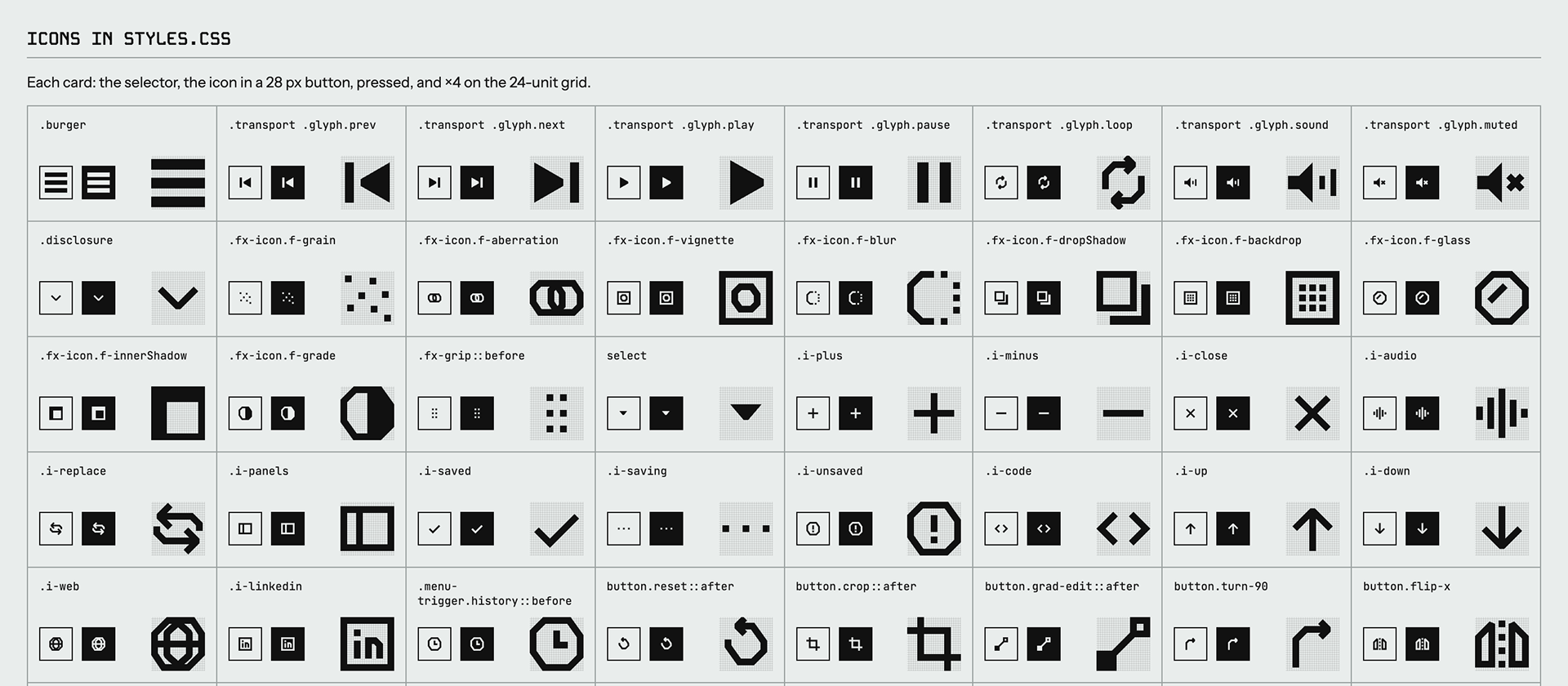
Once the panels were rebuilt like a design tool's inspector, they needed icons, so I drew a set to match Kode Mono. Each sits on a 24-unit grid at 12 px, so one unit is one device pixel on a retina screen, and lines run only horizontal, vertical, at 45° or at 2:3. Icons are not always the right answer, though. The four Fill types were hard to tell apart as icons, so they became words.

Part of the icon sheet: each icon at 12 px, pressed, and enlarged on its grid.
​​​​​​​How it was kept
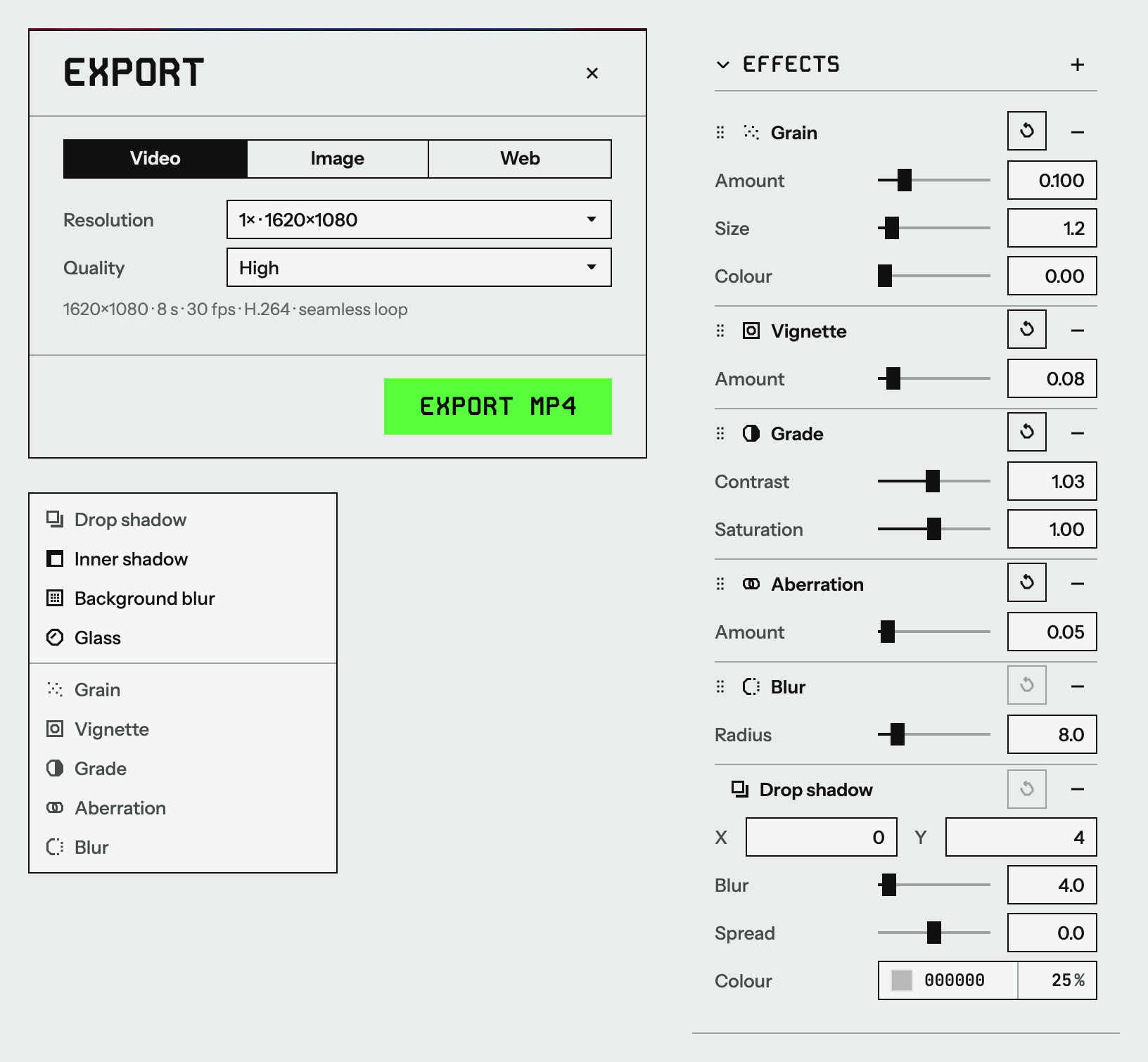
The tokens live in one file shared by the editor and the phone site. The written system is part of the spec the AI agent reads every session, and it has been revised in 77 commits.

Components from the shipped editor: a dialog with one primary button, the effects menu, and the Effects stack.
​​​​​​​Principles
Five principles guided most of the decisions in Postmo.
Work like the design tools people know
The first working version of Postmo was a form: you filled in fields, and the canvas only showed the result. I audited it against Figma and logged 56 problems, and most fixes pointed the same way. The canvas should be where you work, and the panel should hold exact values. So the rule became: if designers already know an interaction from the tools they use every day, copy it rather than invent one. Constraints, text box modes, double-click to crop, ⌥-drag to duplicate and holding ⌥ to measure all work the way designers expect. When the agent proposed its own fix for a clash on the ⌥ key, I turned it down, because anyone used to those tools would notice the difference.
Where design tools have nothing to copy, the new feature follows the closest thing they have. The biggest example is how shaders became fills. (Case 1)
Built-in visuals loop
Every built-in shader loops, and a test checks that each template's last frame leads back into its first. Looping is the product's signature, but custom shaders and audio do not have to follow it. (Cases 2 and 3)
Undo, don't ask
Postmo has no confirmation dialogs. Deleting layers, shuffling a layout and changing a shader can all be undone, and destructive actions show a short message with an Undo button.
Random, within the designer's rules
The dice for a shader's pattern, its colours and a template's layout all work within limits. Seed 0 and layout 0 are always the original design, and locked colours and layers stay where they are. (Case 4)
Your work stays on your computer
Designs and media are stored in the browser and are not uploaded. Usage statistics record the names of a few actions, with no text, file names, IP addresses or cookies.
Case 1 · From background to fill
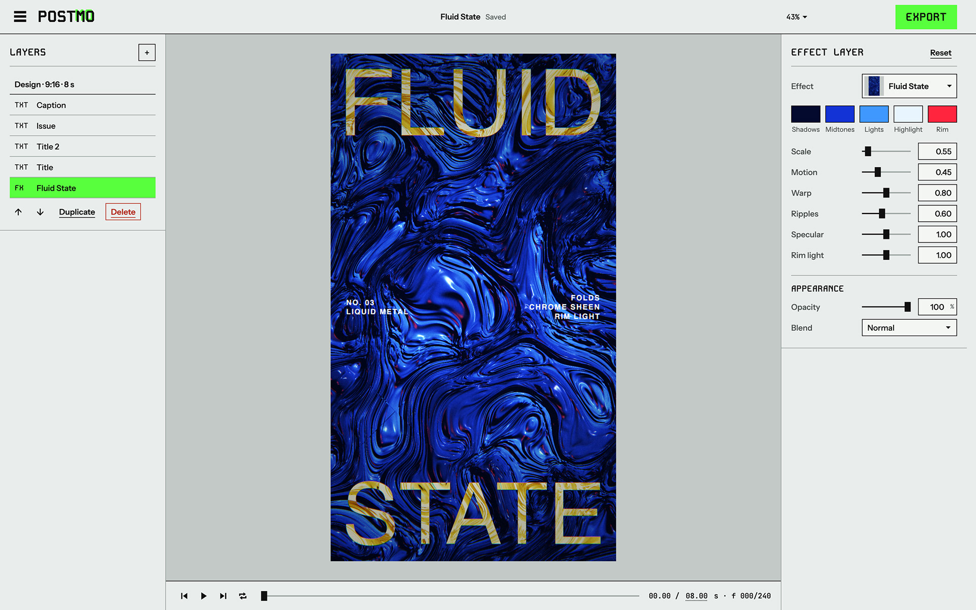
The first idea was simple. A shader would be the background, and text, shapes and images would sit on top of it. Every template was built that way. The shader layer always covered the whole canvas, its panel was one Effect layer section with the shader's colours and sliders, and the background colour underneath had nothing to show.

Before: the shader was an effect layer (FX) that always filled the canvas, with one panel for its colours and parameters.
​​​​​​​The question that changed it
On September 30, while using the editor, I asked whether the effect layer could be resized and reshaped to cover only part of the canvas. The first answer was a crop box on the effect layer. Within a couple of hours I saw that this was too small a change. A shader could be a design element like any other, something you scale, crop, mask and animate. So I looked at how design tools treat its closest equivalent, the image, and rebuilt the shader around that in three steps over three days.
Step 1: a shader as a generated image
In Figma an image is a fill inside an ordinary frame, and a fill mode decides what happens when the frame changes. I used the same model. A shader layer became a normal layer with a frame that can be moved, resized, rotated, picked by layer order and animated with Loop motion. In Fill mode the shader redraws at the frame's size, so a smaller frame gives a smaller, recomposed picture rather than a stretched one. I accepted that, because it suits something generated. In Crop mode the shader keeps its own rectangle, which you enter by double-clicking, as with images elsewhere, or from a button in the panel. A shader that fills the canvas looks exactly as before, so no template had to change.
Step 2: a mask layer, kept light
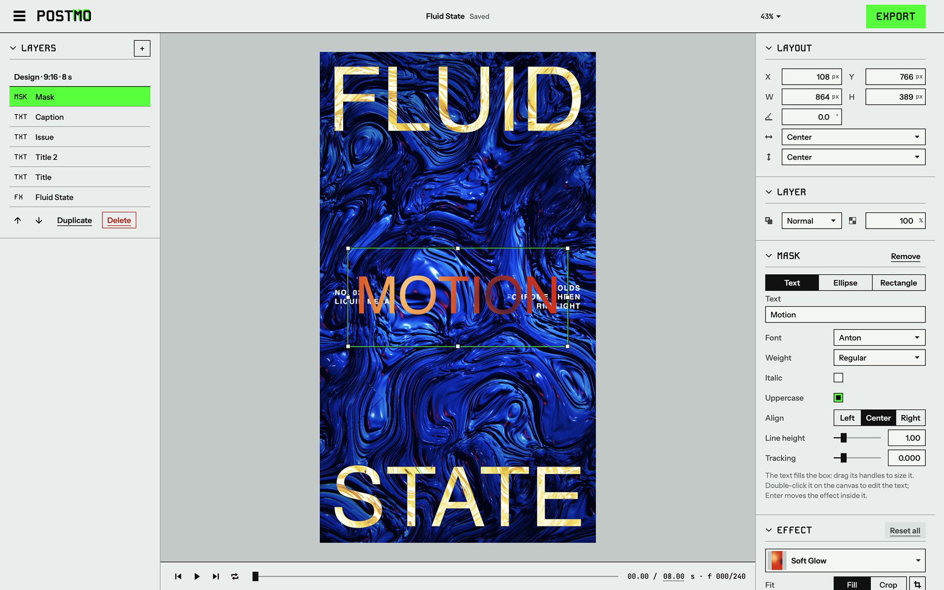
Next I wanted shaders inside text and simple shapes. General-purpose masks need groups and layer ordering, which felt too heavy for this product, so I added one fixed component instead: a Mask layer made of a shape (text, an ellipse or a rectangle) with a shader inside, similar to Canva's Frames. Over the next day it grew image masks, edge softness, an Outside setting that lets light spill past the shape, and more shapes.

Step 2: the Mask layer (MSK), a shape with a shader inside. Here the word MOTION shows a shader through its letters.
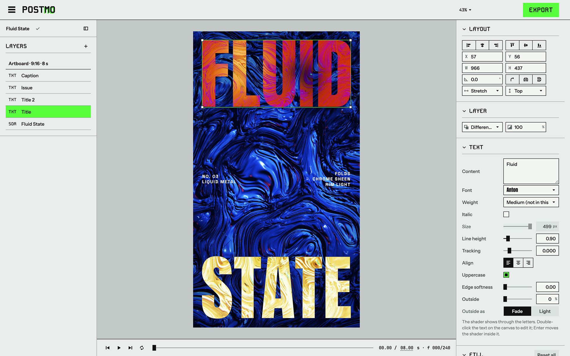
​​​​​​​Step 3: one model, shape × fill
By October 2 the editor had the same idea built three times. Shader layers could be any size but only rectangles. Mask layers could be any shape but could only hold a shader. Shape layers could be any shape but could only hold a solid colour. What a layer contained decided what it could do, so people had to pick the right type before they knew what they wanted. I looked at how online design tools handle this, and rebuilt Postmo on their answer: a layer is a shape plus a fill.
Every layer now answers two questions. Its Shape can be a rectangle, ellipse, polygon, star, arrow, text or a shape taken from an image. Its Fill can be Solid, Gradient, Shader or Media. Switching the fill keeps the frame, shape, effects and motion. The Mask layer type disappeared, and older files convert when they open. Text takes fills too, so a headline can be filled with a shader and still be edited as text. The + menu changed from Effect, Mask and Block to a set of shapes, Text, and two ready-made entries, Shader and Image or video, which are rectangles with that fill.

Now: the title is a text layer with a Shader fill. It is still edited as text, and the shader shows through the letters.
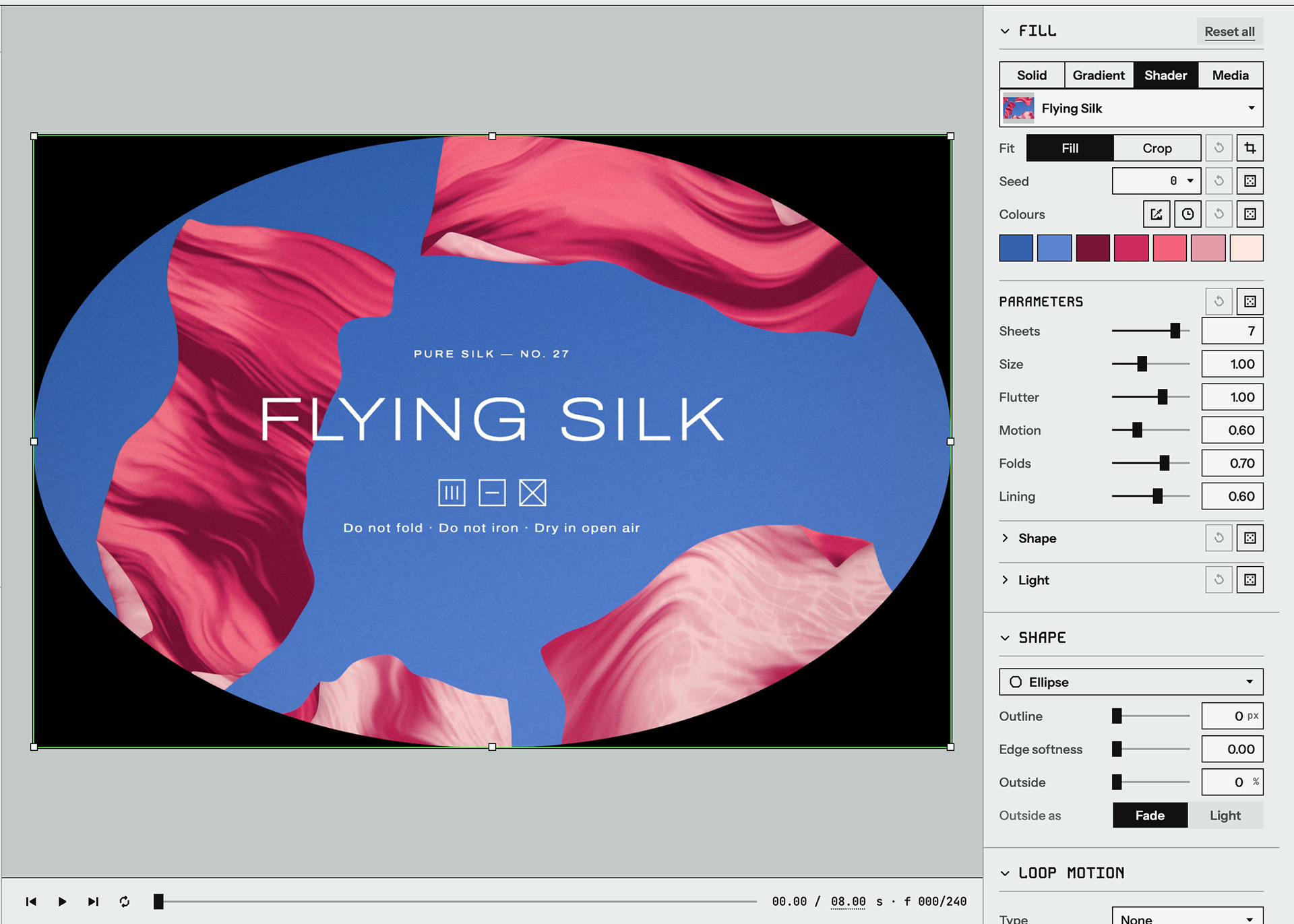
A shader layer with an Ellipse shape. Fill and Shape are separate sections.

​​​​​​​Because a shader is now a fill, the templates did not need rewriting, and the next feature became possible: a user's own shader could be a fill too.
Case 2 · Bring your own shader
The built-in shaders are mine. Each one started from a photograph and was tuned to loop. People who write code, or who ask an AI to write it for them, will want their own look, and a lot of good shader code already exists on Shadertoy and in tutorials. The goal was to let anyone write or paste their own GLSL and use it as a fill, with everything a built-in shader has. I wrote the plan on October 2, shipped the first version on October 3, and reworked how people get in, and where AI fits, on October 4.
A custom shader is just a shader
I did not add a separate code layer. A custom shader is a Shader fill like any built-in one (Case 1), so the frame, crop, shapes, effects, seed, colour die, colour locks and Reset all work on it without a second version of each. The code is saved inside the design file, so saving, copying between designs and the web export all carry it. Several layers can share one shader, and editing the code updates all of them.
Parameters live in the code
Custom code needed a way to declare sliders. I looked at ISF, an existing format that declares inputs in a JSON header, and chose something simpler: a comment on the uniform line.
uniform float speed; // @param Speed 0 2 0.01 1
uniform vec3 glow; // @color Glow #58ff3e
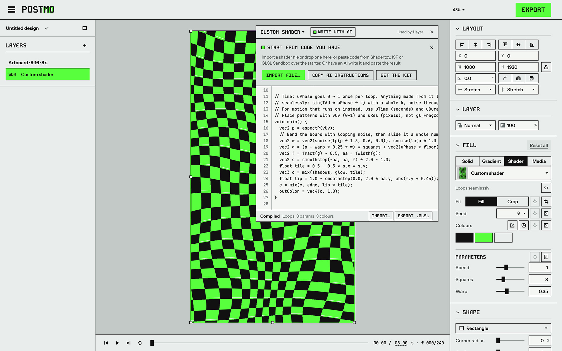
The code stays plain GLSL that other tools can compile, everything about a parameter is on one line, and a new line gives a new slider as soon as it compiles. ISF is still supported, but as an import format. Custom shaders have the same limits as built-in ones, 10 parameters and 8 colours. Colours are declared rather than written into the code, so the colour die and locks work on them too.

A new custom shader. The parameters and colours declared in the code appear in the panel like a built-in shader's.
​​​​​​​Code from anywhere
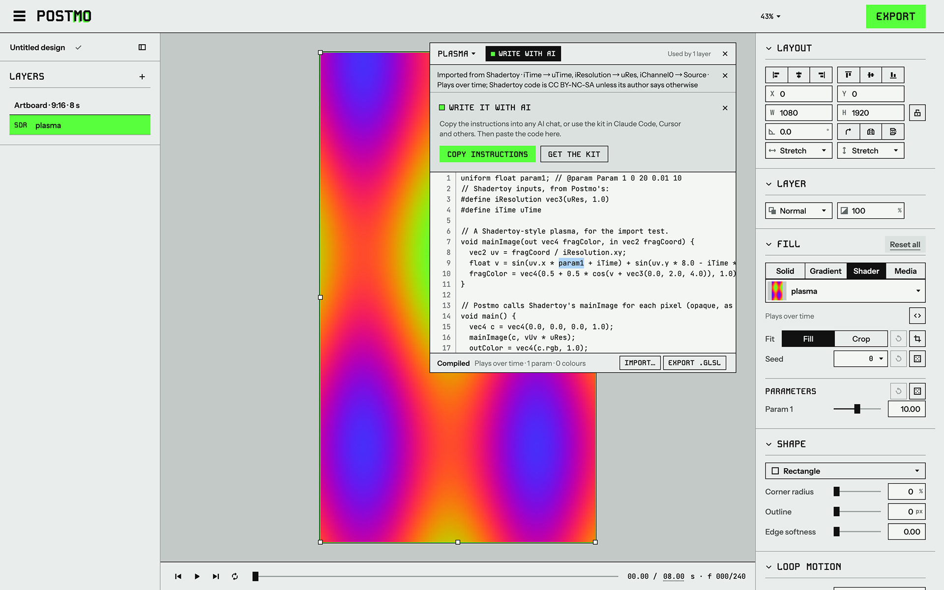
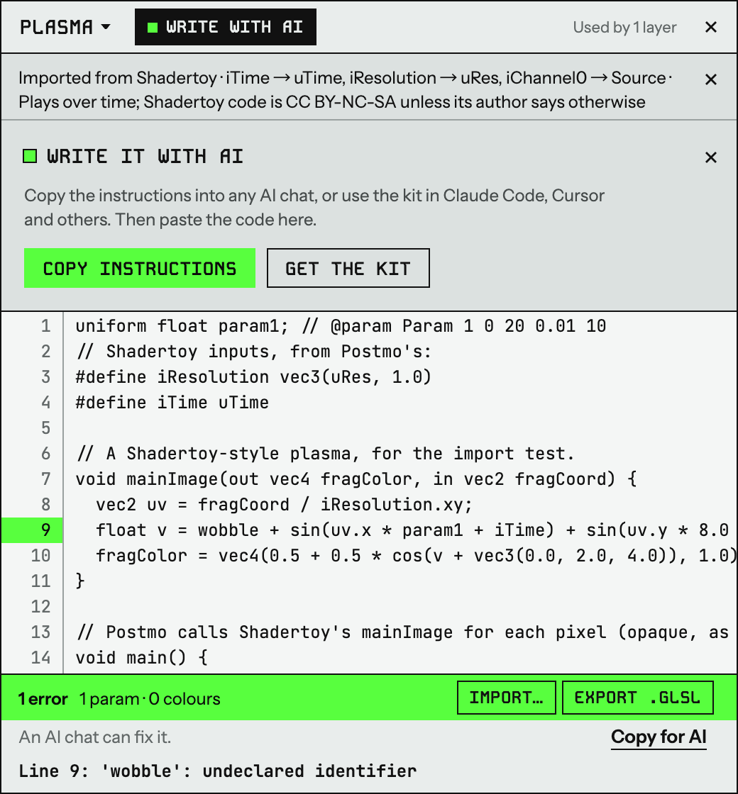
Import reads the format and converts it: Shadertoy code gets a small wrapper, older WebGL and GLSL Sandbox code is upgraded, and ISF inputs become sliders, colours and menus. The conversion is never silent. A note at the top of the window says where the code came from and what changed, and for Shadertoy it adds that the code is CC BY-NC-SA unless its author says otherwise. Code that is not recognised goes in unchanged, because a compile error that names the line tells people more than a refusal.
Imported code rarely has parameters, since its numbers are written straight into the maths. Make parameter fixes that: select a number and press ⌥⌘P, and it becomes a slider with that number as the default and a range from 0 to twice the value. The picture does not change.
One gap showed up in use: imported code kept the starter's colours. Now values still at the old defaults follow the new code, and anything the user set stays.

A Shadertoy shader after import. The note lists what was converted, and one number has become the Param 1 slider.
​​​​​​​One way in
The first version had entry points everywhere: dragging a file, pasting, Open, the Add shader dialog, the Fill section's shader menu and the New design dialog. Most offered both New and Import, which asked people to choose before they had seen anything. On October 4 I merged them into one. New shader opens the code window with a small starter shader, and the window is where code comes in: Import, a dropped file, or a whole shader pasted over the starter. A strip above the starter offers Start from code you have, with Import file as the primary button, and it stays while people type so the code does not jump under the cursor.
Mistakes are safe
When the code does not compile, the layer keeps drawing the last version that did, and the error is marked on the user's own line. A shader heavy enough to stall the GPU is held back for the session instead of taking the editor down.

An error marked on line 9, with Copy for AI to hand the problem to an AI chat.

​​​​​​​Loops as information
For built-in shaders a seamless loop is a requirement. For custom ones it is information. After the code settles, the editor renders one loop of 60 small frames and compares the jump from the last frame to the first with the changes inside the loop. The status bar says Loops seamlessly, or Doesn't loop with a button that shows the seam, in neutral text rather than red. None of this stops an export.
Writing it with AI
Most designers will not write GLSL themselves, but they can ask an AI to. Without guidance, the AI makes the same mistakes every time, and each causes a real problem in Postmo:
What an AI writes by default → What happens in Postmo
Numbers written into the maths → No sliders in the panel
Time fed straight into noise → The loop jumps at the end
Patterns placed with gl_FragCoord → The pattern slips when the layer is cropped
Colours written into the code → The colour die and locks cannot touch them
Its own noise functions → The seed does nothing
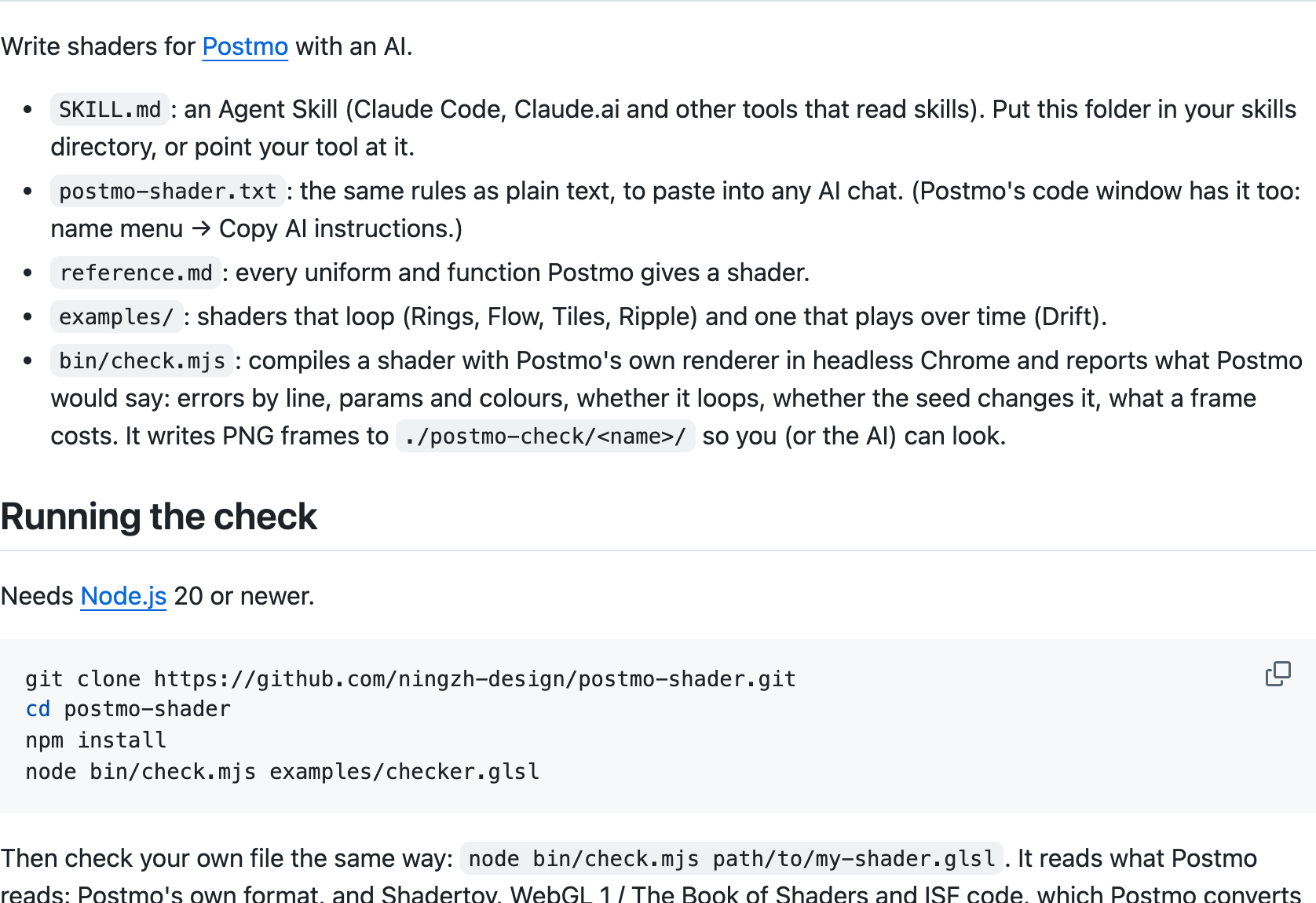
Postmo gives the AI the rules in three ways. Copy AI instructions puts them on the clipboard for any AI chat. An open-source kit on GitHub gives tools like Claude Code and Cursor the same rules as a skill, plus a check script that compiles the shader with Postmo's own renderer and reports errors, looping, seed and frame cost, with PNG frames the AI can look at. When something goes wrong in the editor, Copy for AI copies the instructions, the code and the problems in one go. All three come from one source, so the editor and the kit always agree.

The open-source kit: a skill, the same rules as plain text, examples and a check script.
​​​​​​​Case 3 · What I cut
Postmo has fewer features than I built, and three decisions were about removing things.
At first, audio looped like everything else: short files repeated, and each pass crossfaded into the next. Most people bring a song or a voice-over, though, and they would hear it restart every loop. Audio now plays once from the point you choose. This is where looping stopped being a rule for the whole product.
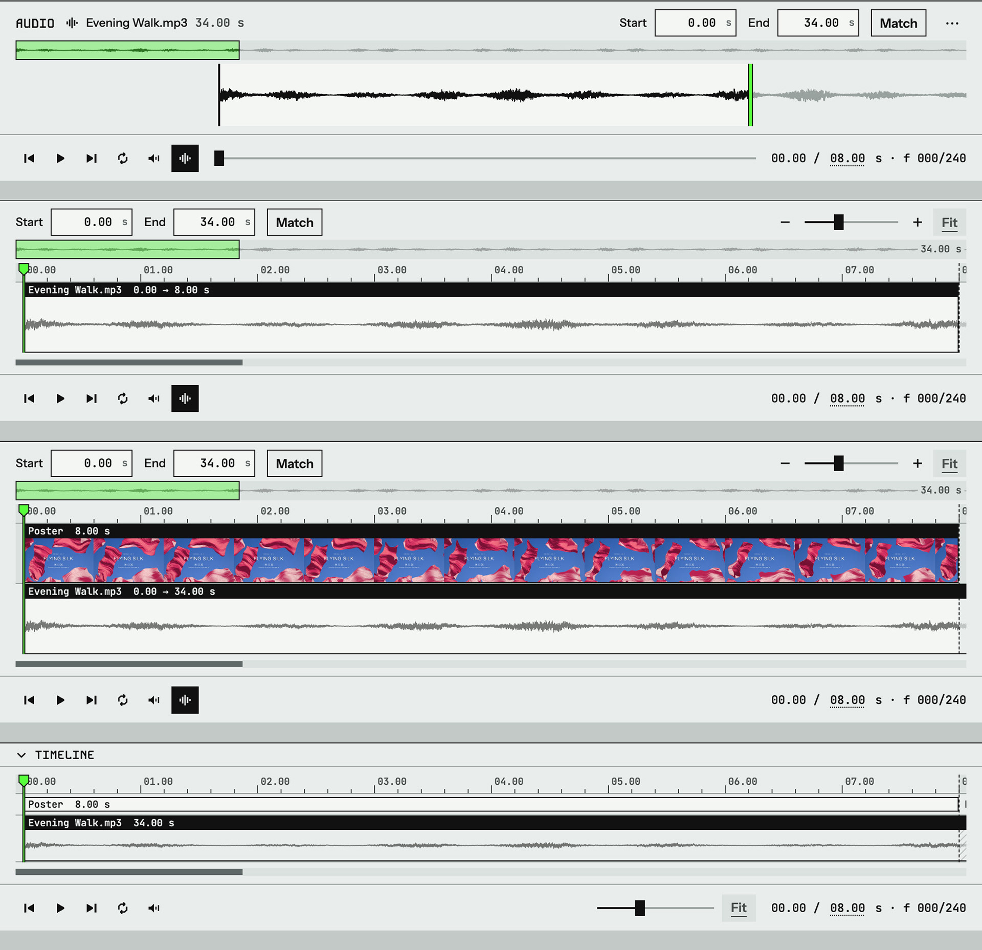
People then needed a way to choose which part of a song plays. On October 3 I went through five versions in one afternoon: Start and End fields, a drawer for sliding the waveform, a small timeline with trim handles and zoom, a full editor timeline with a movable clip, and a simpler track meant to grow into a timeline for every layer. After the fifth, I removed all of it. Each version was a sensible step from the one before, but together they added up to a video editor inside Postmo. People who edit sound already have tools for it, and people who don't only need to pick where the song starts. What shipped is Start offset, two fades and a Match button. The timeline is archived on a branch.
Apply look moved a template's shaders onto the current design, and as the editor grew it began replacing the user's own shader layers too. I removed it: templates now only start a new design.

Versions two to five, top to bottom. All four are archived on a branch.
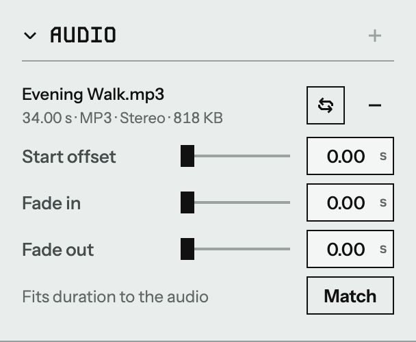
What shipped: one track row, three sliders and Match.
Case 4 · A phone site that never plays the same twice
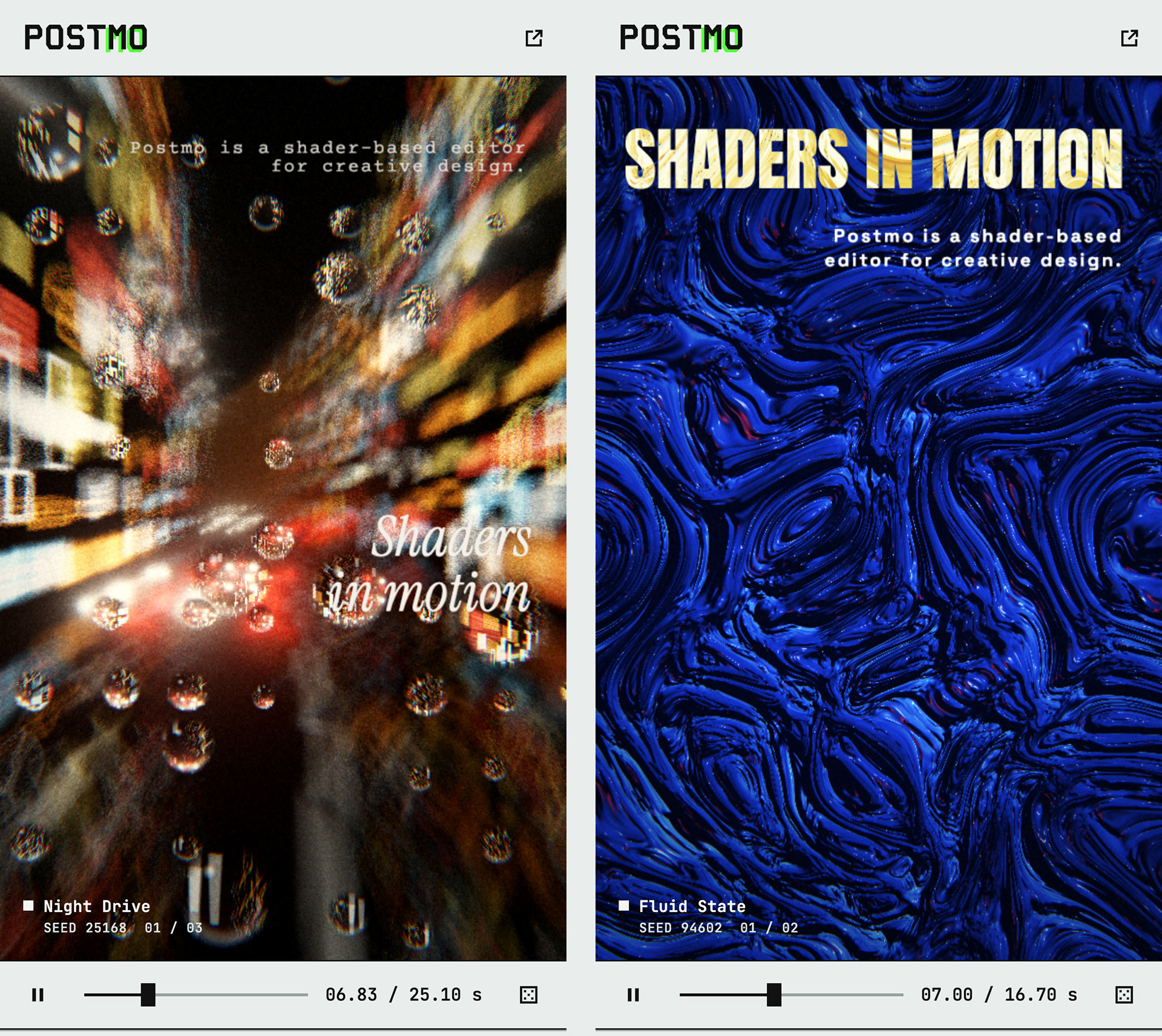
The editor needs a desktop, so the original plan gave phones a message saying so. But links get opened on phones, including links shared on LinkedIn, and that message shows nothing. I kept the editor off phones and designed a separate page that shows what the product makes.
The first screen is a reel of two to four live templates, each with a random seed and starting point, so it differs on every visit. A headline and three short sentences are spread across the cuts, and each cut stays on screen as long as it takes to read. Shaders that draw text carry the copy themselves: Neon Echo's sign spells the headline.
Type size, alignment, line breaks and position all come from the seed, so every layout has to pass rules first: inside the margins, no overlaps, a headline of at least 28 px and body text of 13 to 17 px. The layouts that pass are ranked by contrast, measured on a tiny brightness map of the shader at the start, middle and end of the cut. Body text that still reads poorly gets a small label behind it. Phones that cannot keep up get a recorded video instead.

The phone site on two visits, each with a different template, seed and type layout.

How I built it
I am a product designer. On Postmo I was responsible for the design thinking and the final result. Claude Code, worked as the programmer and the tester: I decided what to build and judged whether it was right, and the agent wrote and tested the code.
For a new shader, I gave the agent a reference photograph and a short description of what mattered. For interface work, I sent a screenshot of the problem and the behaviour I expected from a design tool. Larger changes went into phased plans that listed my decisions, fourteen in all, and the decisions were collected in a spec the agent reads every session. Some became tests: one fails if a new shader has more than ten parameters.
I reviewed the product by using it, the way I would review a developer's build. When the word "Saved" crossed the panel line below it, the agent rebuilt the top bar on the panels' columns. When thin wrinkle lines in Sheer Pressure looked unnatural, I had them removed. A change shipped only after the tests passed: every template has to render, loop and export, alongside about 120 browser tests and more than 300 unit tests.
Reflection
The audio redesign, and then undoing it, changed how I think about product decisions. As Case 3 describes, the timeline kept growing because at each step I asked what else a user might want to do with their sound, and then added it.
The problem was in that question. I was trying to give users as much as I could, and that felt like good design while I was doing it. It pulled Postmo toward being a video editor and made me lose sight of what Postmo is: a tool for making a moving design, where sound is something you add near the end.
I now test a new feature against the product's position before I test it against user needs. If a feature only makes sense in a different product, it is probably the wrong feature, however useful it looks on its own.
What's next
Layers can loop, but they cannot yet enter, leave or animate with keyframes. That timeline will be designed around layers first, with audio as one track on it. Postmo also needs a list of saved designs, because the browser keeps only one design at a time today.
↑Back to Top