

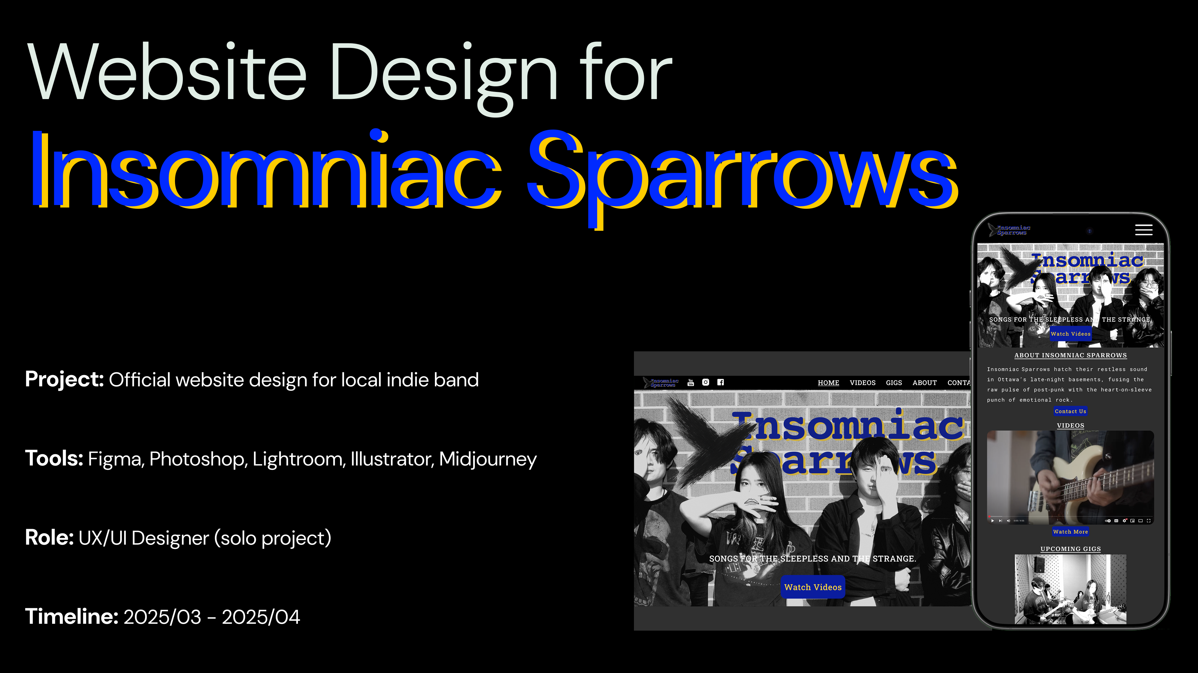
Update, July 2026
Since writing this case study, I used Figma MCP and Codex to turn the original Figma prototype into a working website and deploy it online.
I also tested the site in a browser and adjusted the font sizes based on how the pages were actually displayed. Several buttons now include small hover and click effects.
A Digital Home for Insomniac Sparrows
I turned a very open request - "We need a website" - into a clear five-page experience and visual identity for a new Ottawa student band.
Project Snapshot
Role: UX/UI Designer, solo project
Timeline: March-April 2025
Tools: Figma, Illustrator, Photoshop, Lightroom, Midjourney
Deliverables: Information architecture, wireframes, desktop and mobile prototypes, logo, visual system, and final website design
Status: Design complete and ready for development
The Starting Point Was Not a Screen
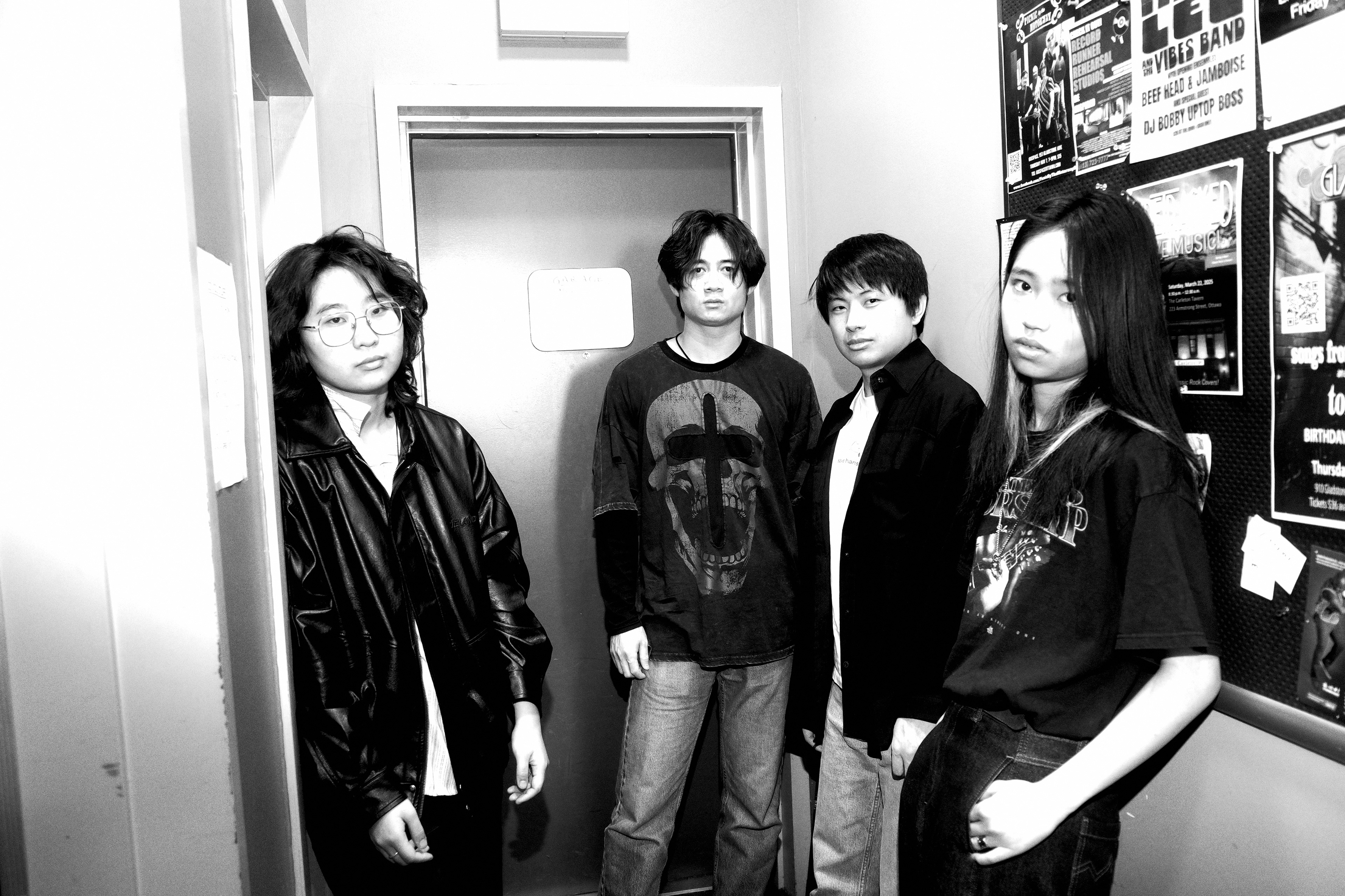
Insomniac Sparrows is a band formed by students from Algonquin College and the University of Ottawa. The lead guitar player is my friend. They wanted a website to introduce the band and help them find more chances to perform locally.
Their first request was simple: "We need a website."
That gave me a starting point, but not yet a design direction. The band was new. They had no existing website and no clear list of features. I did not want to open Figma and begin arranging pages before I understood what the website was meant to do.
The first question I needed to answer was:
When music already lives on social media and streaming platforms, what useful job is left for a band website?
Learning What a Band Website Is For
I reviewed the official websites of Peach Pit, KT Tunstall, and Maggie Baugh. I was not looking for a style to copy. I wanted to see what information these sites kept in one place and where they sent visitors next.
The pattern was simple. Music, videos, tickets, and social posts may live on different platforms, but the official website connects them. It gives listeners, event organizers, and potential booking contacts one dependable link to use.
This changed the way I saw the project. The website did not need to replace the band's social media. Its job was to bring the band's story, performances, upcoming shows, and contact details together.
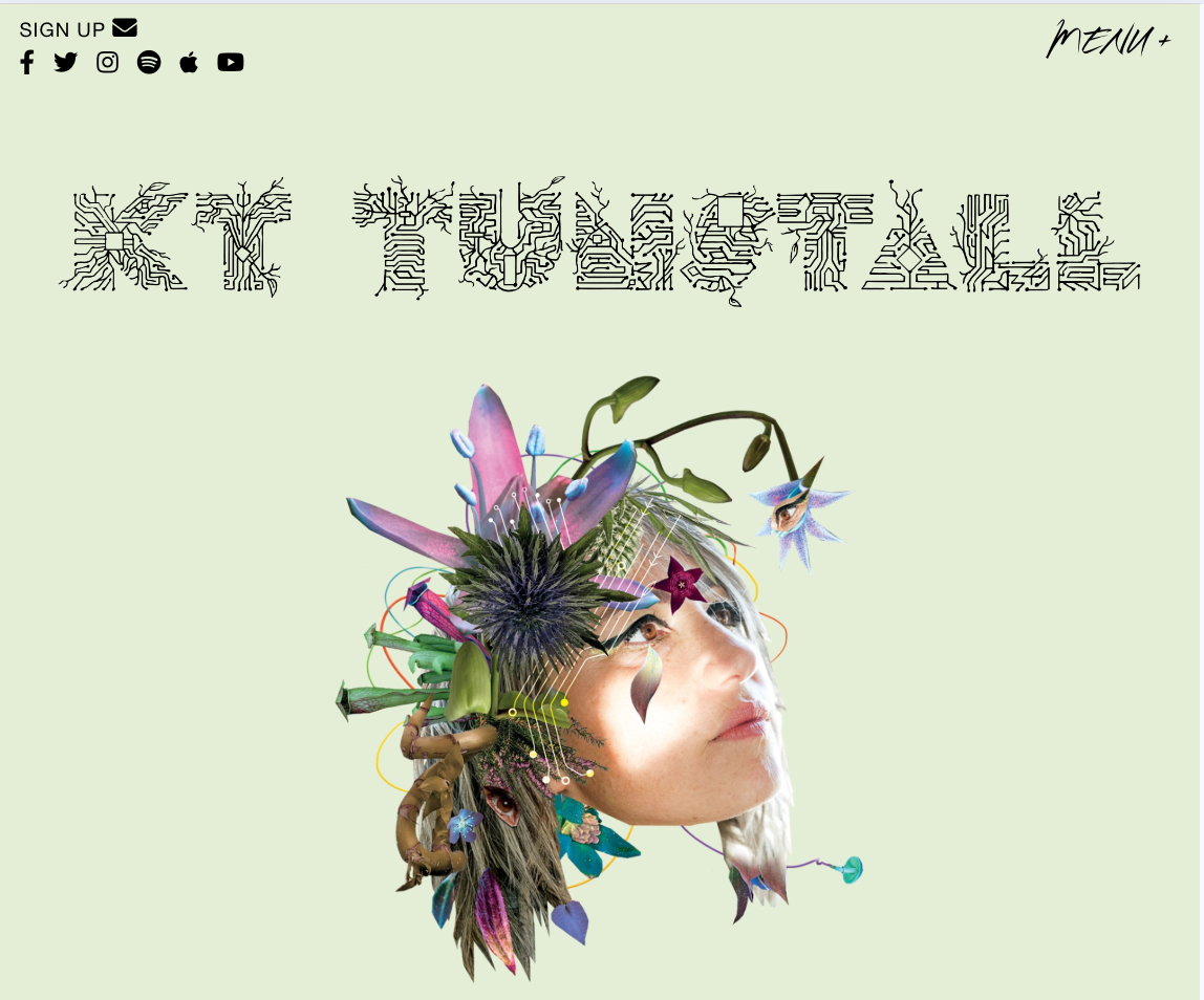
Official website of KT Tunstall
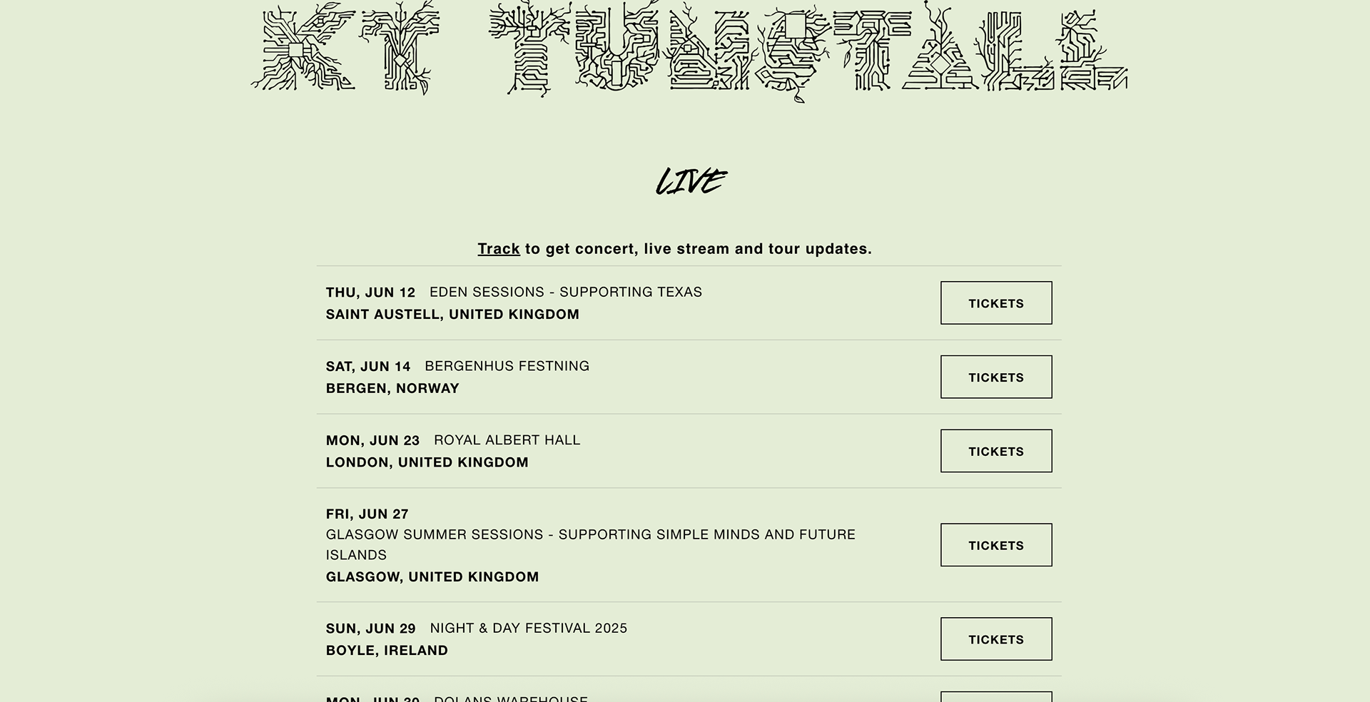
Official website of KT Tunstall: lives and performance announcements
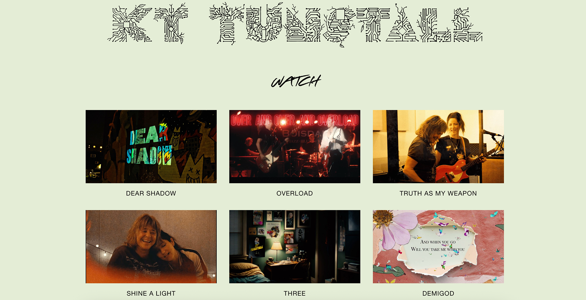
Official website of KT Tunstall: videos
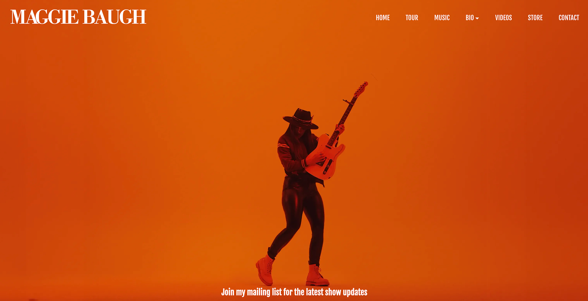
Official website of Maggie Baugh
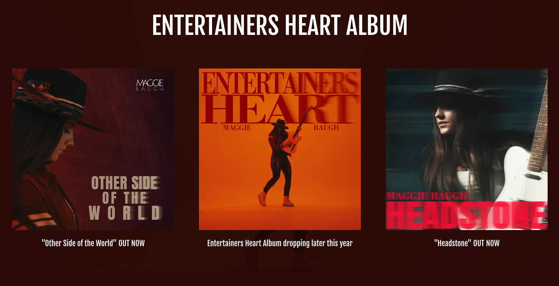
Official website of Maggie Baugh: albums
Turning a Loose Request Into Five Pages
Once the purpose was clearer, I organized the site around five pages:
Home: gives a quick view of the band and the latest content from the rest of the site.
Videos: shows the band's performances.
Gigs: lists upcoming shows and ticket links.
About: introduces the band and its members.
Contact: gives venues and organizers a clear way to ask about bookings.
I treated the homepage as a front door rather than a long introduction. A visitor should be able to understand who the band is, see or hear their work, and choose where to go next without searching through the site.
Starting With Rough Wireframes
I began with low-fidelity wireframes so I could focus on order, hierarchy, and navigation before spending time on colour and visual details.
The homepage used a summary-style layout. Instead of repeating full pages, it showed a small part of the band's videos, gigs, story, and photography. This made the homepage useful to first-time visitors while keeping each section easy to reach.
I then built clickable desktop and mobile prototypes in Figma and shared them with the band.
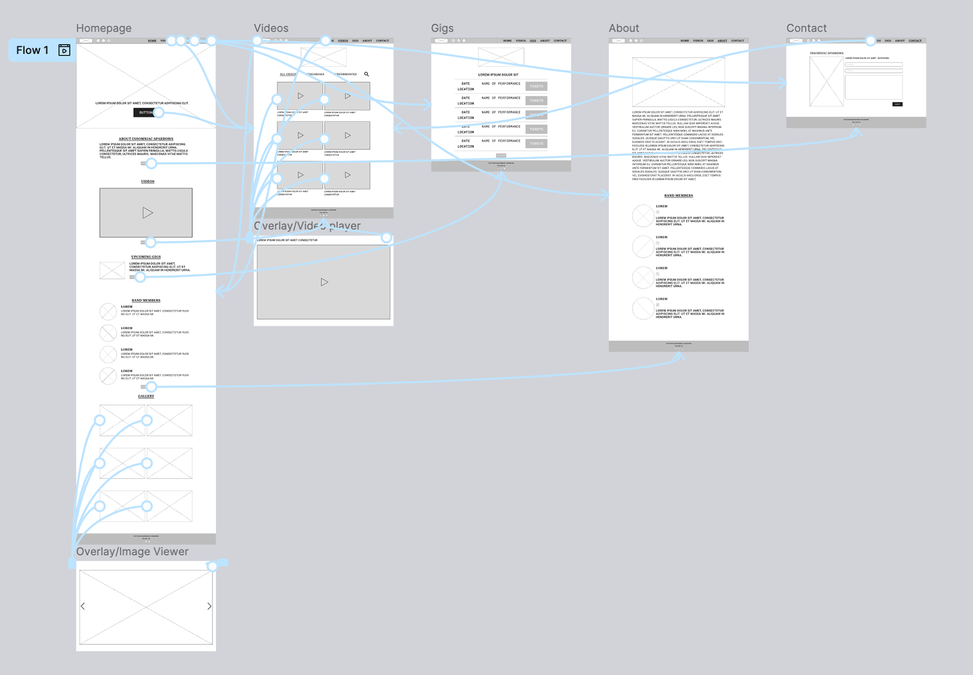
Lo-fi wireframes
The Band's Feedback Made the Site More Practical
The first prototype gave the band something concrete to react to. Their feedback led to three changes:
1. I added a photo gallery to the homepage so visitors could see more of the band's personality.
2. I made the video thumbnails larger because performance footage was one of the strongest ways to introduce their music.
3. I moved the social links into the header so they were easier to find from any page.
These were not large changes, but they made the design feel more like the band's website and less like my first interpretation of the brief. This was a useful reminder to show work early. A rough prototype can start a better conversation than a polished screen shown too late.
Building the Visual Identity From a Personal Detail
The band's vocalist shared a photograph that included a small mark on a wall. The shape looked like a bird in flight, and it became the starting point for the logo.
I explored the shape with Illustrator and Photoshop, with AI tools supporting early visual experiments. I then refined it into a simple mark that could work in the website header and across promotional material.
For the website, I chose a blue-black base to fit the band's rock sound and used bright yellow for emphasis. A consistent type system helped the pages feel connected even when they contained different kinds of content, from videos to gig listings.
What I liked most about this direction was that it did not come from a generic music template. It came from something the band had noticed in its own surroundings.
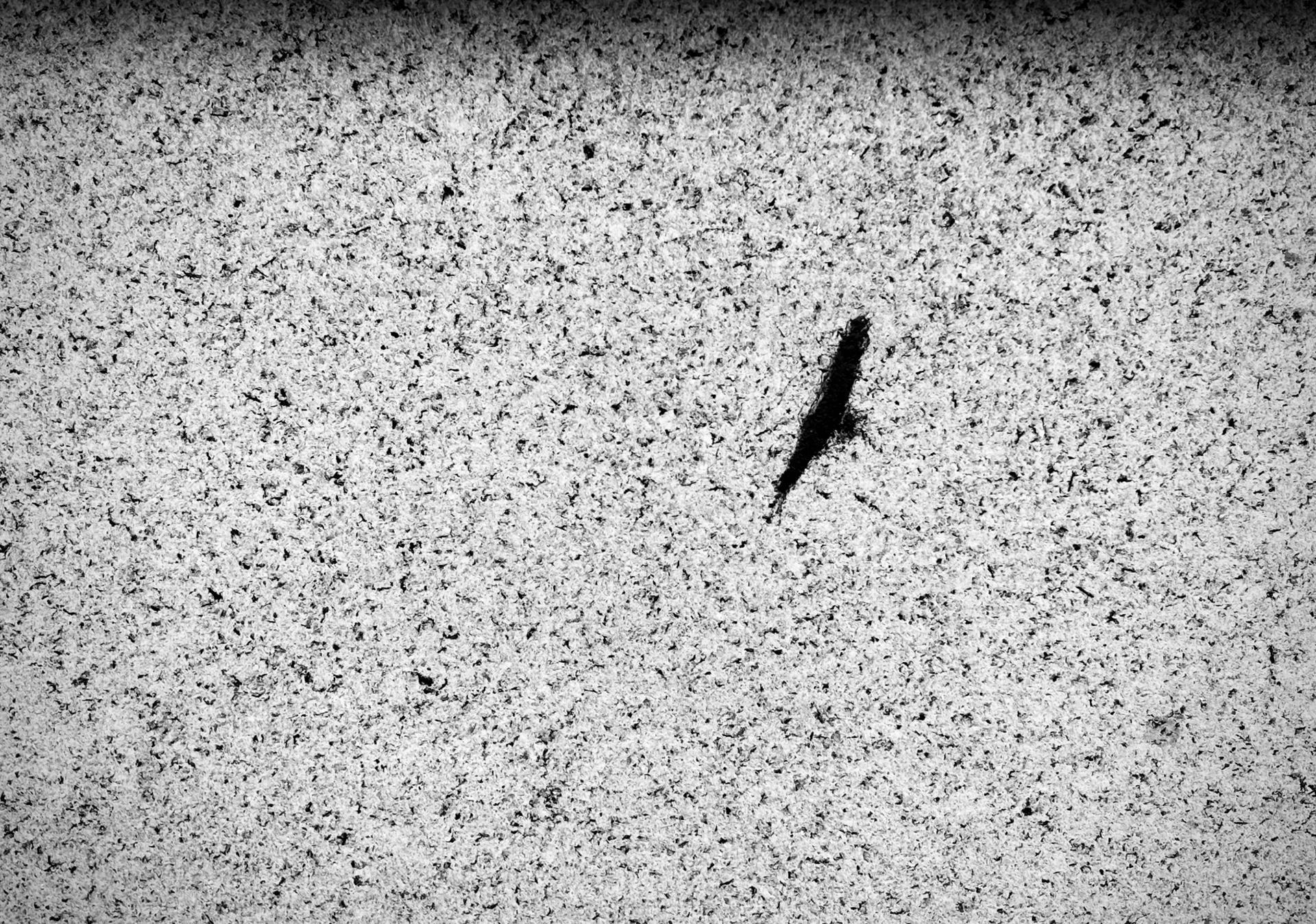
The logo's design was inspired by a bird-like mark on the wall, as described by the band's lead singer.
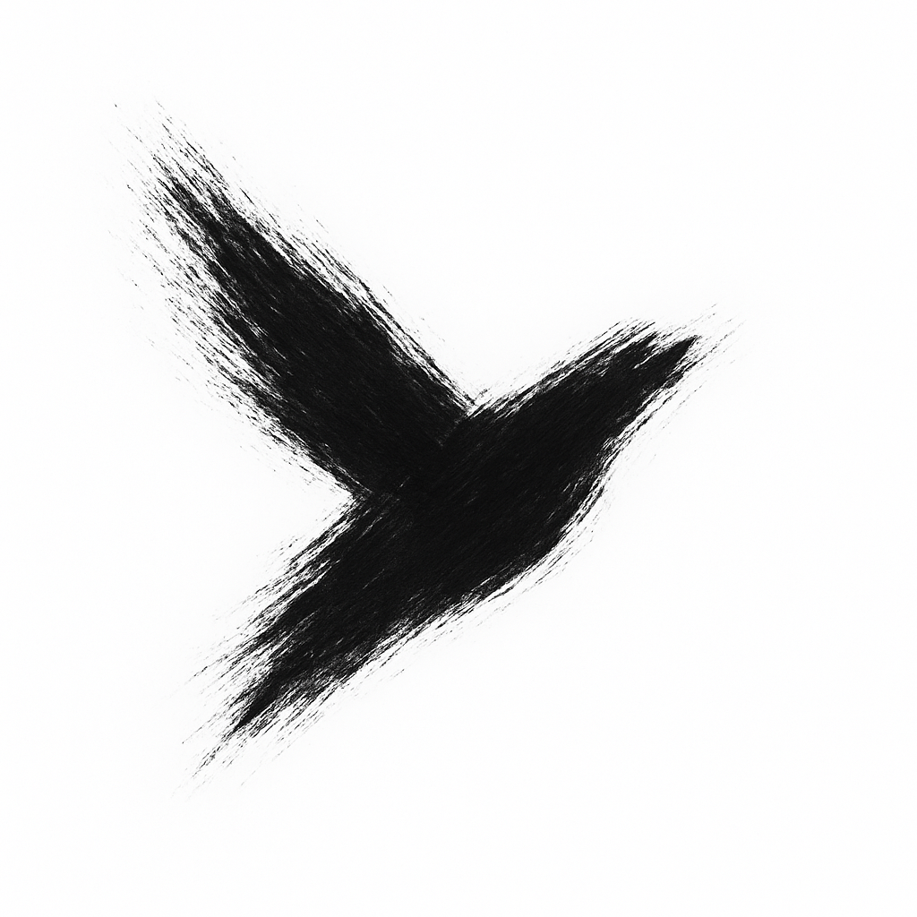
Final version of band logo design
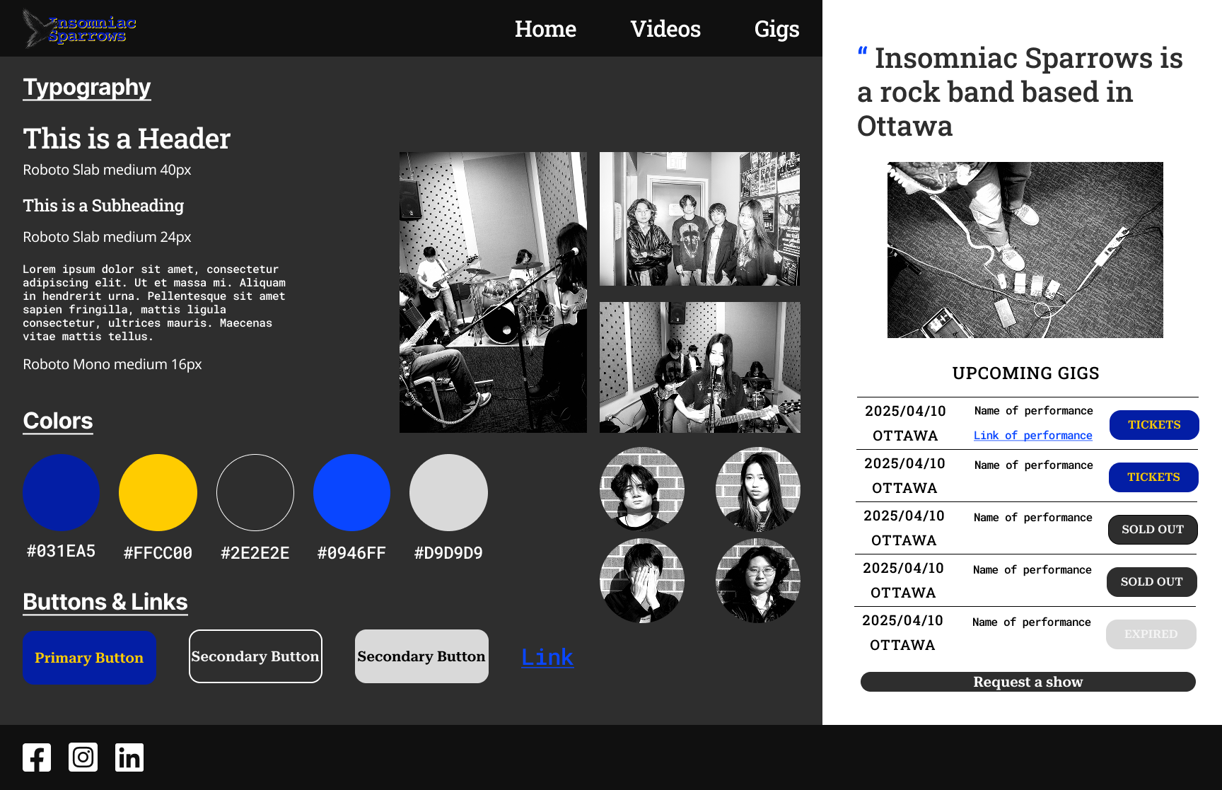
Style tile
The Final Design
The final website will give the band one place to share its identity, performances, upcoming gigs, story, and booking information. It will also connect visitors to the outside platforms where they can watch, listen, follow, or buy tickets.
I completed responsive desktop and mobile designs and prepared the work for development. The band was happy with the direction and felt that the site could support its promotion.
The website was not developed during this project, so I do not have traffic, engagement, or booking numbers to report. I would rather be clear about that limit than turn positive feedback into a result I cannot prove.
After the Project
By the middle of 2025, changes in the members' work and study commitments made it difficult for the band to continue, and Insomniac Sparrows disbanded.
That makes this project feel even more personal to me. Getting to know the band and spending time at their regular rehearsals is something I will remember for a long time. I have always loved rock music, and this experience let me see the everyday life of a band up close. I was welcomed into their rehearsals, where I took photos and later filmed and produced a rehearsal video. Instead of only watching live music from the audience, I could feel its energy inside the rehearsal room.
I also had the chance to design a website for the band. As a rock music fan and a designer, that was honestly very cool.
What I Took Away
The most important lesson was not about a Figma feature or a visual trend. It was about beginning with the right question.
When a client says, "We need a website," the request may still hide the real problem. Competitive research helped me move from a loose idea to a clear purpose. Early feedback helped me improve the design before I became too attached to the first version.
This was also one of the local projects that helped me become more confident working as a designer in Canada. I had to listen, give structure to an unclear request, explain my choices, and turn feedback into visible changes.
If I continue the project, my next step would be to test the prototype with two groups: people discovering the band for the first time, and local organizers looking for performance and booking information. I would check whether they can quickly find a video, the next gig, and the contact details, then revise the design before development.