Redesigning "Same Money, Different Story": Public Health Poster Series
During my final semester at Algonquin College, our student team worked with Ottawa Public Health on a campaign about online gambling harms among young working adults aged 22–35. The brief focused on how easy it can be to overlook small online bets when no physical cash changes hands.
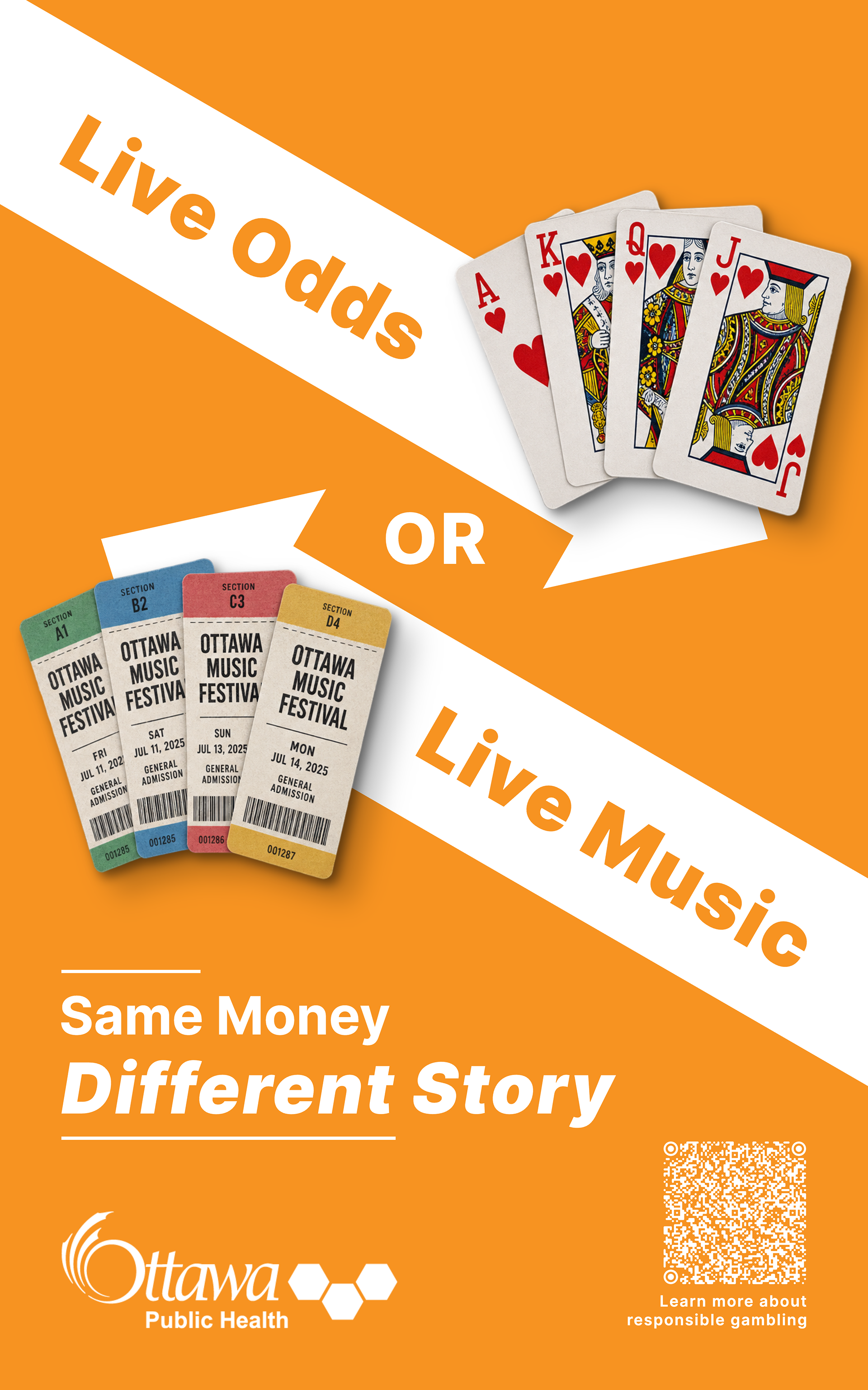
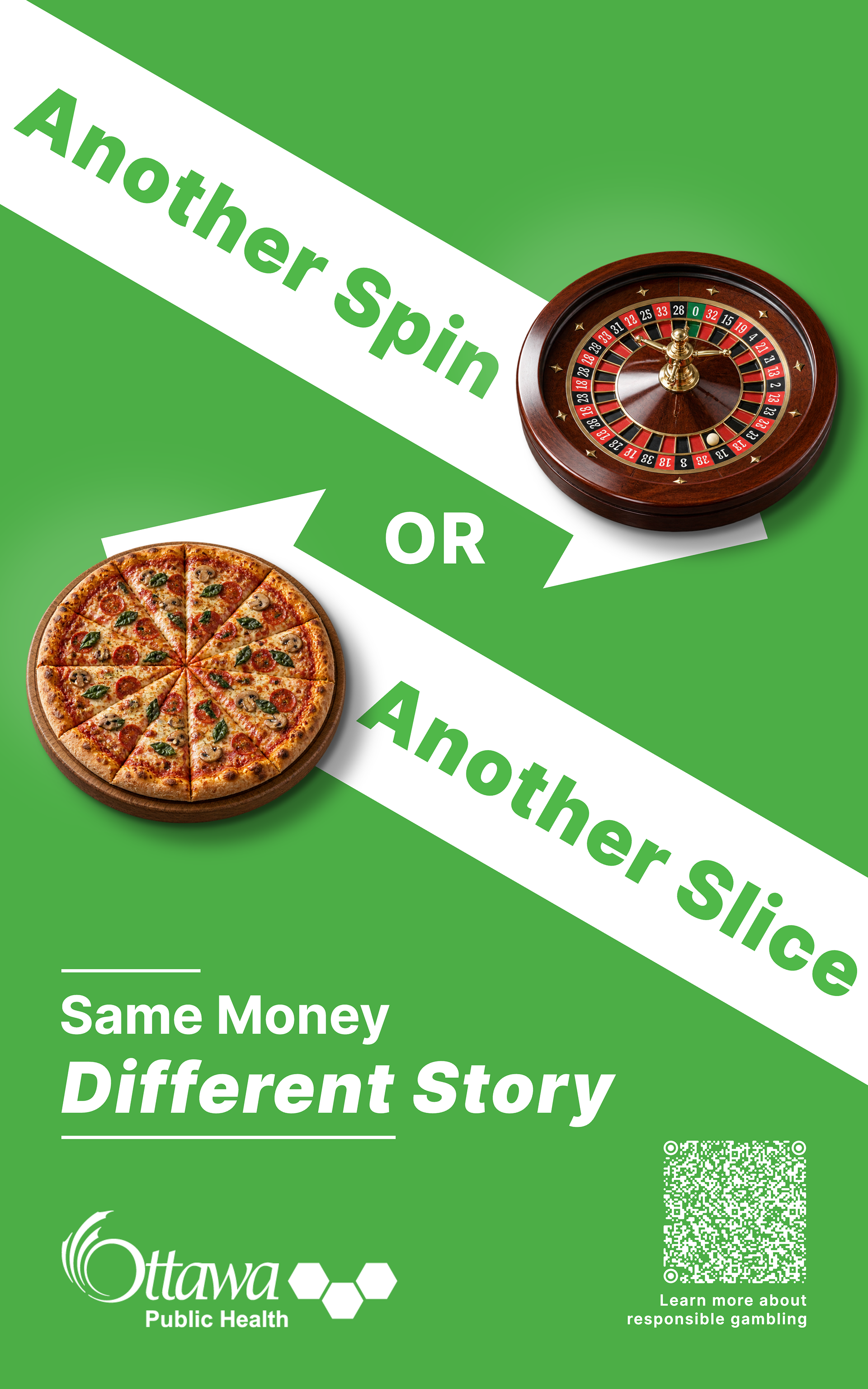
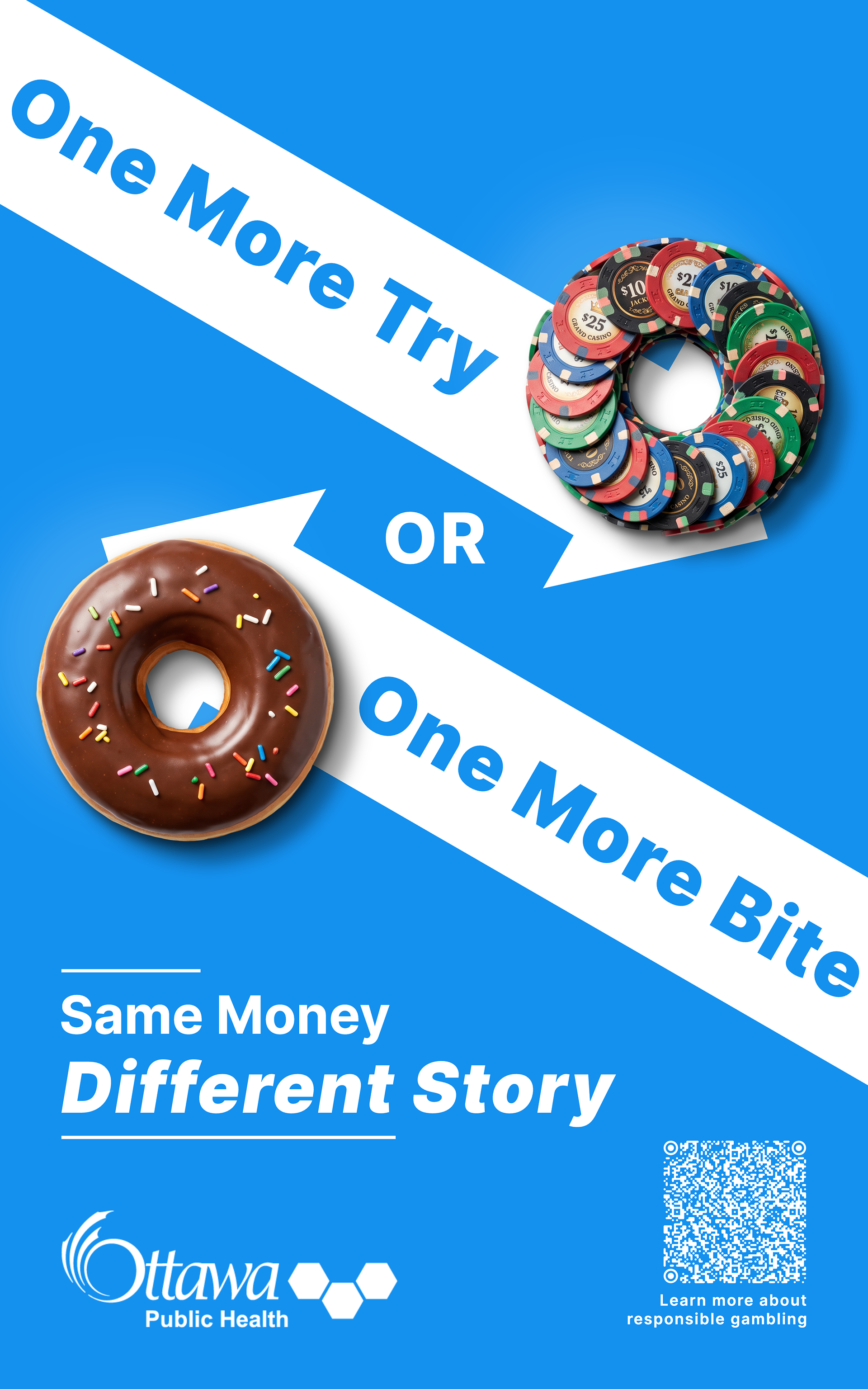
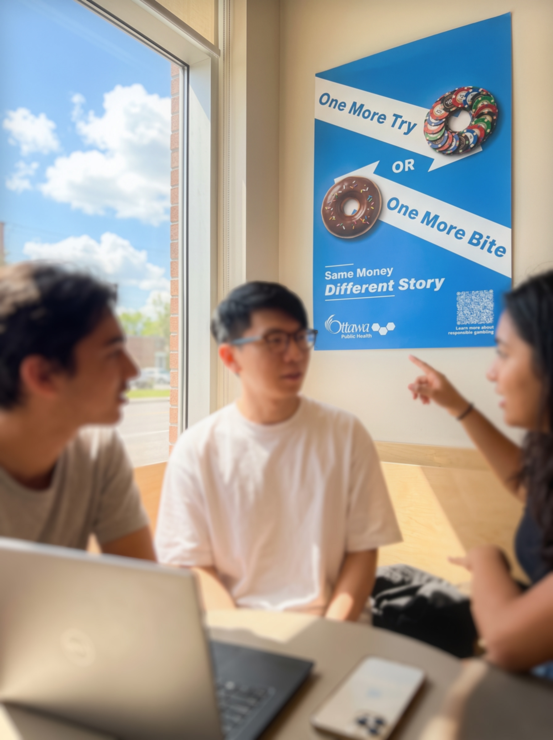
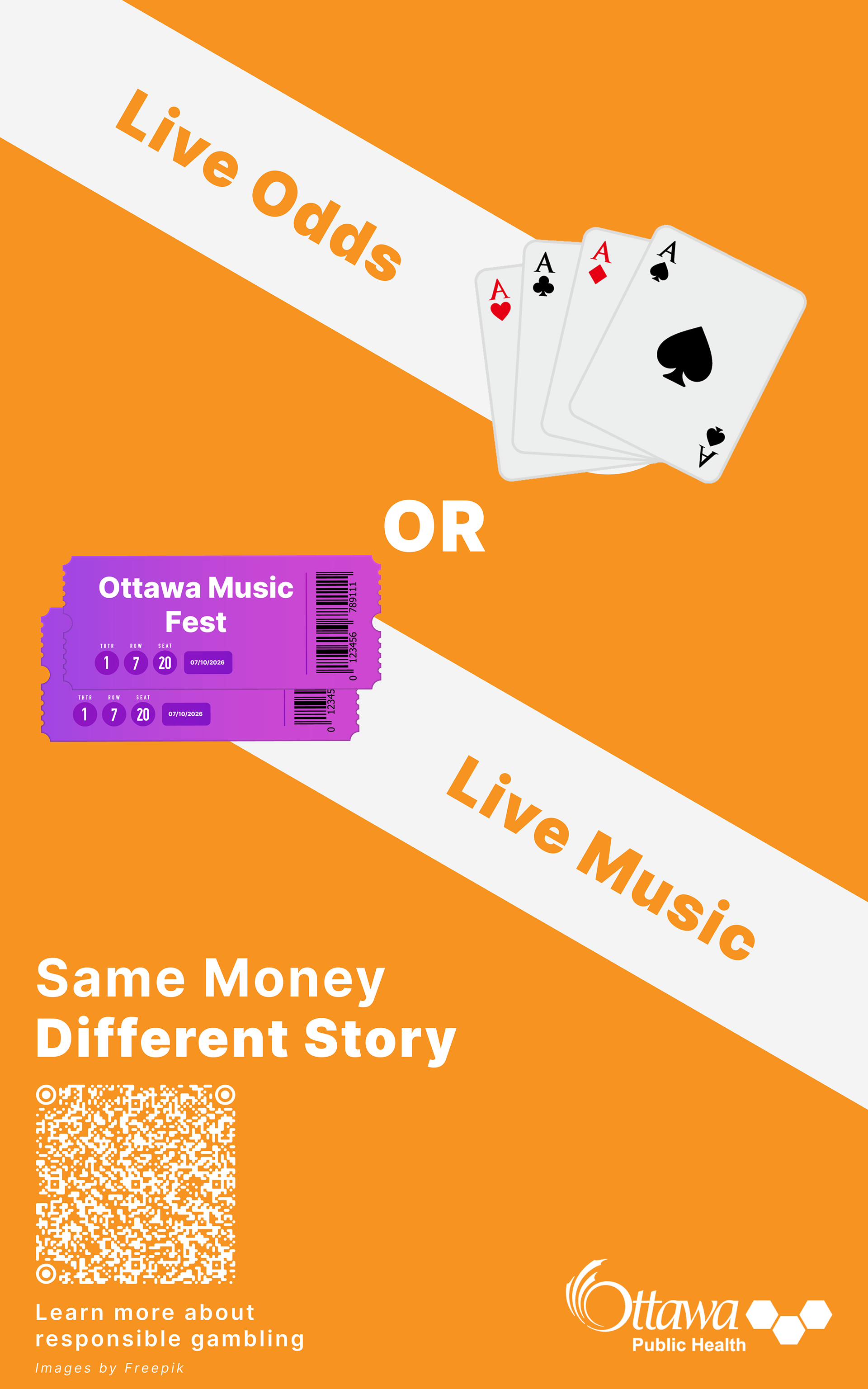
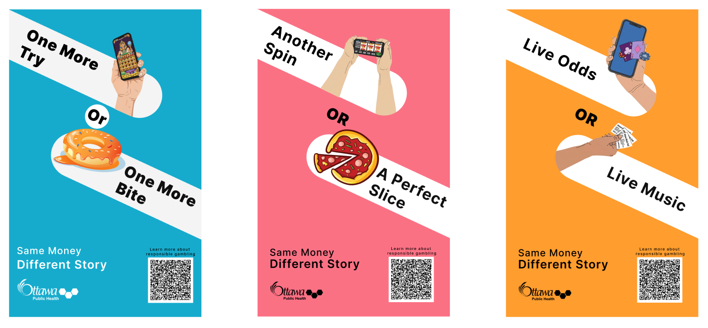
I developed “Same Money, Different Story” to compare spending on gambling with everyday experiences. Each poster pairs objects with similar shapes: casino chips and a donut, playing cards and concert tickets, and a roulette wheel and a pizza. The headlines ask viewers to consider what else their money could pay for.
Why the Redesign
When I revisited the project for my portfolio, I wanted to improve the visuals and try a version for screens. The original posters used flat vector illustrations, which felt too flat to me. I replaced them with photographic cutouts and soft shadows so the objects looked more real. I also changed the white bars into angled arrows and adjusted the type, tagline, logo, and QR code to balance the layout.
I designed the updated layouts in Figma, then used Codex to help build three HTML and CSS webpages. Working in a browser let me test and adjust the animations. The images slide into view, and the arrows move slightly past their final positions before bouncing back. Their text follows a little behind. The tagline, logo, and QR code appear at the end.
After arriving, the objects gently float up and down. I combined small movements and changes in scale with shadows that grow softer and lighter as the objects rise. I kept the movement smaller for the roulette wheel and pizza because of their angled perspective.
I exported each webpage as a 10-second video and used ElevenLabs’ text-to-speech feature to create the voiceovers. The scripts suggest spending time with someone: sharing a bite with a friend, enjoying live music with a partner, or having a slice with family. I tried different voice tags to find a delivery that sounded warm and natural.
The video below are social media ad concepts based on the redesigned posters. This was a chance to take an earlier print project further and work through the layout, animation, and voice together.
Before: Original Deliverable (Vector Edition)
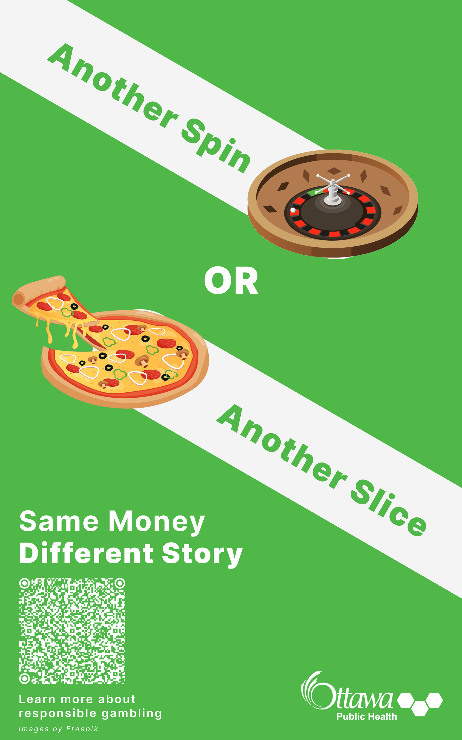
Before: Original Deliverable (Vector Edition)
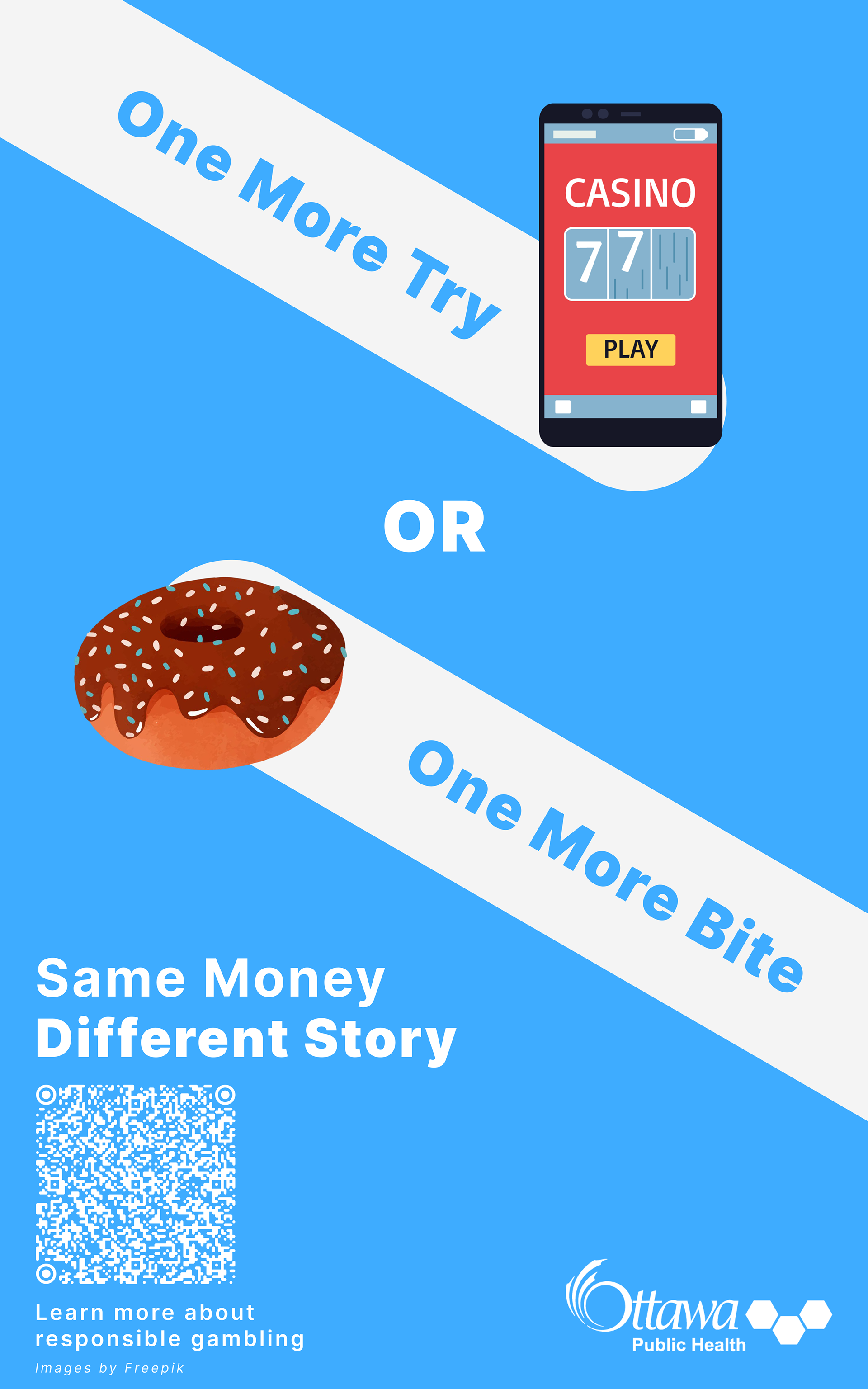
Before: Original Deliverable (Vector Edition)
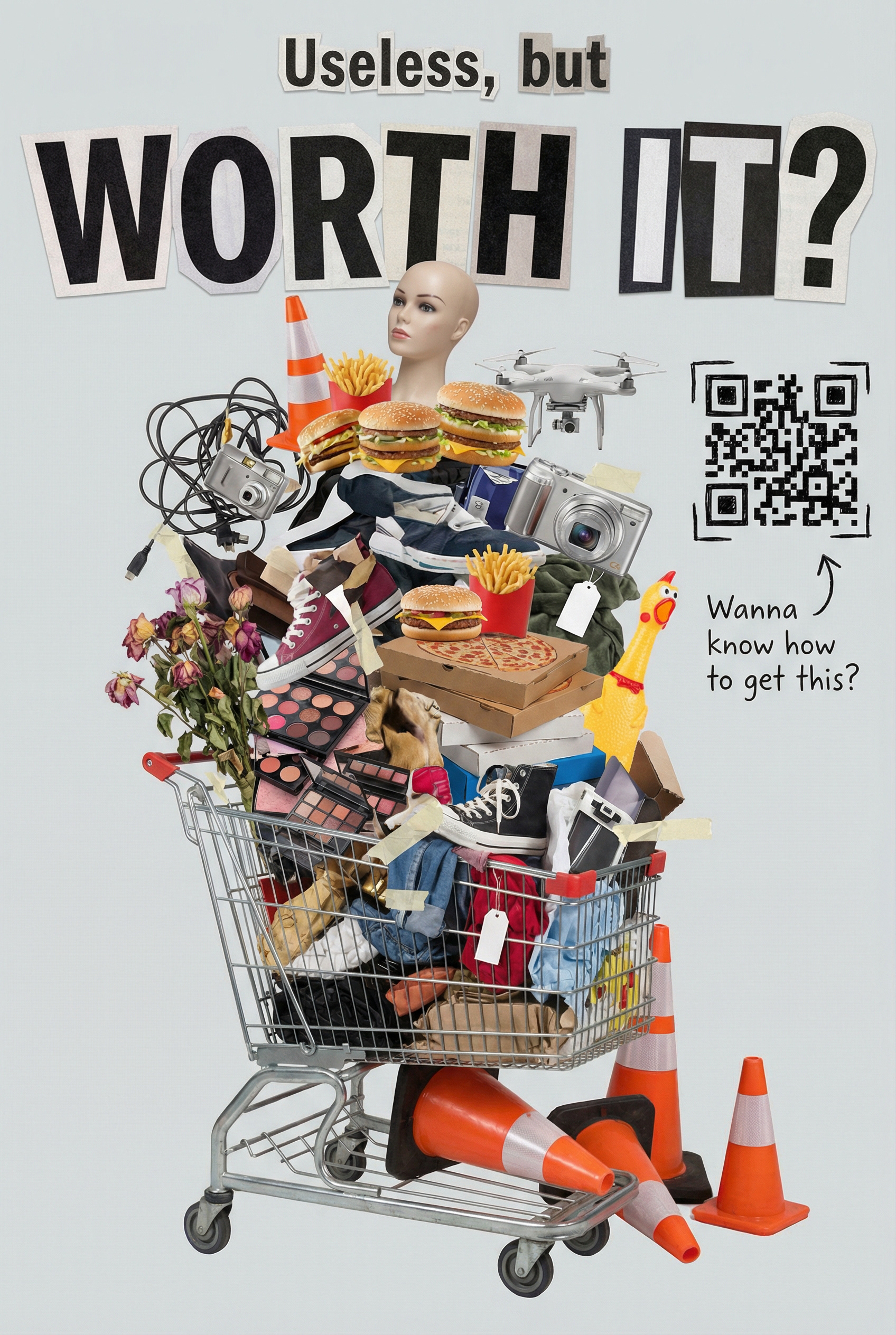
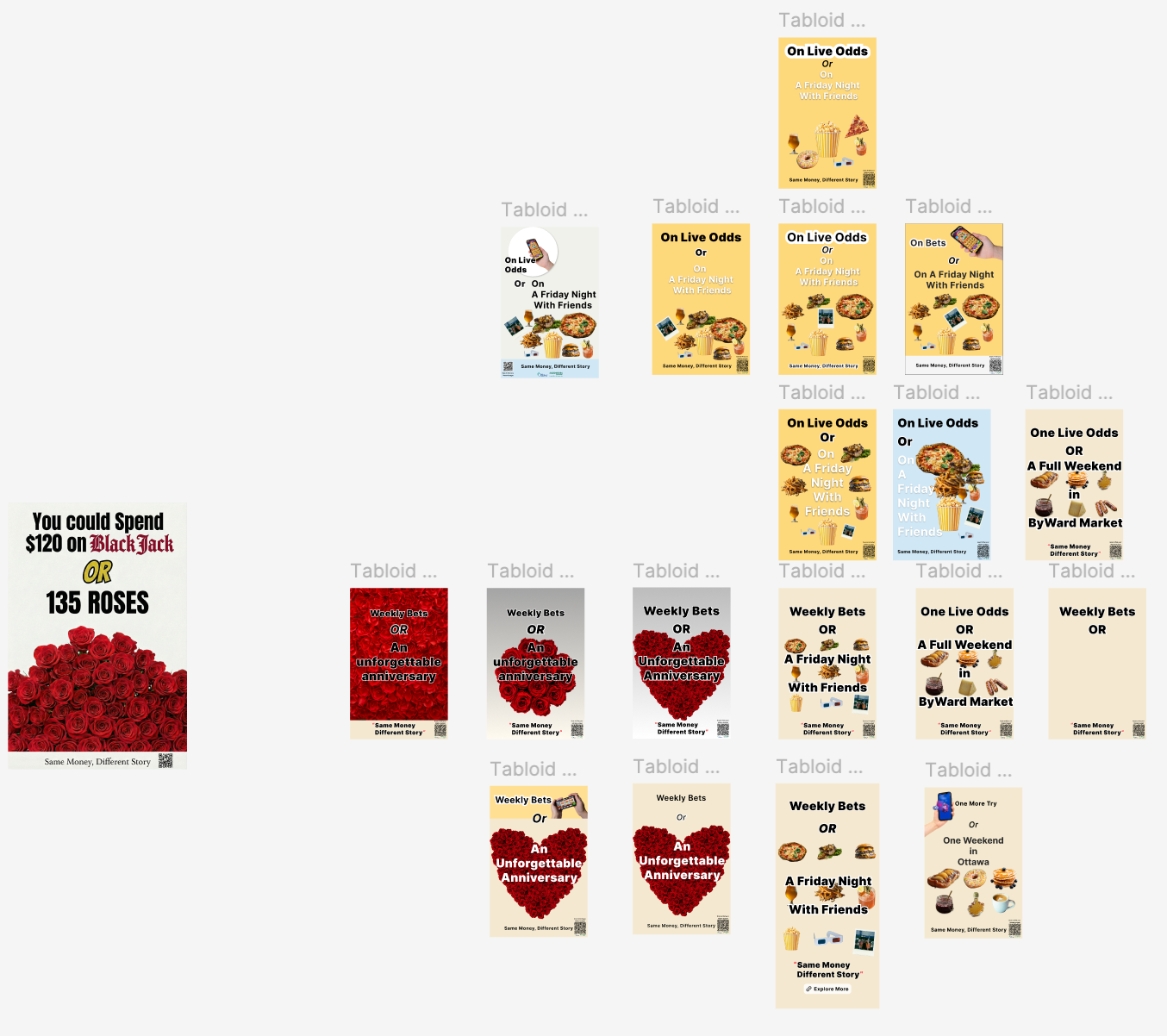
Early Sketches (Archived Directions)
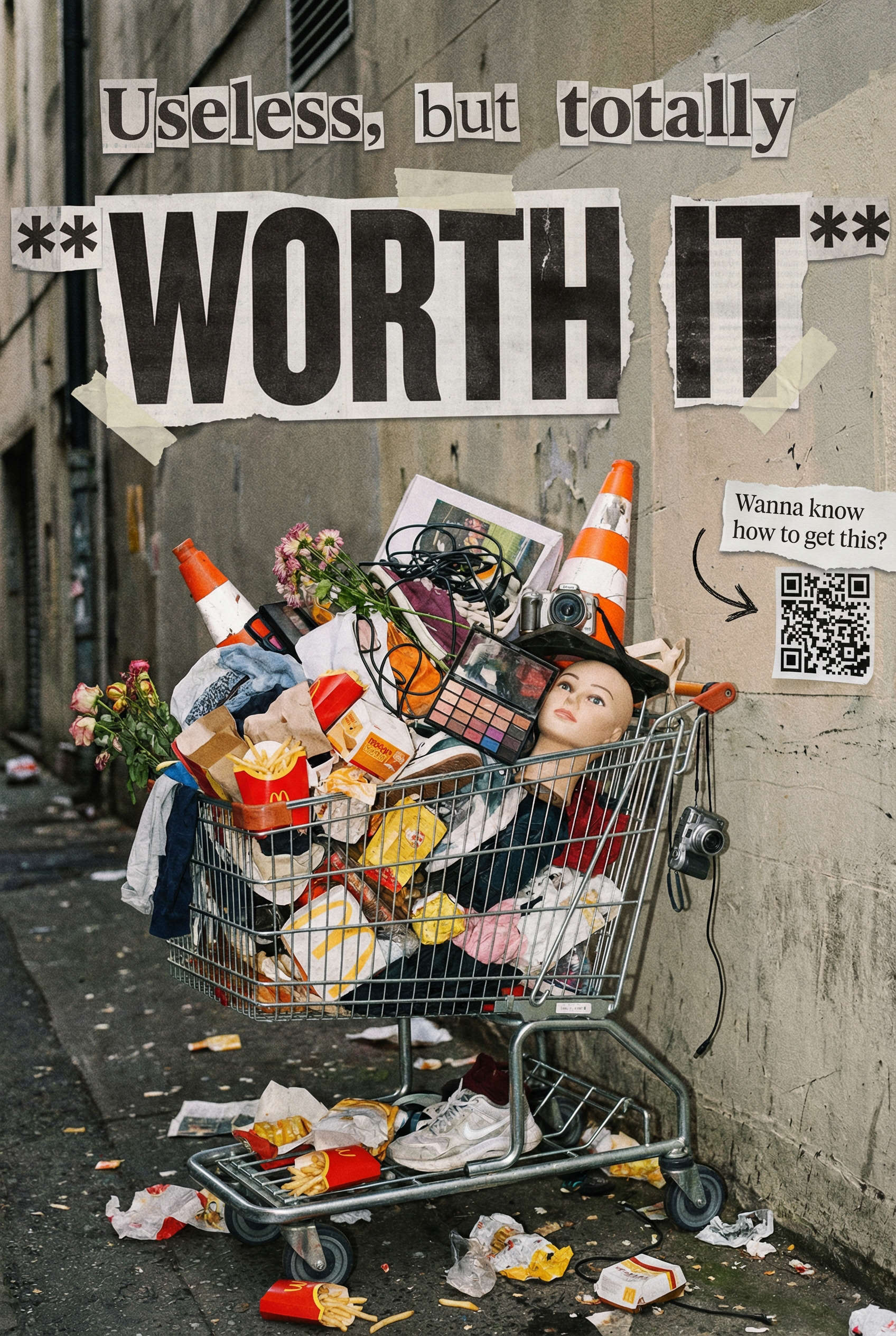
Early Sketches (Archived Directions)
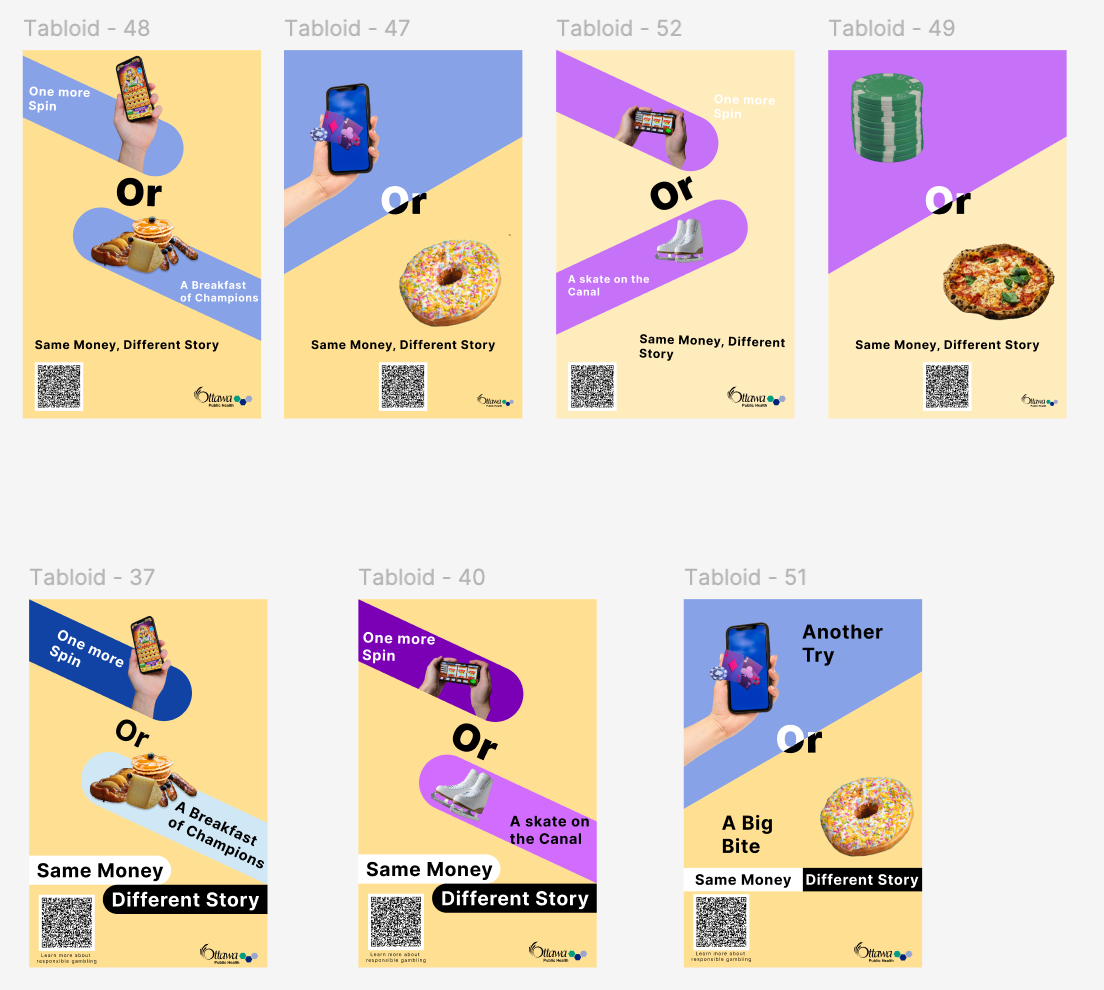
Early Sketches (Archived Directions)
Early Sketches (Archived Directions)
Early Sketches (Archived Directions)
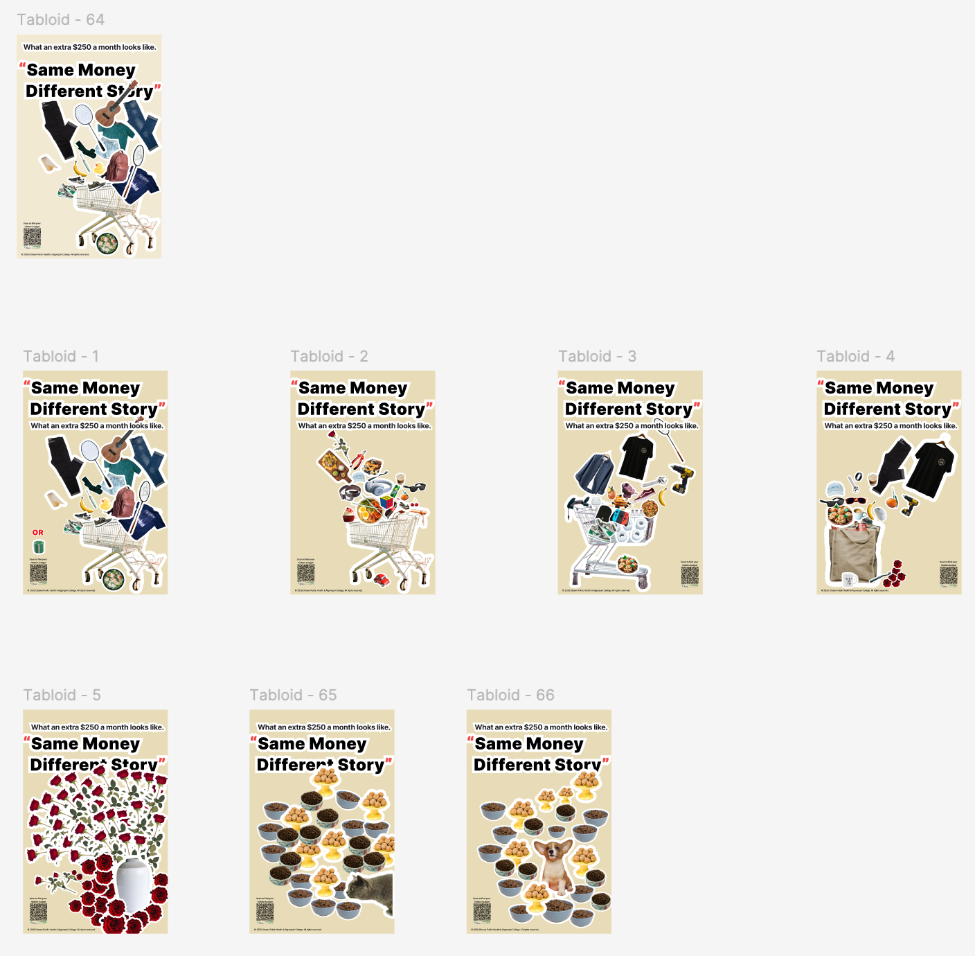
Early Sketches (Archived Directions)
Ottawa Talks: Studio Poster & Visual Identity
I designed this promotional and studio poster for Ottawa Talks (渥談會 / Chinese Voices in Canada), an independent interview show hosted by my youtuber friend Frank. The series documents personal stories and conversations with members of the Chinese community across Ottawa and Canada.
To anchor the show to the city, I chose Ottawa's most recognizable landmark: Parliament Hill and the Peace Tower. Instead of using a standard color photograph, I used Nano Banana to convert the architectural shot into a high-contrast, black-and-white ink print style. Removing photographic clutter gave the masonry an editorial, woodblock-print feel suited for thoughtful, long-form discussions.
The main design challenge was weaving the English title directly into the building. Rather than placing text as a flat overlay, I broke the red letterforms apart and layered them through the architecture: the letters of "Ottawa" weave in front of and behind the Peace Tower, while the elongated stem of the "T" in "Talks" drops through the stone facade. Interlocking the red letterforms with the monochrome stonework adds visual depth, making the show's name feel built into the landmark itself.
The Chinese title anchors the upper left, while the bottom section arranges the bilingual subheadings, host credit, and four platform icons (TikTok, YouTube, Bilibili, and Xiaohongshu). The finished design was printed, framed, and mounted on set as the physical backdrop for recorded interview episodes.
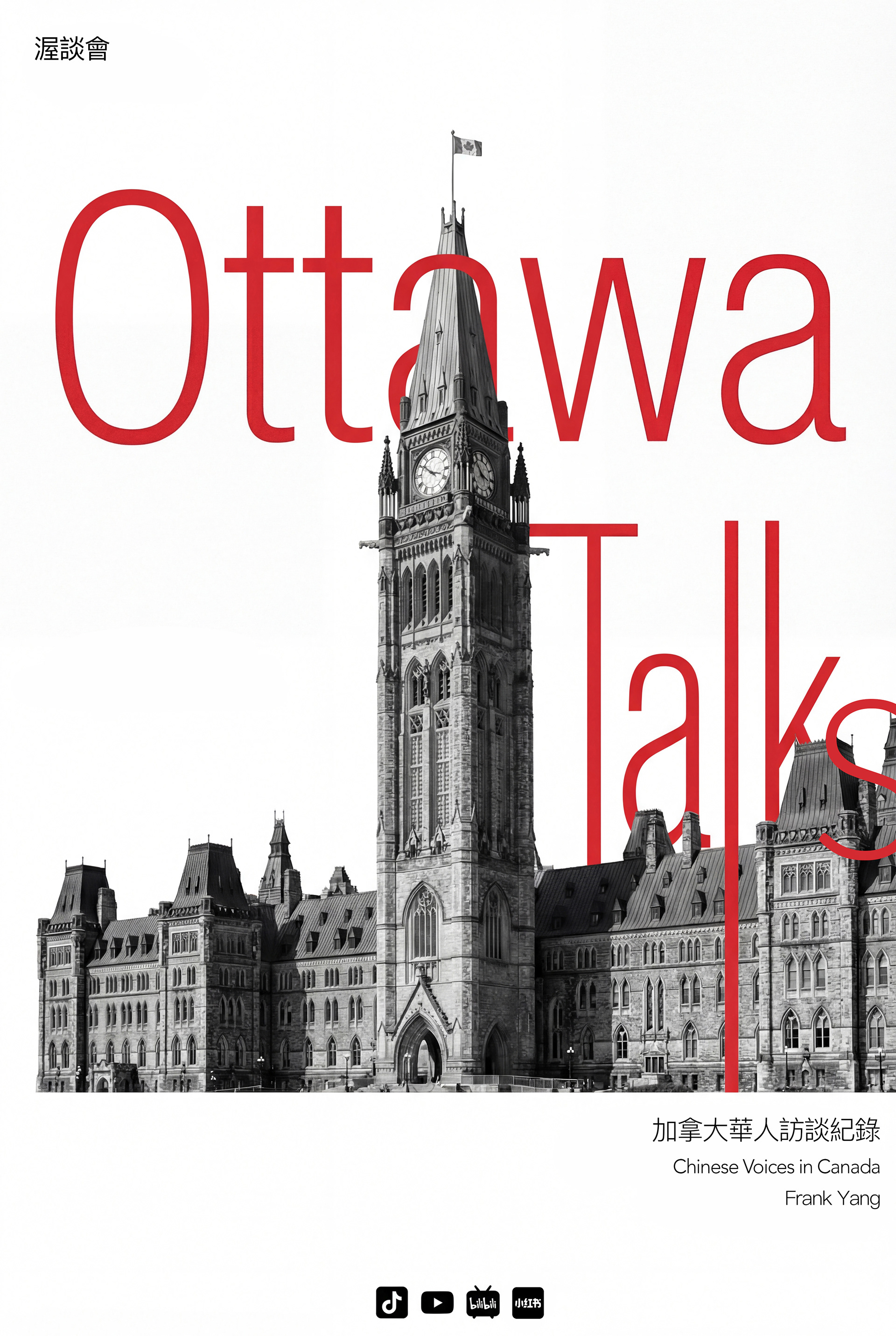
Final Poster Design
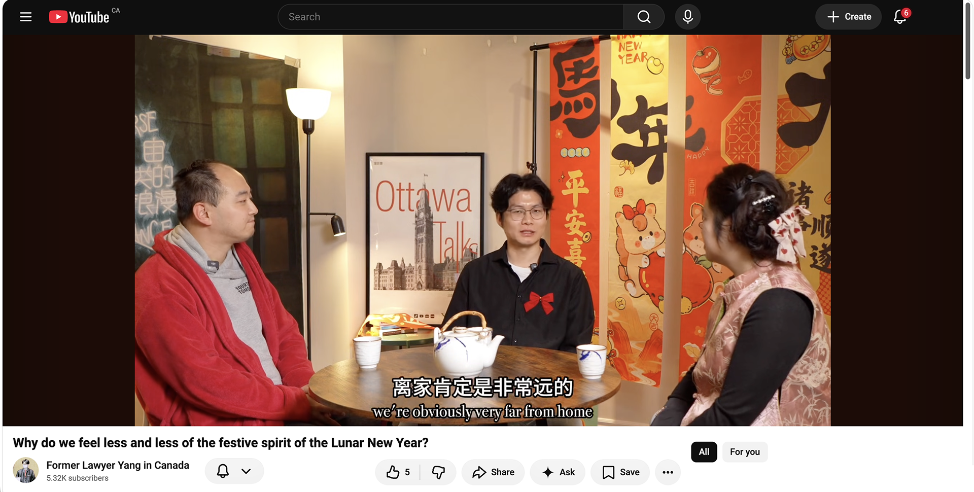
In-Studio Placement: The framed poster on set as an on-camera backdrop during a recorded episode of Ottawa Talks.
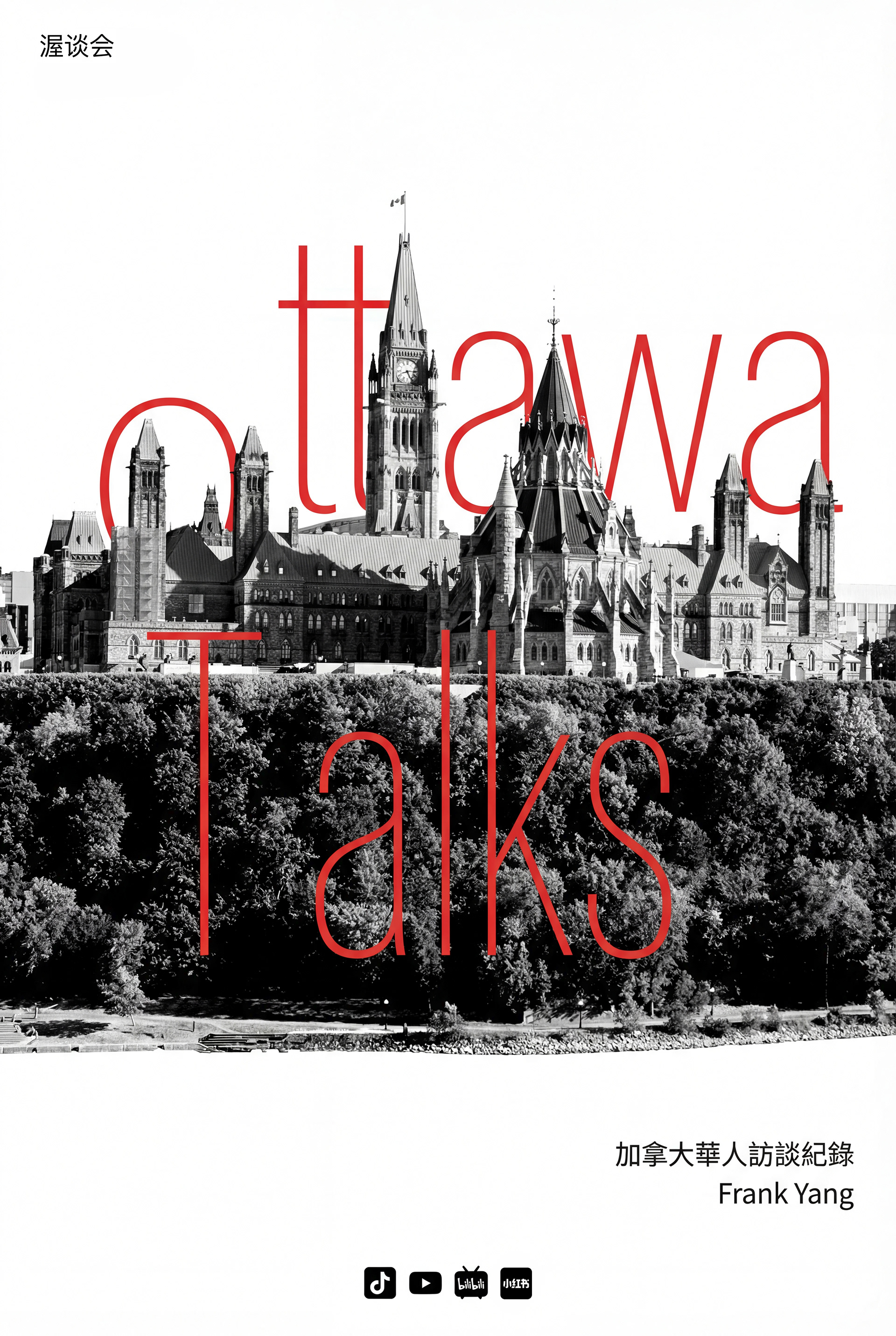
Early Concept
Mobius
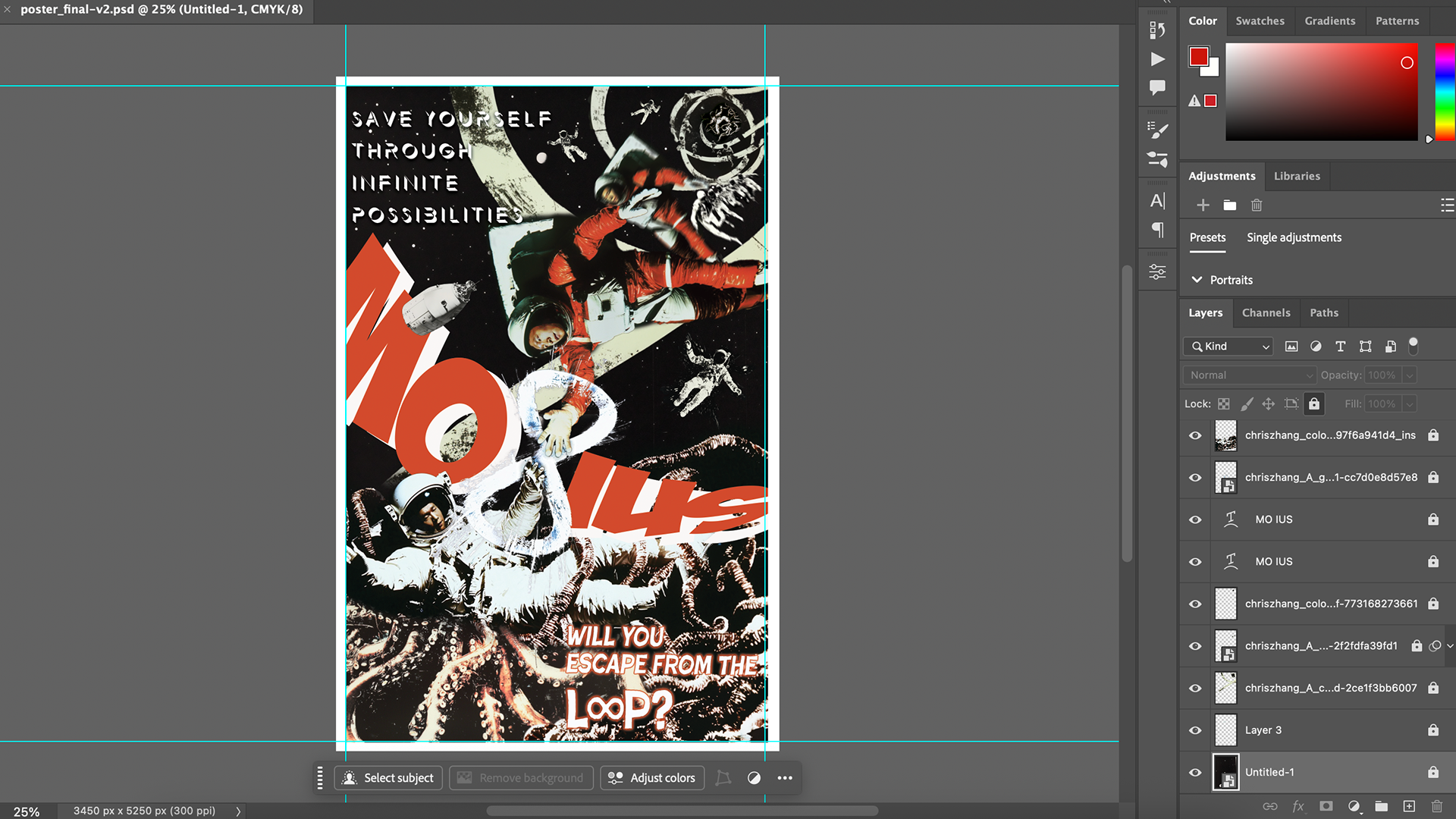
"Mobius" was my final project for the Level 1 Digital Graphic course. I spent more time on it than I would on a normal assignment because the idea was personal. That is why I chose to include it in my portfolio.
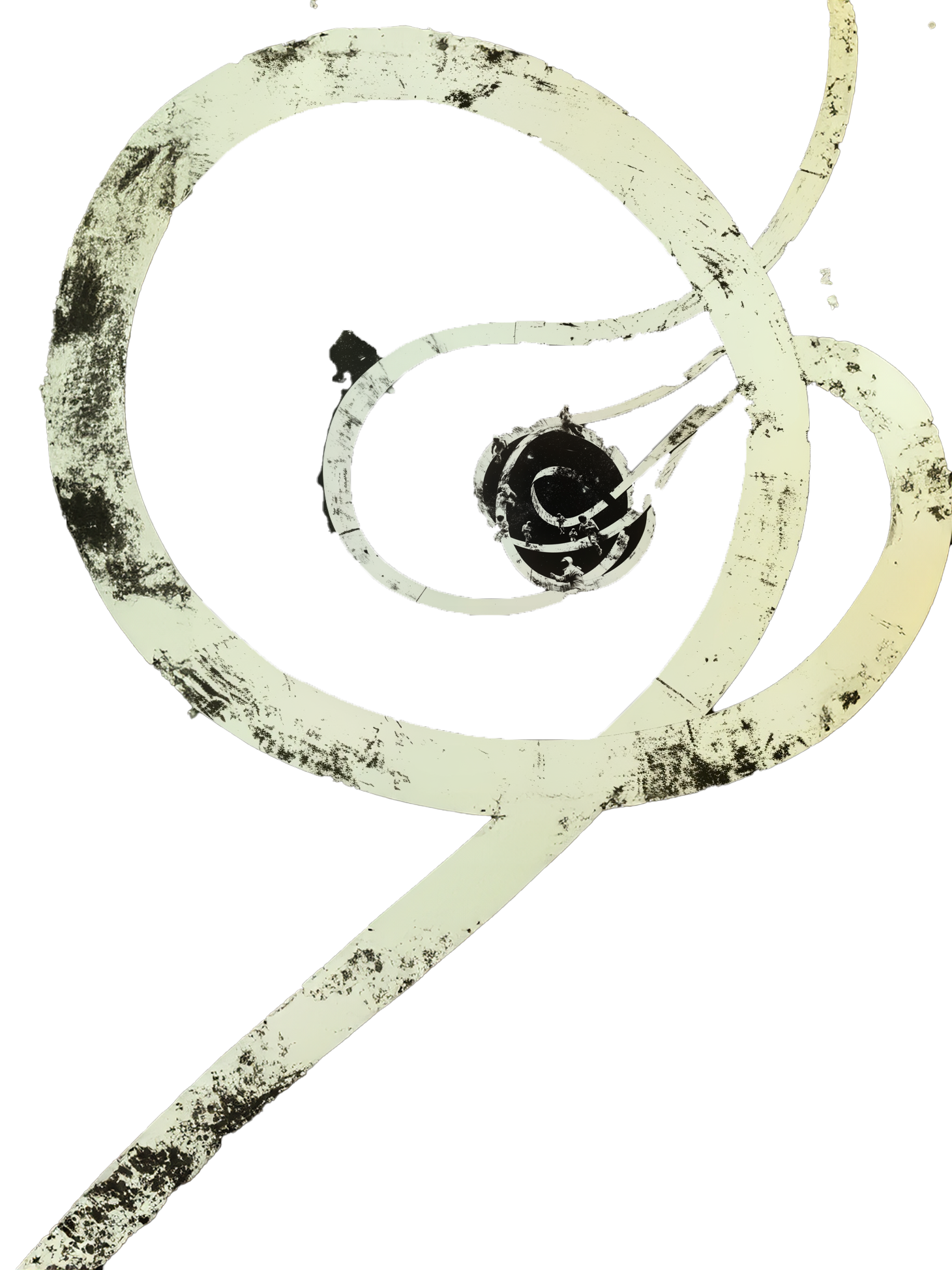
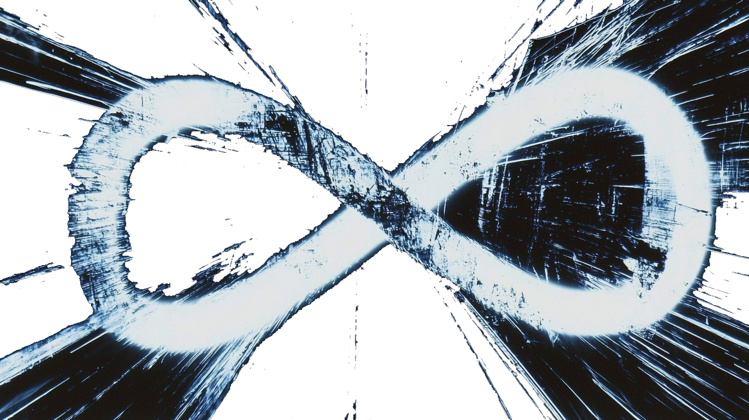
A Mobius strip forms a loop with no clear beginning or end. For me, the loop shows the fear of getting stuck in a life where every day feels the same. A few years ago, the pandemic, losing my job, and a painful breakup left me feeling that way. I had no clear direction. I often imagined myself as an astronaut trapped in a spaceship, living the same day again and again, like "Groundhog Day" in space.
My life did change in the end. New opportunities gave me a way to leave my old life and move to Canada for a fresh start.
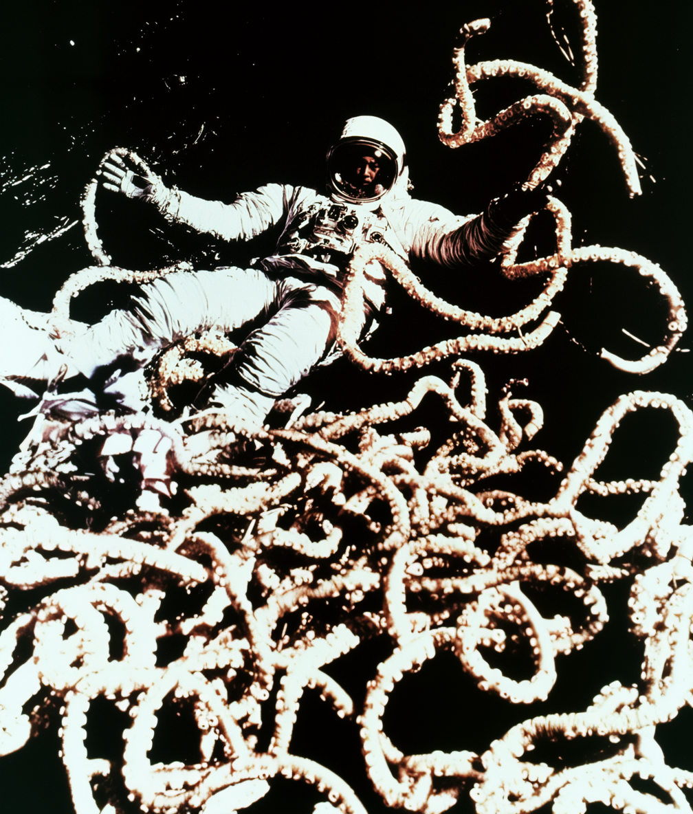
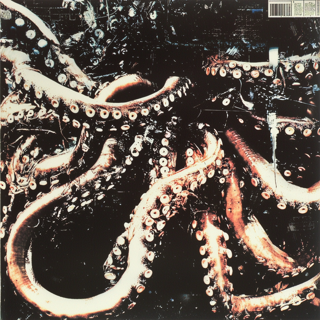
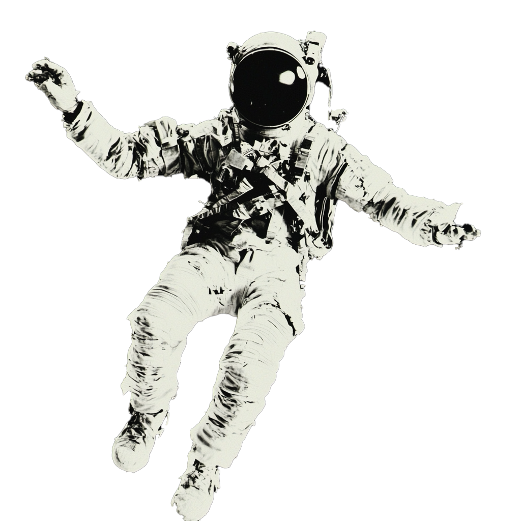
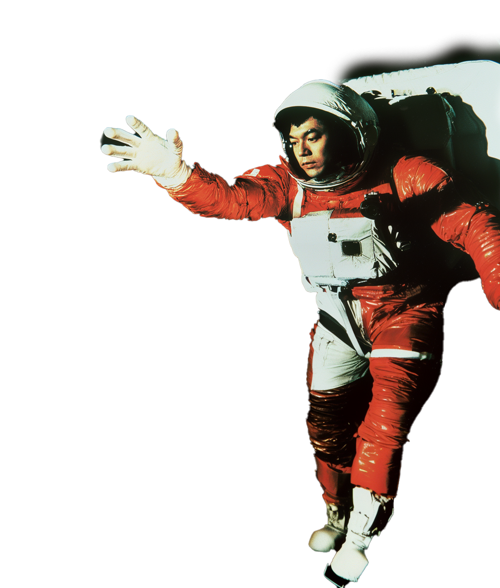
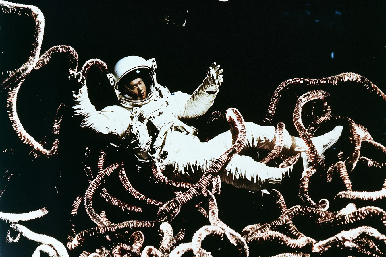
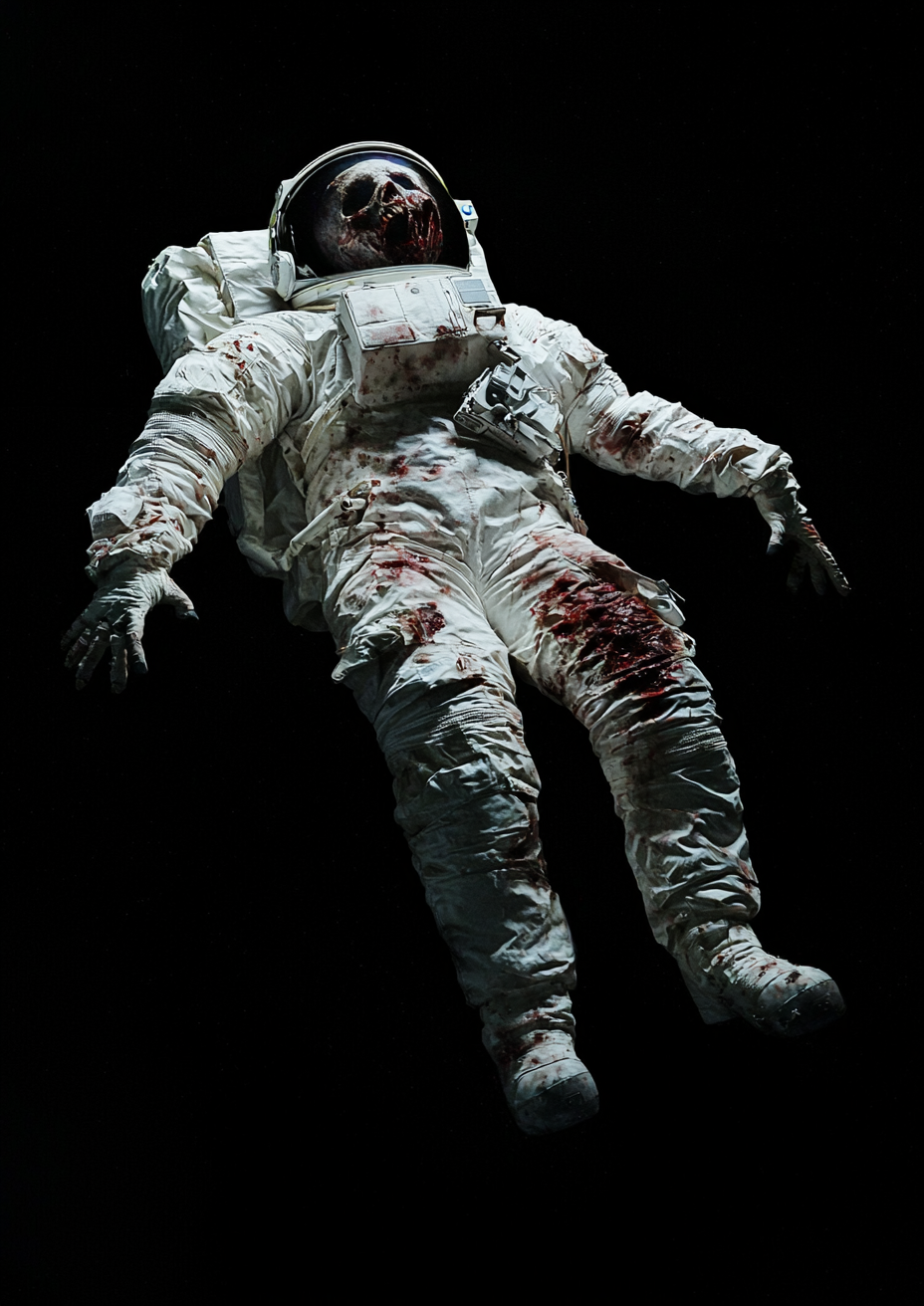
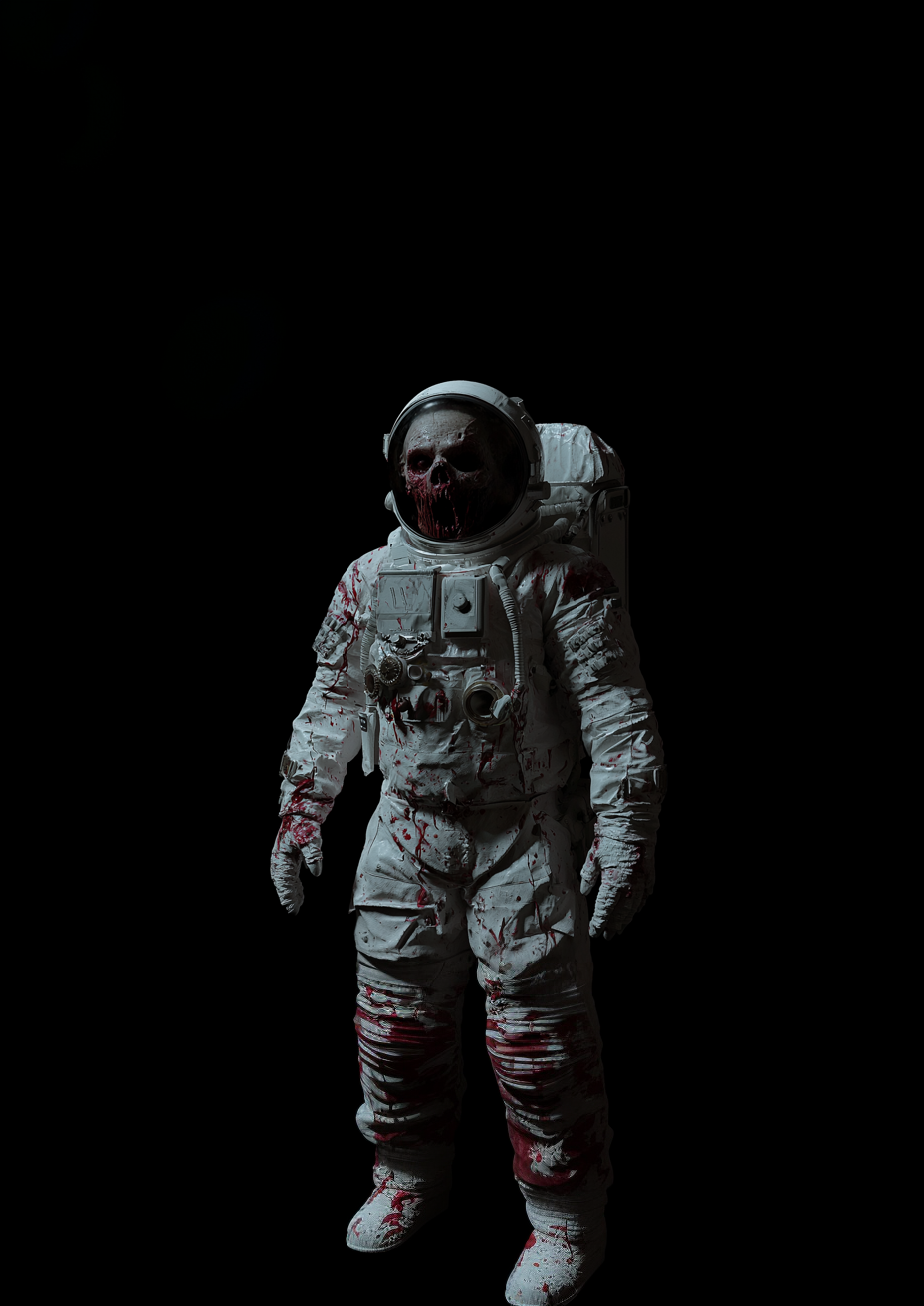
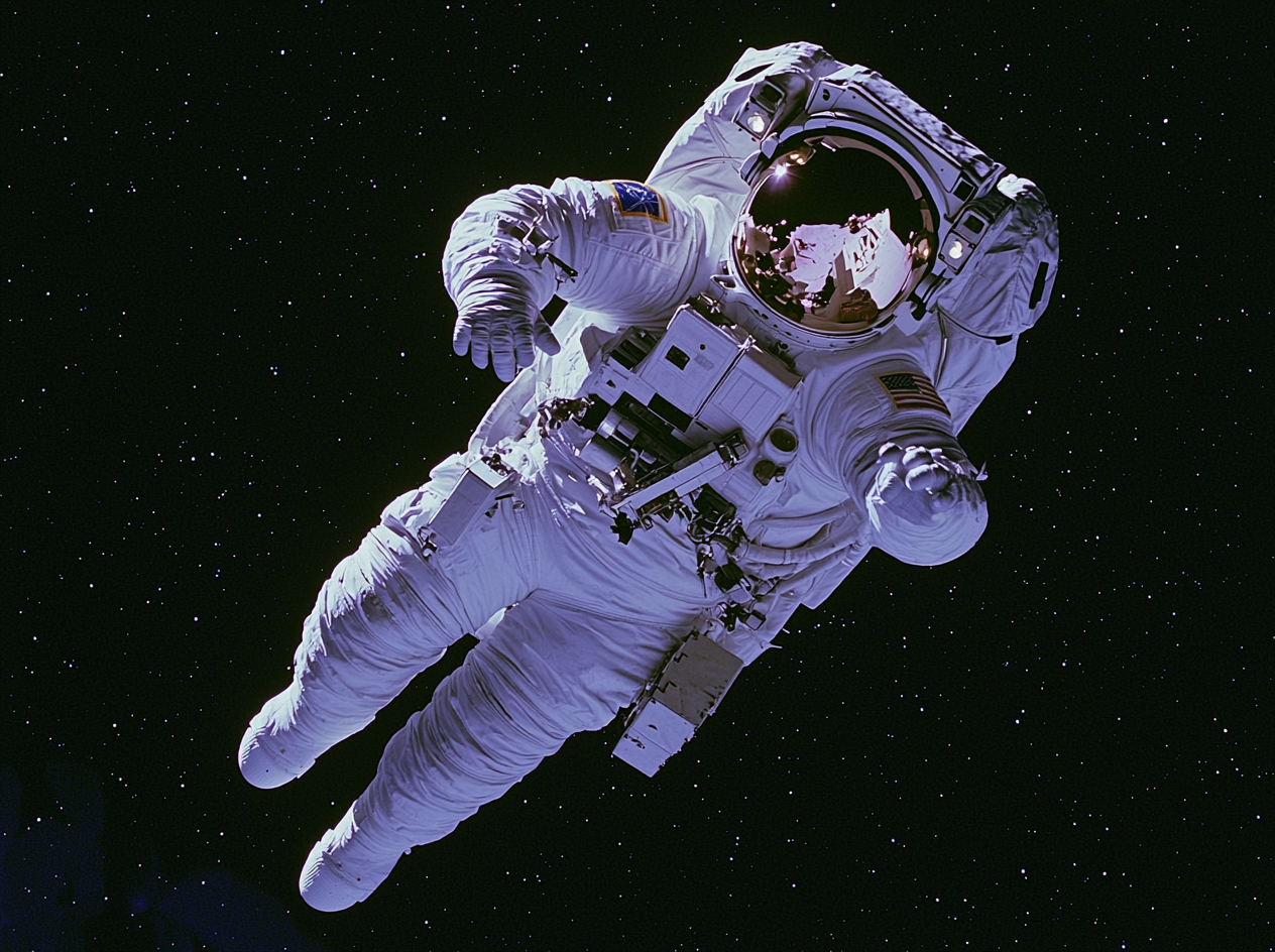
Both astronauts in the poster are versions of me, and I placed my face on each of them. One is caught in a mass of tentacles and pulled into darkness. He shows how hopeless I felt at the time. The other finds a way through the infinity symbol and reaches back to pull his past self out of the loop.
I generated all the elements with Midjourney, then arranged them in Photoshop across 27 layers. I based the look on movie posters from the 1970s and 1980s. The astronauts' poses refer to Michelangelo's "The Creation of Adam."
This project still means a lot to me. I printed a copy and hung it on my bedroom wall.
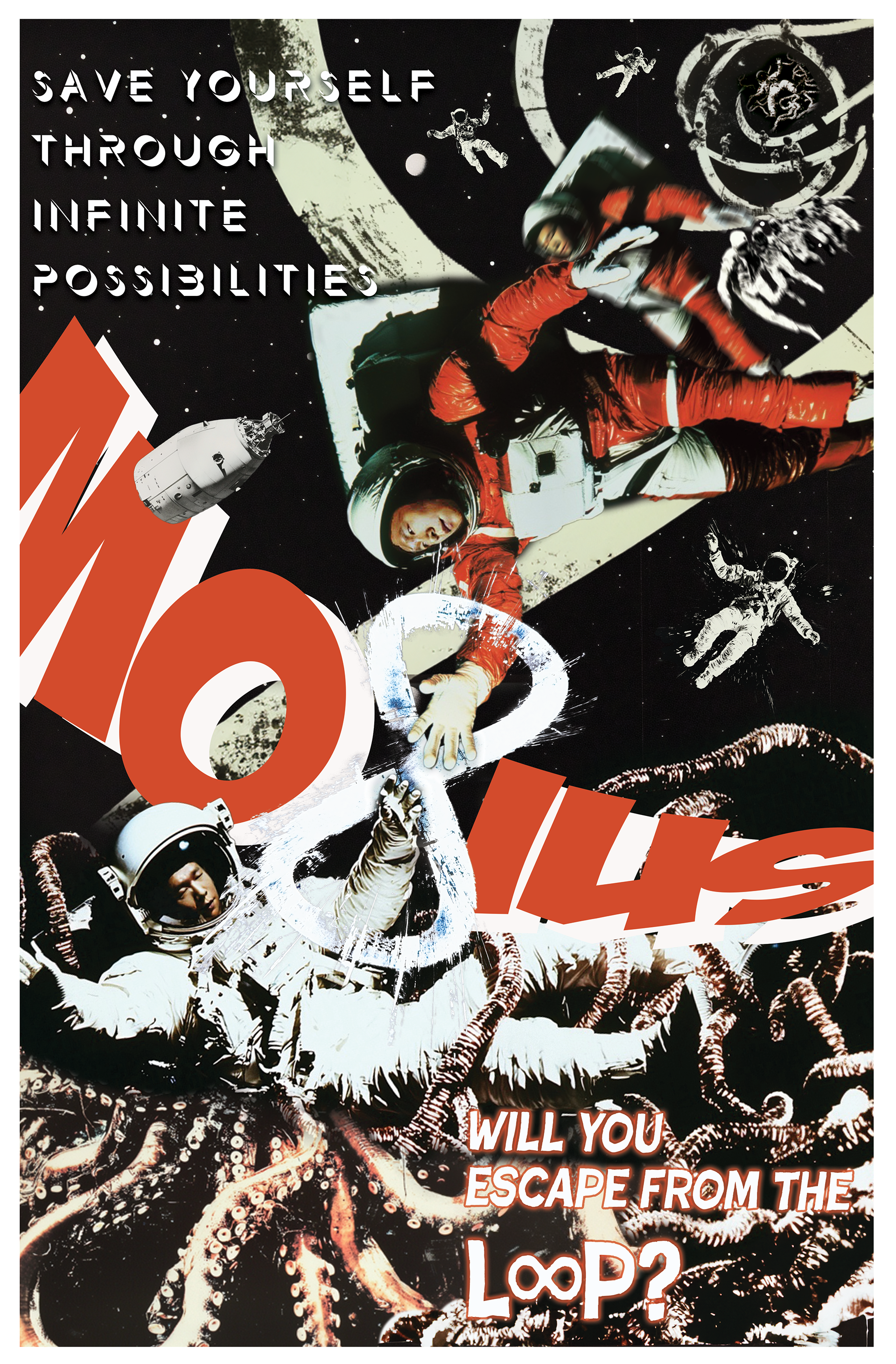

Sad Rock
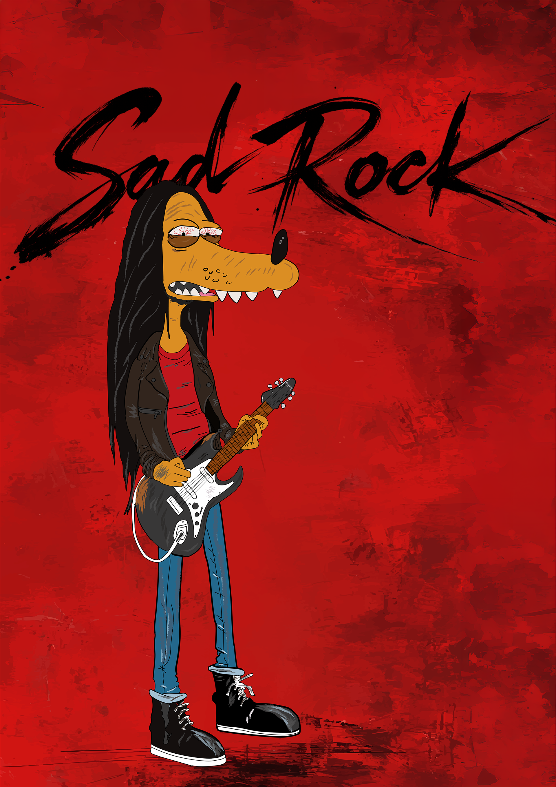
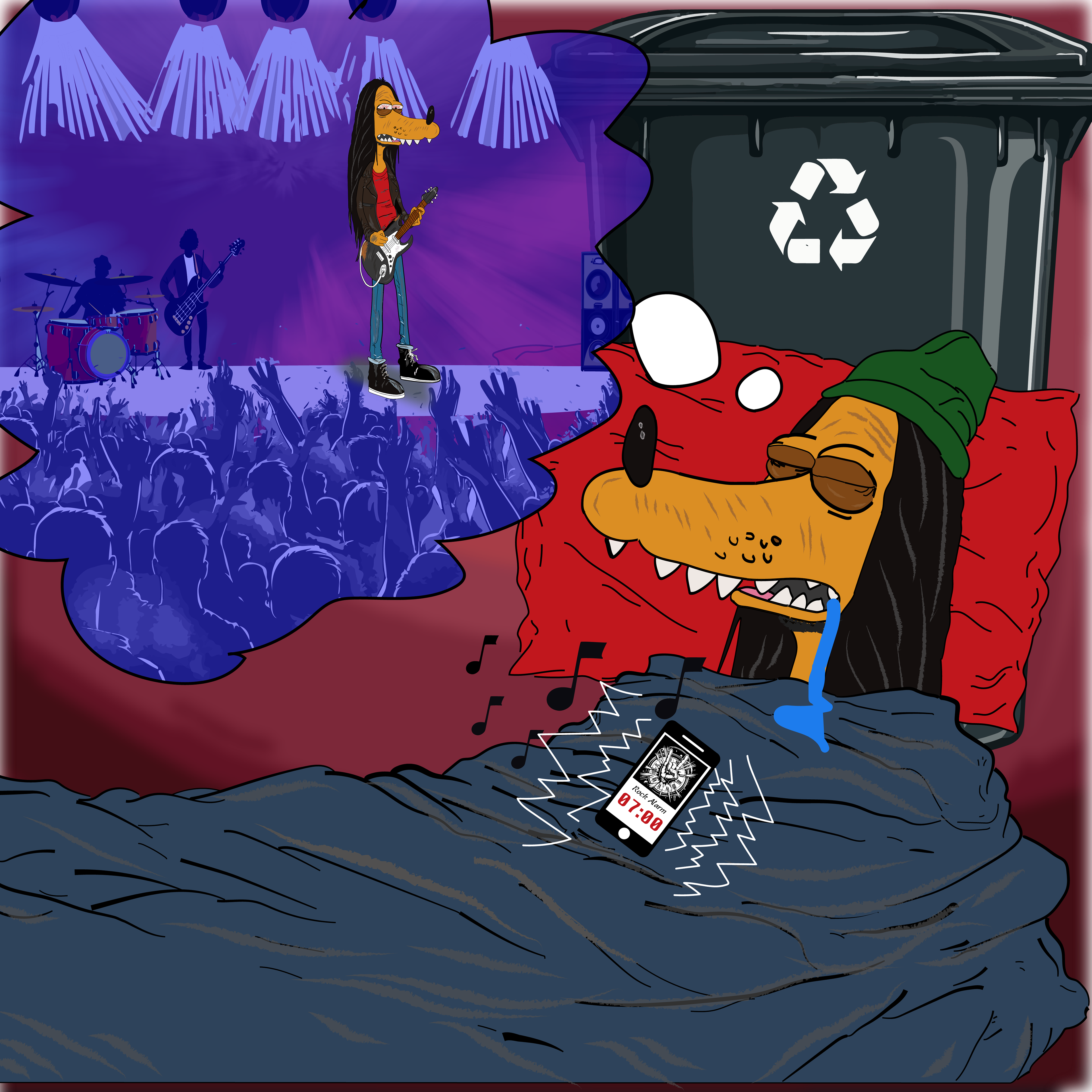
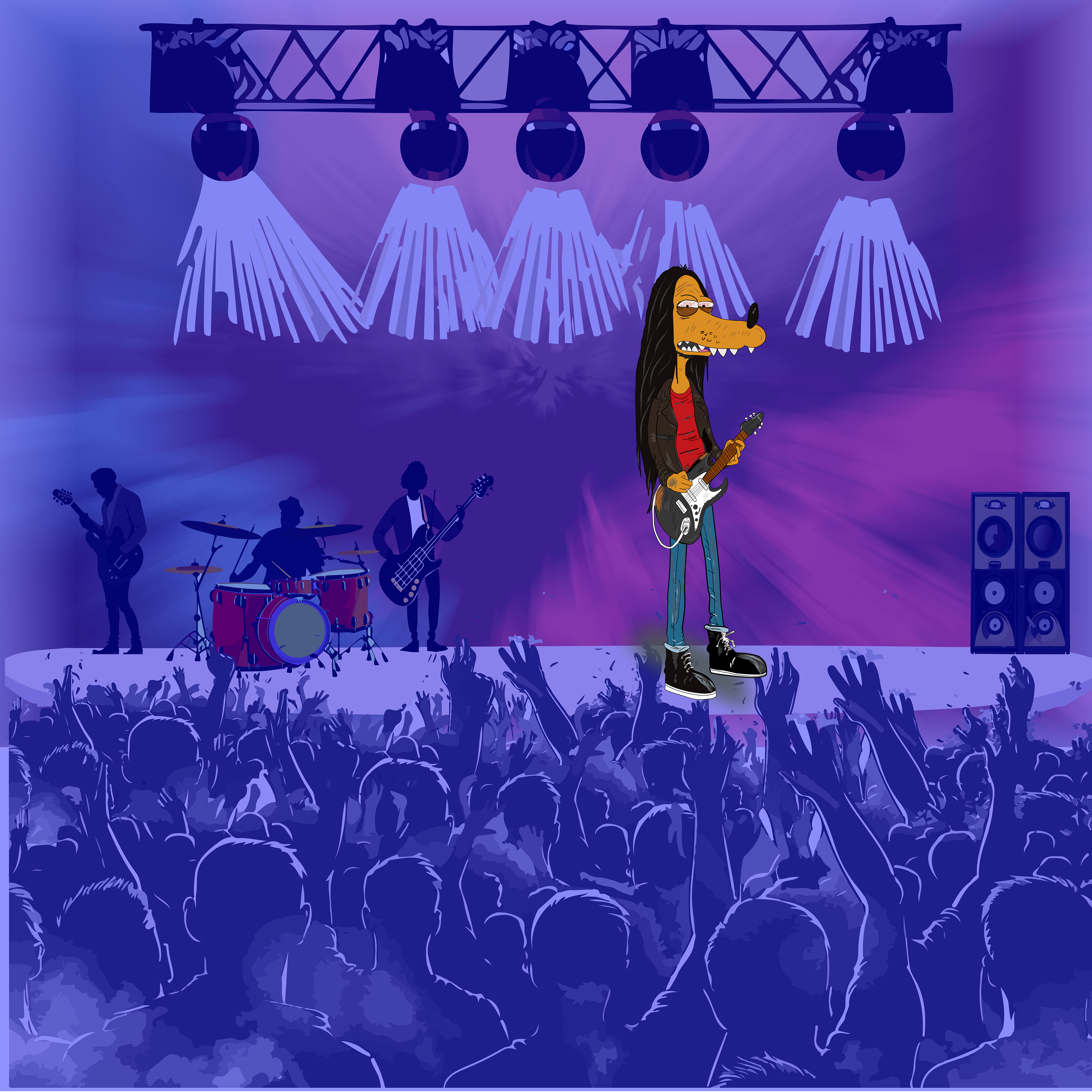
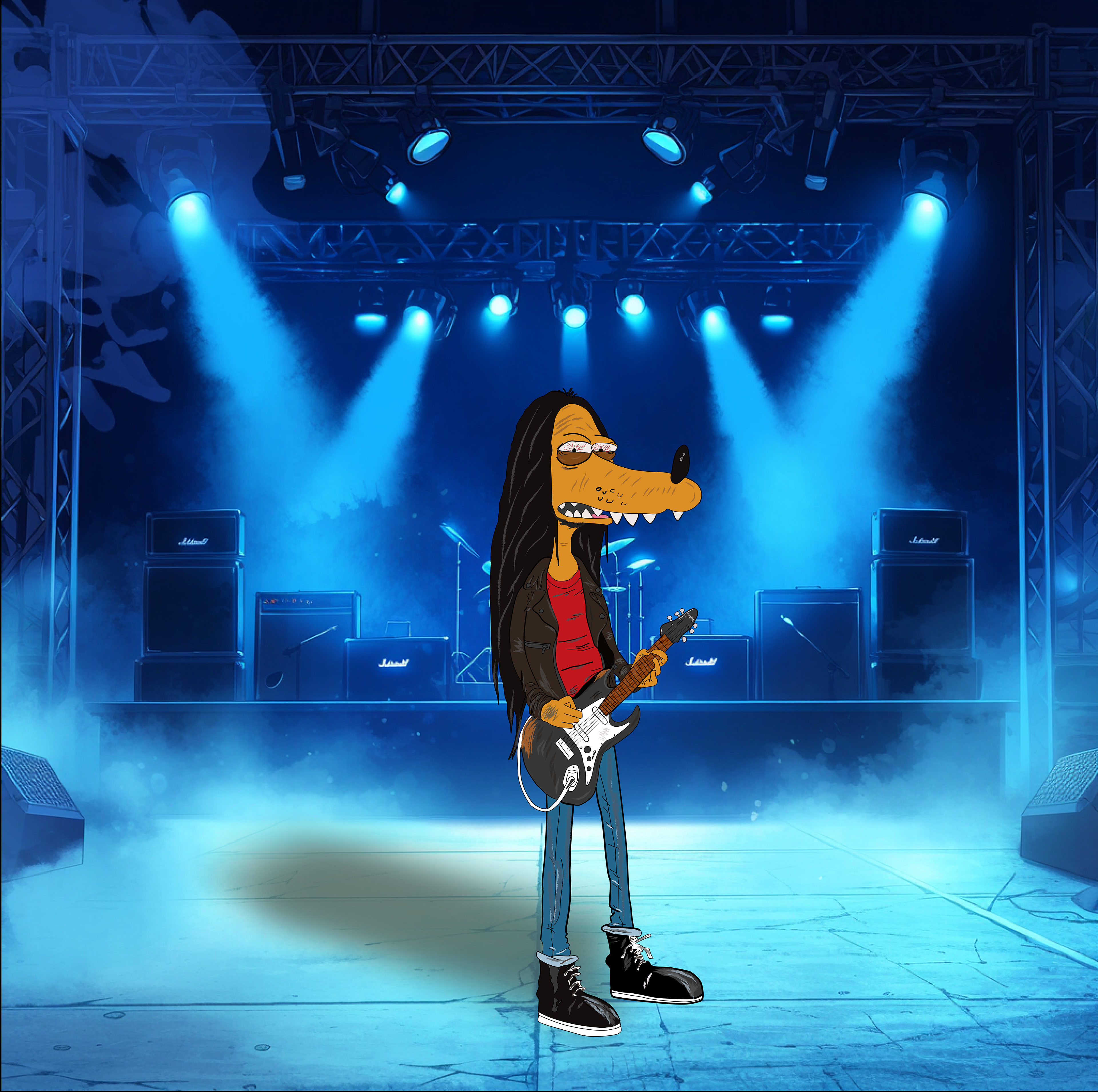
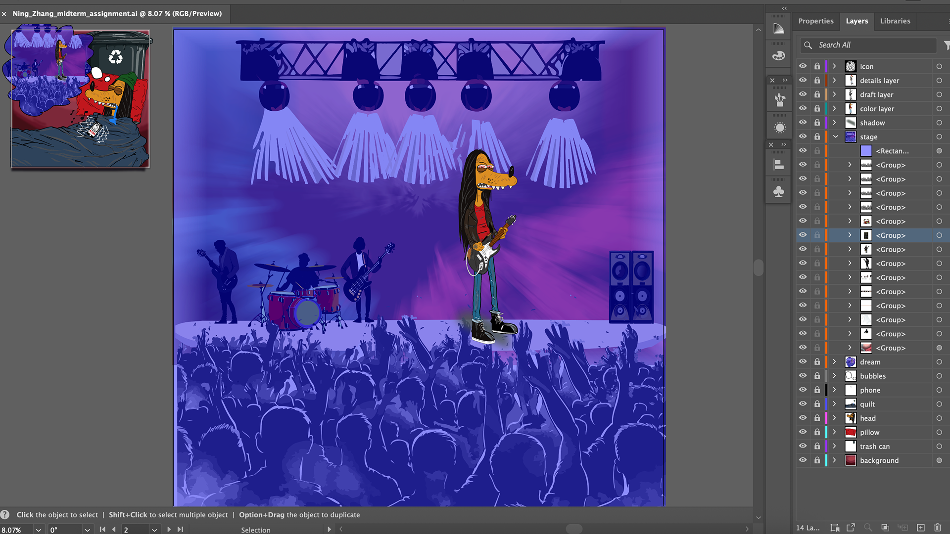
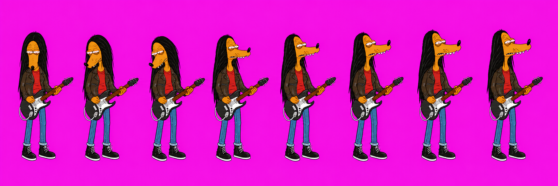
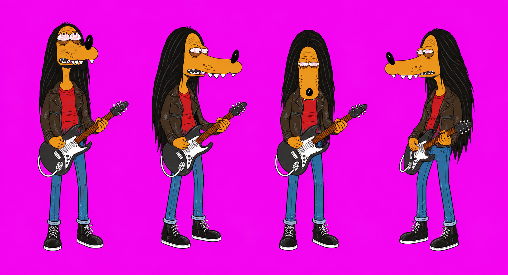
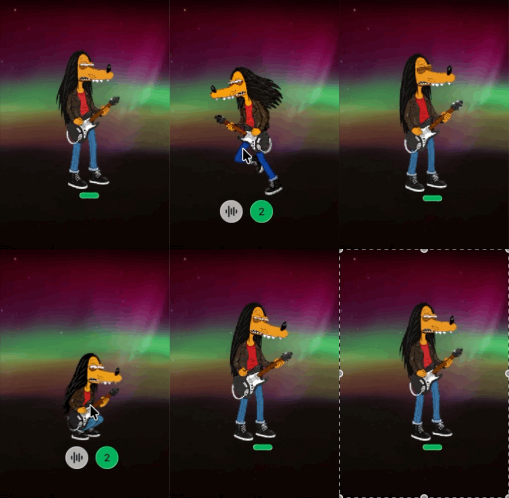
"Sad Rock" is a cartoon character I created. Its look was influenced by "The Simpsons" and the work of Peng Lei, my favorite Chinese artist and rock star. I drew the character in Adobe Illustrator and made parts of the background with Midjourney and Illustrator's AI tools.
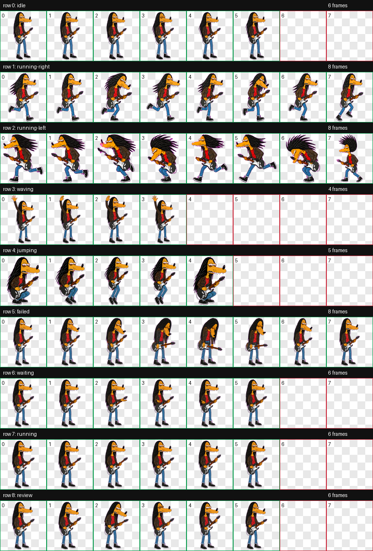
I recently used Codex's custom pet feature to turn Sad Rock into a Codex Pet. Now it moves around, plays guitar, and keeps me company while I vibe code.
There is something really fun about seeing a character I drew back then come alive inside my coding workspace. It makes the whole experience feel a little more personal.
There is something really fun about seeing a character I drew back then come alive inside my coding workspace. It makes the whole experience feel a little more personal.