Graphic · 2 min read
Wild Grass Folk Fest
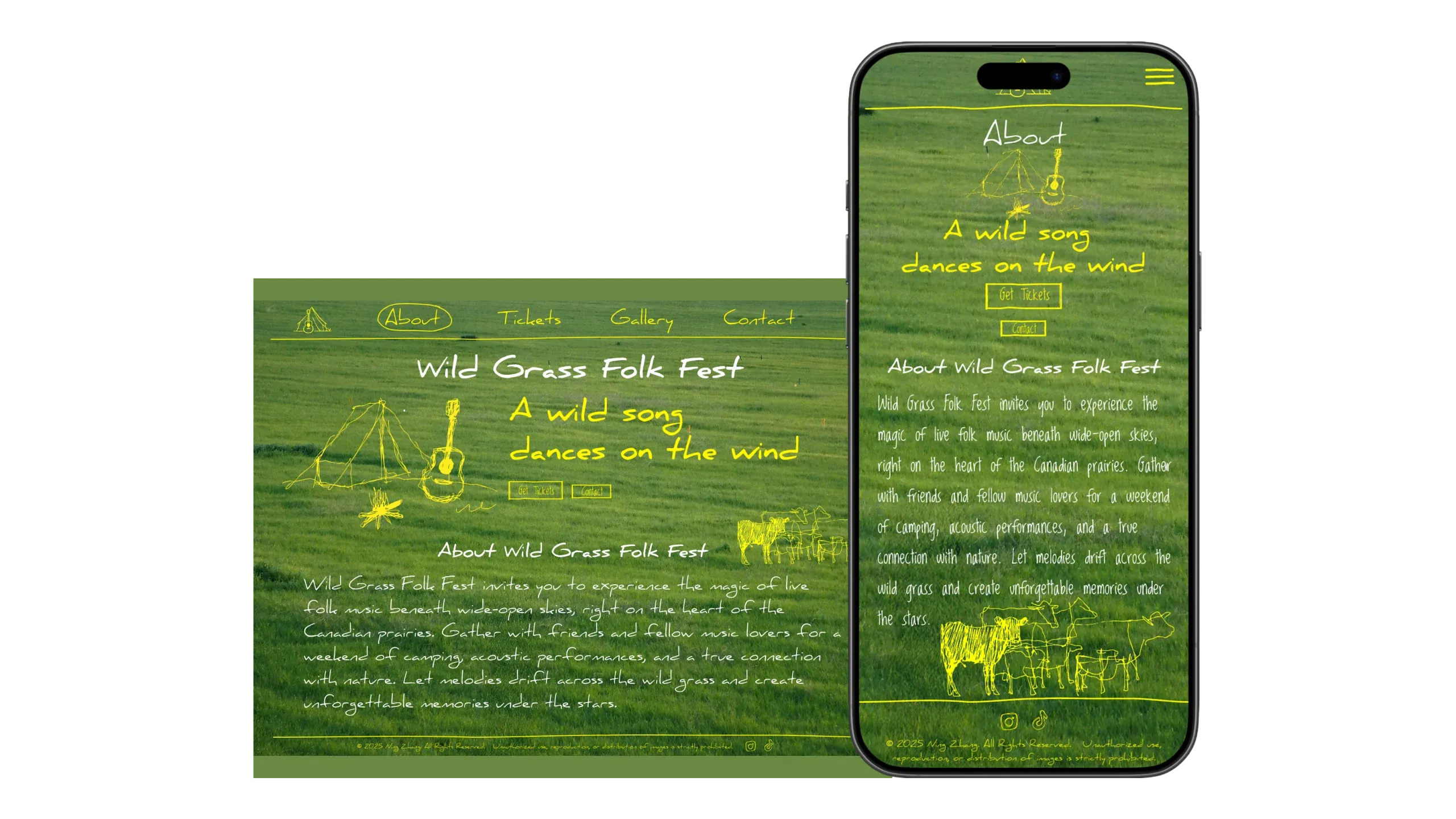
A three-day experiment in designing a festival website like a summer event poster, drawn in one yellow line.
- Role
- Designer
- Timeline
- May 30 to June 1, 2025
- Platform
- Desktop and mobile web
- Tools
- Figma, Midjourney, Photoshop, Illustrator
- Status
- Figma prototype; not built
- 3 daysfrom the first sketch to both prototypes
- 5hand-drawn style sketches generated with Midjourney (Case 1)
- 4sections on the site, About, Tickets, Gallery and Contact (Case 2)
TL;DR
- Problem
- Event posters work at a glance. I wanted to see whether a website could feel like an interactive poster and still be easy to use.
- Solution
- A site for a fictional folk festival on the Canadian prairies, with a grass field filling the screen and the logo, drawings and interface all drawn in one yellow line.
- Result
- Desktop and mobile prototypes in Figma, made in three days. The site was not built.
Wild Grass Folk Fest is a three-day experiment from spring 2025: a website for a fictional folk festival on the Canadian prairies, designed to look like a summer event poster. A grass field fills the screen, and a yellow line in a hand-drawn style carries the logo, the drawings and the interface. I finished it as a desktop and a mobile prototype in Figma.
Context
Event posters work at a glance. I wanted to know whether a website could work like an interactive poster and still be easy to use.
I started from warm, sunlit festival photos, handwriting and the posters themselves. The festival invites people to a weekend of camping and acoustic music under open skies. The site has four sections: About, Tickets, Gallery and Contact.
Case 1 · One yellow line ties the drawings to the interface
- Options
- Use the Midjourney sketches as they came out; turn them into vectors and draw the interface in the same line
- Trade-off
- The generated sketches were black lines on white. On a green photo they needed a new colour, and the menus and buttons needed to look drawn by the same hand.
- Decision
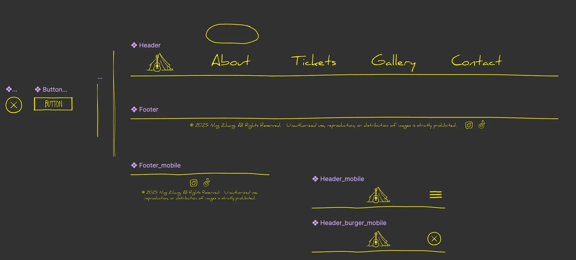
- Turn the sketches into vectors in Illustrator, colour them yellow, and draw the navigation, buttons and dividers in the same rough line.
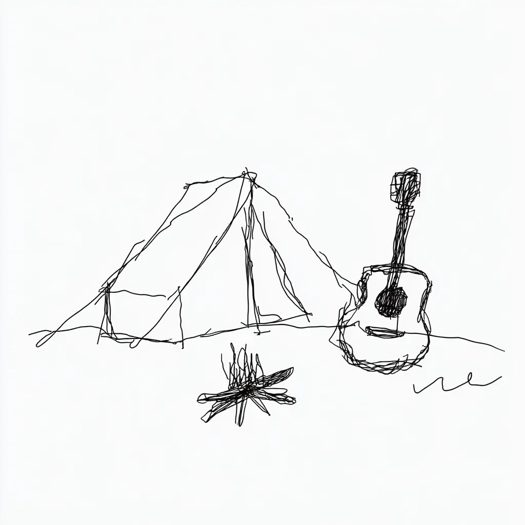
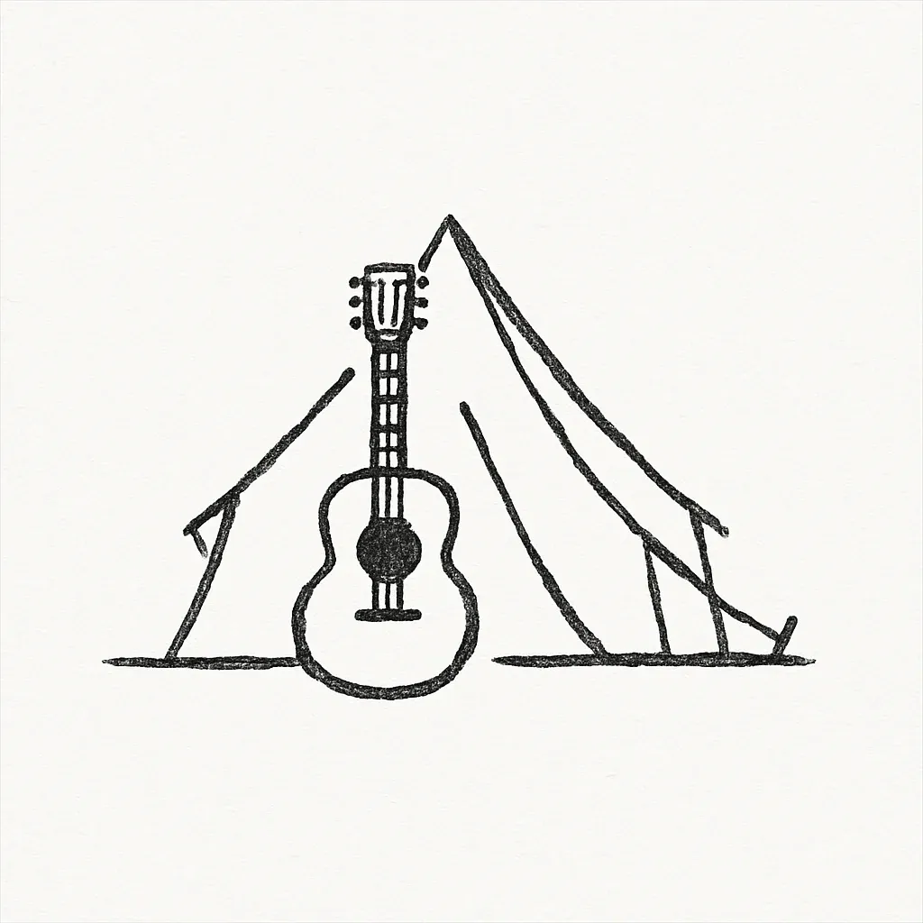
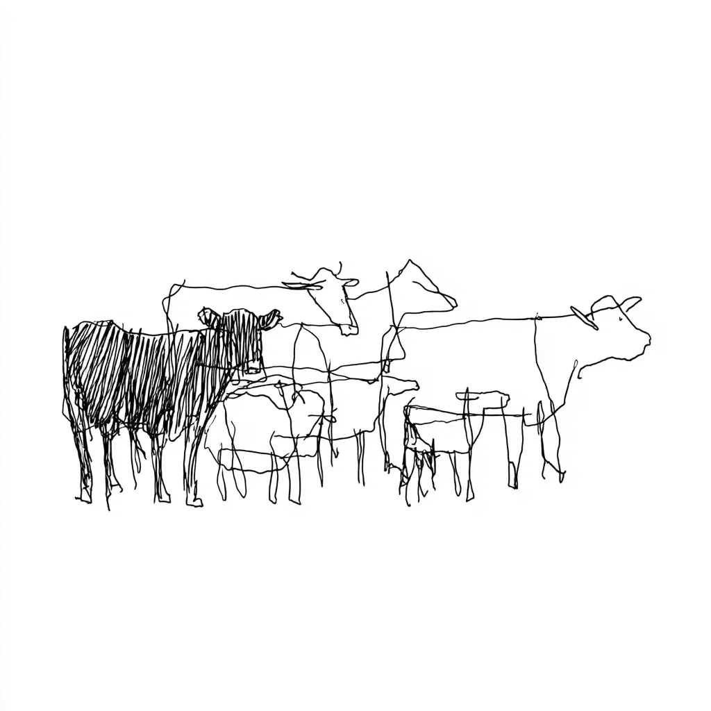
I generated the illustrations with Midjourney in a loose, hand-drawn style: a tent with a guitar and a campfire, a herd of cows, horses and sheep, a row of festival tents. Then I refined them into vector graphics in Illustrator. The logo, a guitar standing in a tent, started in Midjourney and ChatGPT-4o.
Midjourney sketch
In the site
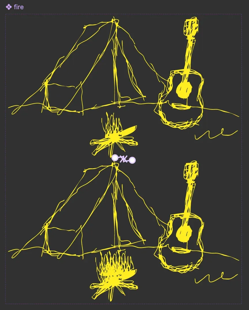
The same line runs through the interface. A loose circle marks the current page in the menu, the buttons are rough rectangles, and a hand-drawn rule closes off the header and the footer. Headings and body text are set in handwritten fonts.
Case 2 · The site stays as sparse as a poster
- Options
- A full festival site with line-up, schedule and maps; a short site with four sections and large visuals
- Trade-off
- A site full of features would bury the photo and the drawings that make it feel like a poster.
- Decision
- Keep four sections and short text over a full-screen photo, and order the information the way a poster would.
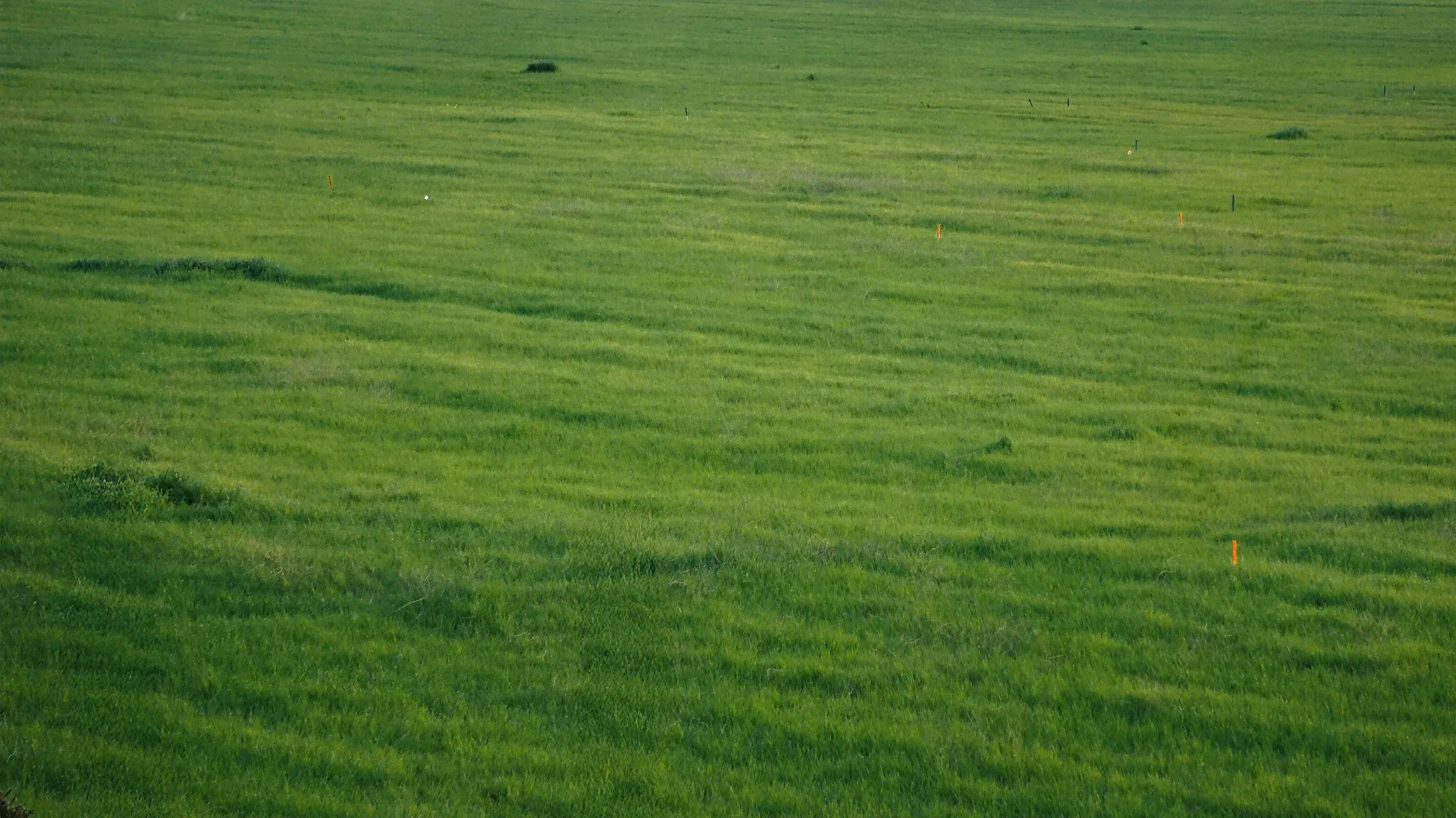
The background is a photo of a grass field from Unsplash, which I retouched in Photoshop. It fills the homepage, and the rest sits on top of it: the festival name, the slogan “A wild song dances on the wind,” two buttons and a short paragraph about the weekend.
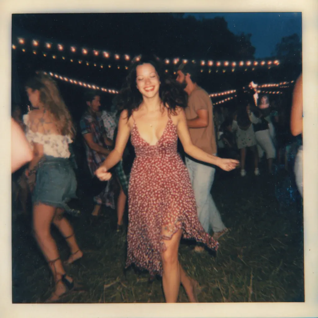
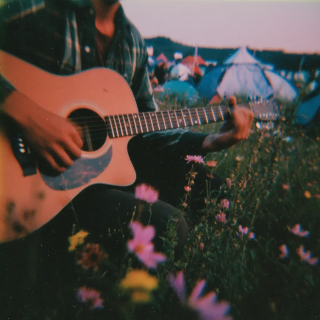
The festival does not exist, so there was nothing to photograph for the gallery. I made film-style photos of the event with Midjourney instead, in the same warm tones as the field.
How I built it
I worked alone from May 30 to June 1, 2025. Midjourney made the sketches, the gallery photos and, with ChatGPT-4o, the logo. I turned the sketches into vectors in Illustrator, retouched the background in Photoshop, and built the layout, components and animation in Figma.
Outcome
The project ended as two Figma prototypes, one for desktop and one for mobile. I did not build the site, so there is no usage data.
Reflection
The Midjourney sketches gave me a fast start, and the time in Illustrator made them belong to the site. Once the drawings were vectors, I could give them one colour and match the menus and buttons to them.