Graphic · 8 min read
Same Money, Different Story
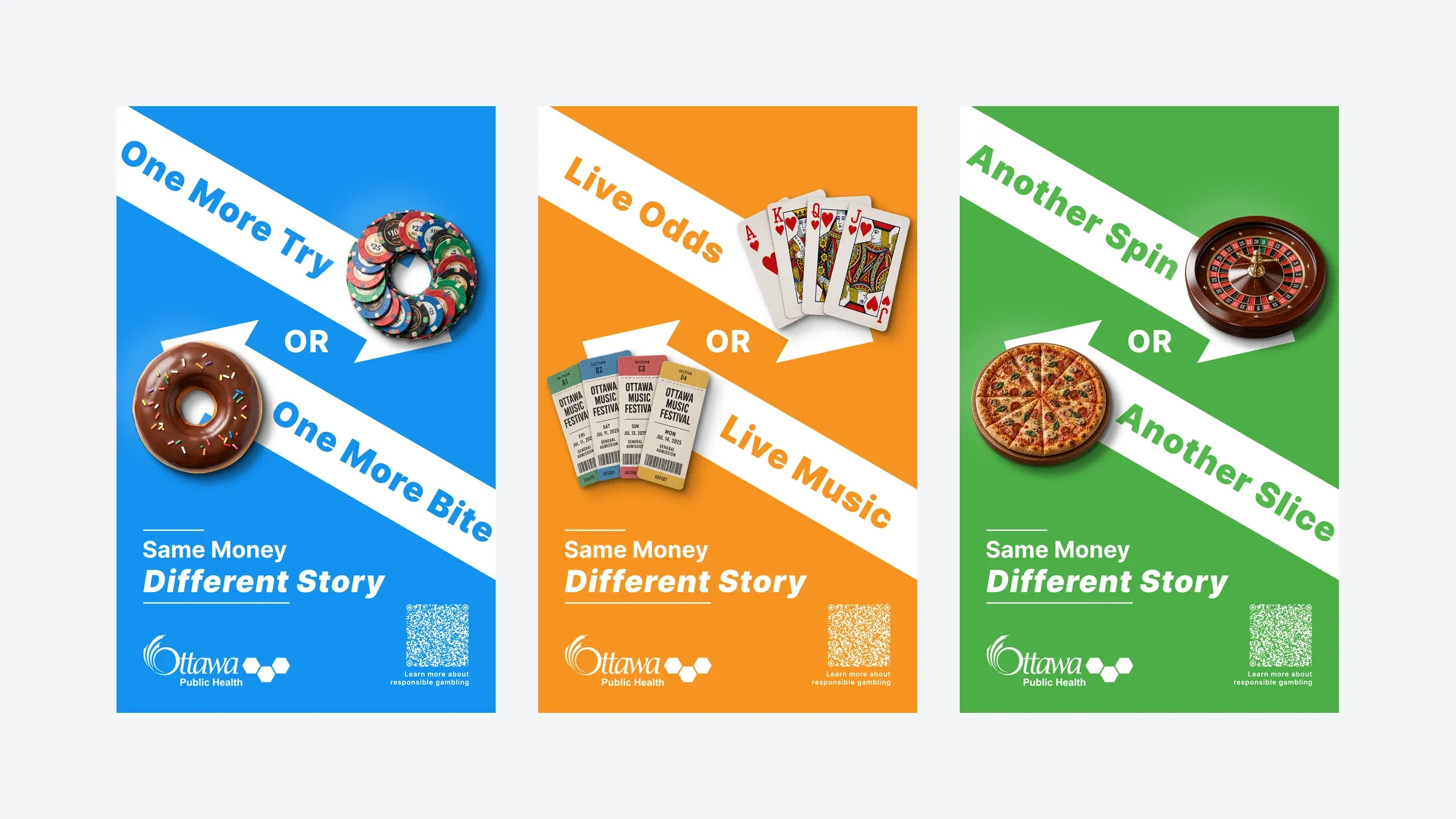
A problem-gambling campaign proposal for Ottawa Public Health, later redesigned with photo cutouts and turned into three 10-second social ads built in HTML and CSS and timed to a synthetic voiceover.
- Role
- Primary designer
- Team
- Five students, with Ottawa Public Health
- Timeline
- Winter 2026 (campaign) · September 2026 (redesign and motion)
- Platform
- Posters and 10-second social ads
- Tools
- Figma, Illustrator, Photoshop, WordPress, Codex, ElevenLabs
- Status
- Proposal delivered to OPH; the ads have not run
- 5channels in the original campaign
- 3posters redesigned and animated (Cases 2 to 4)
- 600frames per ad, rendered from the browser (Case 4)
TL;DR
- Problem
- Small online bets are easy to overlook because no cash changes hands, so young adults can notice the harm late.
- Solution
- Posters that set a bet beside something the same money could buy, later rebuilt as web pages whose motion follows a voiceover.
- Result
- A five-channel proposal for Ottawa Public Health, then three redesigned posters and three 10-second social ad concepts.
In my final semester at Algonquin College, a team of five students worked with Ottawa Public Health (OPH) on online gambling harms among young working adults. As the primary designer, I developed the “Same Money, Different Story” concept and designed most of the campaign: posters, transit and mall ads, social assets and a WordPress site prototype. After graduating I came back to the posters on my own, swapped the flat vectors for photo cutouts and rebuilt each poster as a web page. Its animation is timed to a synthetic voiceover, and each one exports as a 10-second social ad.
Context
OPH and the college’s Human-Centred Design Lab gave us one question: how might we help young professionals in Ottawa spot early warning signs of problem gambling before it gets worse?
Online betting now sits inside everyday entertainment. A bet placed on a phone during a game doesn’t feel like spending, and small amounts add up before anyone notices. The research we worked from included a 2025 CCSA report, which put the share of young online gamblers who had experienced gambling harm at about 23.5%, and work by Dowling and colleagues on reflection in the moment. That gave us our angle: one short pause, at the moment the money is spent, to think about what else it could pay for.
Who it was for
Our audience was people aged 22 to 35 in Ottawa with steady incomes who are on their phones a lot. We designed around three betting habits in that group: impulse bets placed while watching a game, fantasy sports and betting as a social part of weekends with friends, and quick bets on the phone right after a targeted ad.
Rules from a public health agency
Working with a public health agency set the rules for the copy and layout. Copy had to use short, common words and never lecture or shame. A poster had to read at a glance in a bus shelter or a mall. The wording had to work in French translation. Type, contrast and hierarchy had to meet accessibility goals, which we checked with Stark and AODA guidelines.
Case 1 · OPH’s feedback turned the posters from abstract to a plain this-or-that
- Question
- How do we make a small online bet feel like real money?
- Options
- A shopping cart of things the money could buy; a dollar figure set against a pile of everyday treats; one gambling object against one everyday thing.
- Trade-off
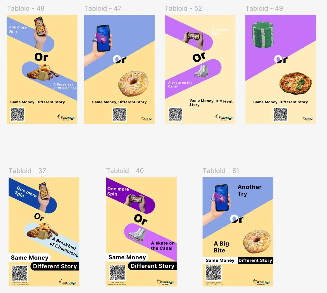
- Our early ideas were dense or abstract. OPH's contact asked for something more direct, and a poster in transit has to read quickly.
- Decision
- Pair one gambling object with one everyday experience, and let a two-line headline ask where the money should go.
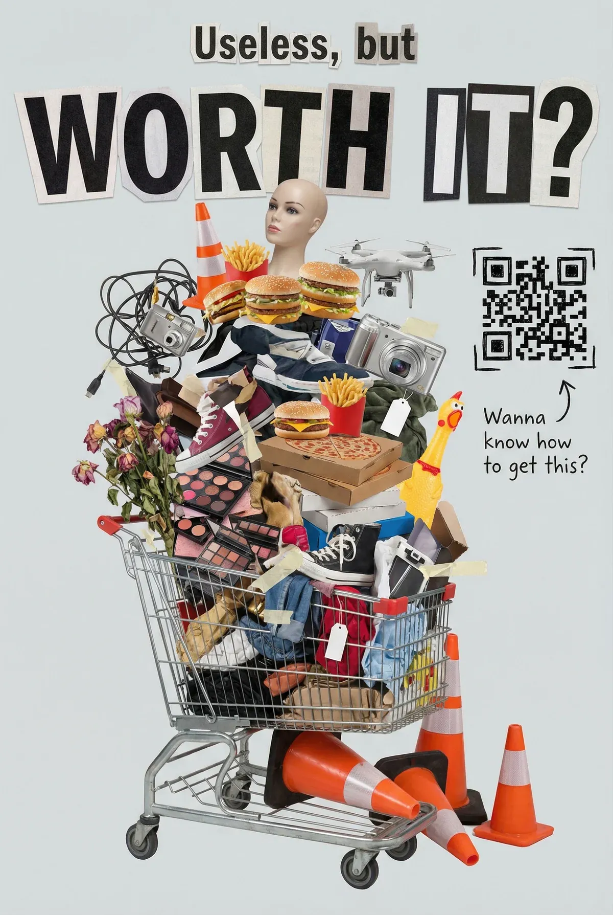
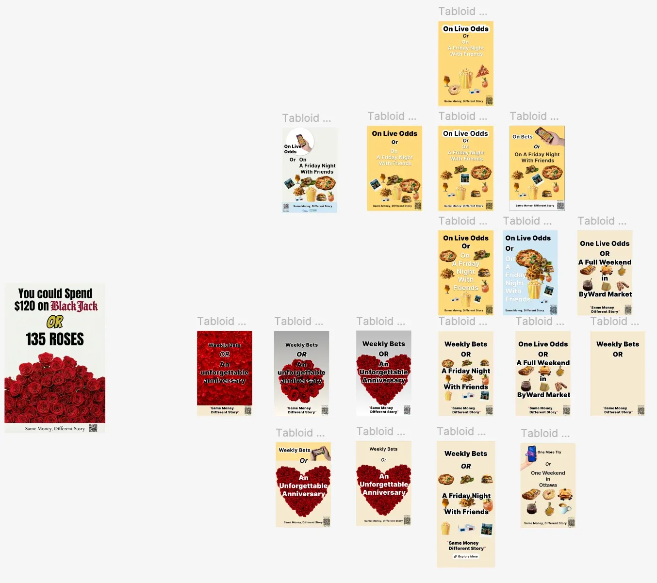
Our first sketches tried to show everything at once. One filled a shopping cart with clutter under the line “Useless, but worth it?”. Others set “$120 on blackjack” against 135 roses, or a bet against a whole Friday night with friends drawn as a spread of food. Each one took a while to read.
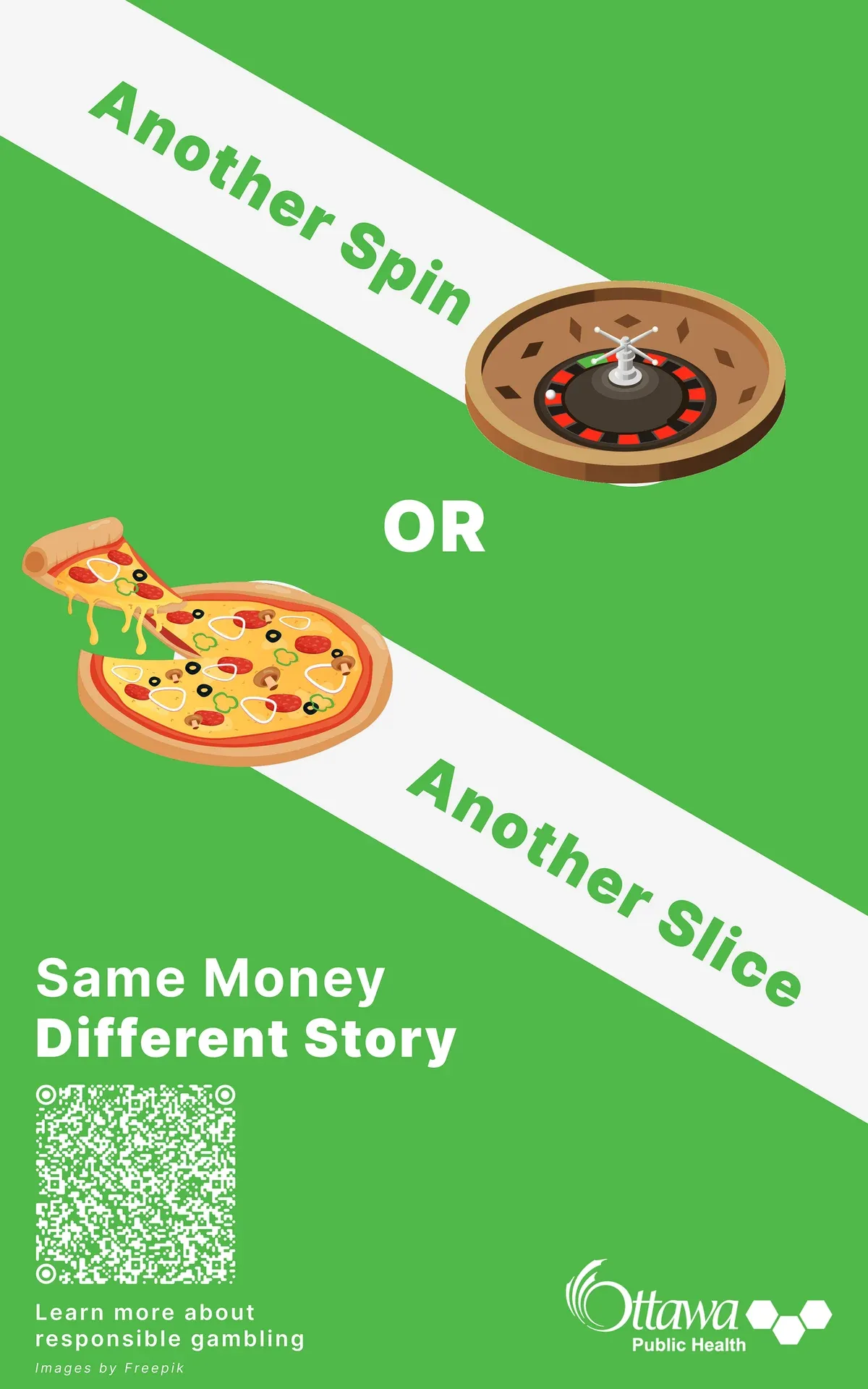
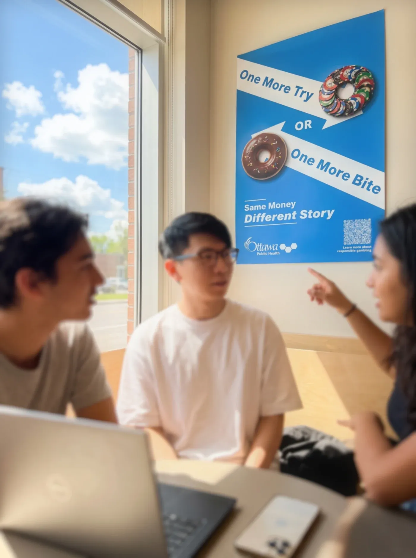
We kept the simplest direction, a single choice between two things. The headline uses the same words on both sides, so the only thing that changes is what the money buys. Blue sets “One More Try” against “One More Bite”, orange sets “Live Odds” against “Live Music”, and green sets “Another Spin” against “Another Slice”.
Case 2 · Photo cutouts and arrows gave the redesign depth and a sharper choice
- Question
- What was holding the original posters back?
- Options
- Refine the vector illustrations; replace them with photographs of real objects.
- Trade-off
- The vectors kept every object flat, so a donut and a slot machine looked like icons.
- Decision
- Use photo cutouts with tested shadows, and turn the white bars into angled arrows that point the two choices in opposite directions.
I came back to the posters after graduating, while putting my portfolio together. This was my own project, done in Figma after the course had ended.
Real objects on a surface
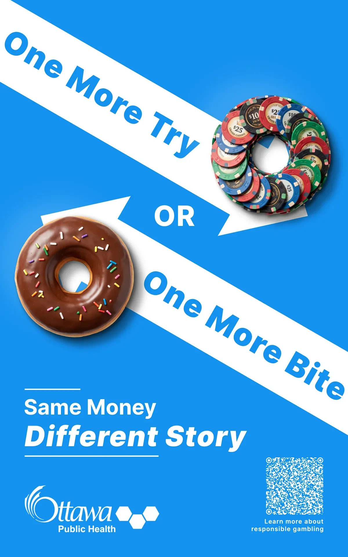
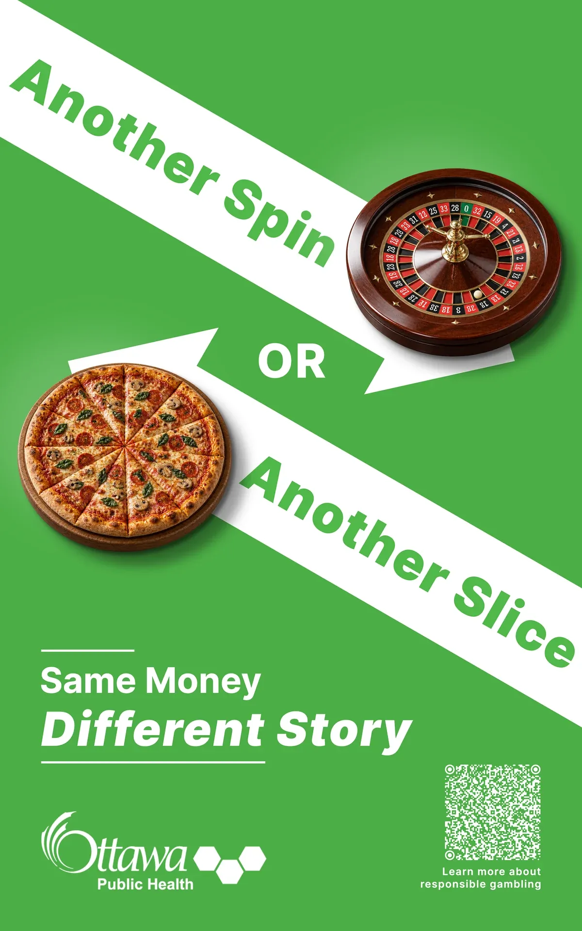
I swapped each vector for a photo cutout and tried several combinations of drop shadows until the objects looked like real things resting on the poster. I also matched the pairs by shape. Casino chips and a donut are both rings, a roulette wheel and a whole pizza are both cut into wedges, and playing cards and concert tickets both fan out. The blue poster lost its slot-machine phone, and the green one traded a single slice for a whole pizza.
Course version
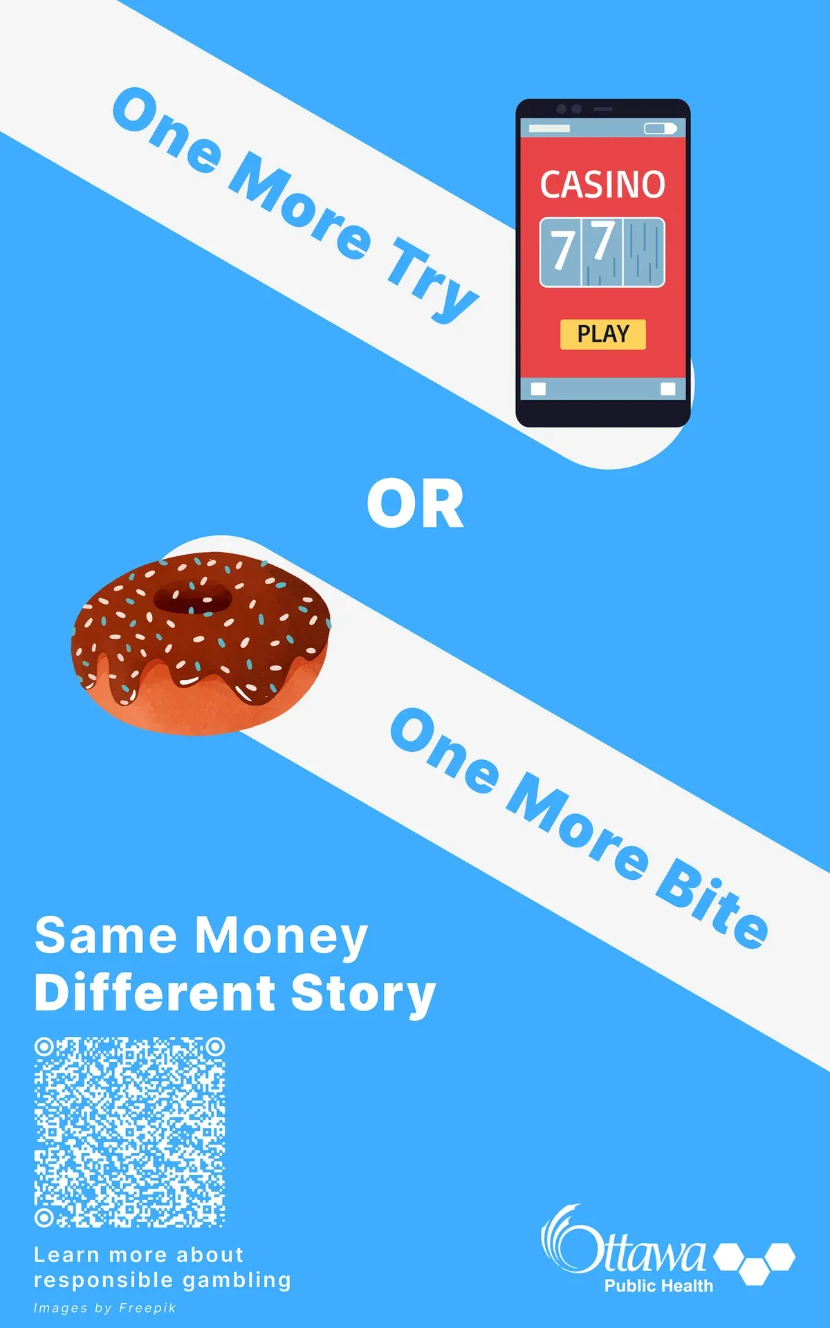
Redesign
Arrows in place of bars
The original posters held each headline in a white bar. I turned the bars into angled arrows that point in opposite directions, so the two choices pull away from each other. Then I adjusted the type, tagline, OPH logo and QR code so the three posters line up as a series.
Course version
Redesign
Case 3 · I dropped the rotation because the light turned with it
- Question
- Once the poster is a web page, what should move?
- Options
- Spin the chips and donut slowly; keep the photos upright and move them in other ways.
- Trade-off
- The photos carry their own highlights and shading. Spinning a photo spins its light. Fixing that would take normal maps or 3D relighting.
- Decision
- Drop the rotation. The objects only slide, lift and settle, so their light stays fixed.
Matching Figma first
Before animating anything, I rebuilt each poster as an HTML and CSS page, with Codex writing the code to my direction. The page scales from the original 792 × 1267 artboard, so the layout holds at any width. I wanted the static page to match Figma before anything moved.
Two things were off. The first build chained several CSS drop-shadow() filters, so the black shadows also fell on the white reflection, which turned grey and spread. I split the reflection and the two black shadows into separate layers, each cut from the photo’s transparent outline, and kept the values I had tuned in Figma: white at 15%, offset −40 / −40, and Figma’s blur of 50 as a CSS blur of 25. The second was type. The web build of Inter drew the italic “ff” differently, so I switched to a local Inter 3.19 at the original weight (900), slant (−10), size and tracking.
Trying rotation
I tried turning the chips and the donut a full circle every 60 seconds. The highlights on the chips and the glaze turned with them, so the light no longer came from one place. With Codex I weighed fixed outside shadows, layered fill light, normal maps and 3D relighting. I chose to remove the rotation and keep the corrected type and shadows.
The orange and green posters reused the same build. A last pass fixed the OPH logo size and centred the text in five of the six arrows.
Case 4 · The voiceover’s word timings decide when each element moves
- Question
- How do I keep three 10-second ads in step with a voice?
- Options
- Animate first and fit the voice to it; nudge the timing by ear; place each cue from the voiceover's word timestamps.
- Trade-off
- Timing by ear has to be redone whenever the voice or the animation changes. Timestamps give exact times I can type into the CSS.
- Decision
- Line the end of the voice up with the end of the video, convert each phrase to video time, and start each element on the phrase that names it.
The entrance
I set the order of the blue poster’s entrance in eight steps. The background appears alone. The chips slide in from the right. The top arrow arrives along its own angle with its text a beat behind, then OR fades in. The donut comes in from the left with the second arrow. The two halves of the tagline enter from opposite sides, and the logo and QR code rise into place last.
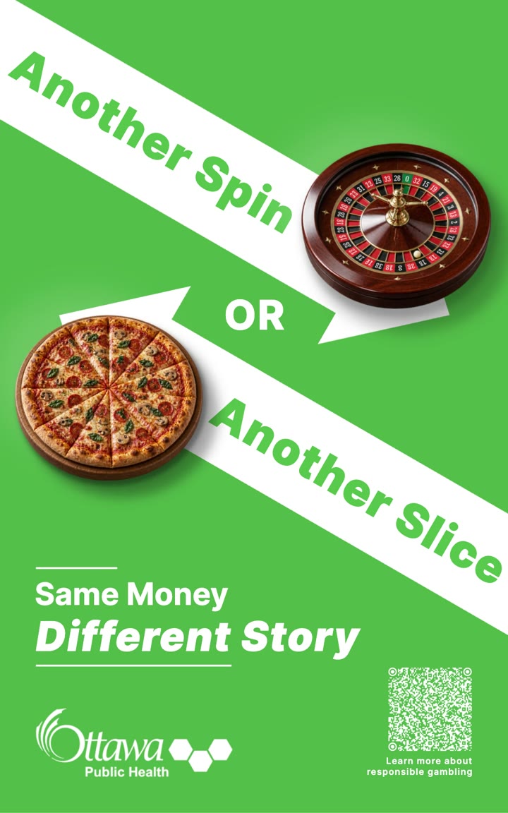
The arrows overshoot their resting place and swing back a little less each time. The spring is plain CSS keyframes, each overshoot smaller than the last. Once both arrows settle, the objects float: they lift and grow slightly while their shadows spread, soften and fade, so they seem to rise off the poster. The two objects start 0.8 seconds apart so they never move in step. On the green poster the roulette wheel and pizza are shot from above at an angle, so their thickness shows and a big lift made them look like images being scaled. I cut the lift there to 5 and 6 pixels and the growth to under 1%.
Watching the exports led to a run of small fixes. The arrow was a rectangle and a triangle that drifted apart while moving, so I merged it into one SVG. A pause before the bounce looked like a glitch, so the arrow now overshoots in one motion. The whole entrance ran slow, so I sped it up 1.3 times, from about 11.5 seconds to 8.8, and started the second object together with its arrow.
A script for each poster
Each voiceover reads the poster’s choice, then ties the everyday side to someone you would share it with: a friend on the blue poster, a partner on the orange and family on the green.
Another spin? Or another slice? Share a slice with your family. Same money. Different story. Scan the code to learn more.
I generated the voices with ElevenLabs text to speech and listened through several tones. I wanted warm and conversational. The opening had to sound like a real question, and the betting side couldn’t sound like an invitation to bet.
Timing from the voice
I took word-level timestamps from the voiceover’s captions and lined the end of the voice up with the end of the 10-second video. That left the first fraction of a second for the first object to arrive.
voice start in video = 10 s − voiceover length
phrase time in video = voice start + phrase timestamp
The green voiceover runs 9.22 seconds, so it starts at 0.78. Every cue then becomes a number in the CSS. The pizza and its arrow start at 2.08, on “another slice”. “Same Money” slides in at 5.60 and “Different Story” at 6.64, as each is spoken. The logo and QR code are in place by 8.10, just before “Scan the code” at 8.14. While the voice says “Share a slice with your family”, nothing new enters and the objects only float.
| Time | Voiceover | Animation |
|---|---|---|
| 0.15 s | Roulette wheel, until 0.90 s | |
| 0.75 s | Top arrow and text, until 1.74 s | |
| 0.78 s | Another spin? | |
| 1.90 s | Or | |
| 1.90 s | OR, until 2.06 s | |
| 2.08 s | another slice? | |
| 2.08 s | Pizza, until 2.63 s | |
| 2.08 s | Bottom arrow and text, until 2.61 s | |
| 2.81 s | Objects float, until the end | |
| 3.36 s | Share a slice with your family. | |
| 5.60 s | Same money. | |
| 5.60 s | Same Money, until 6.41 s | |
| 6.64 s | Different story. | |
| 6.64 s | Different Story, until 7.45 s | |
| 7.40 s | Logo and QR code, until 8.10 s | |
| 8.14 s | Scan the code… |
The cues end up as a few custom properties per poster:
/* "another slice" */
.pizza-poster { --second-arrow-delay: 2.08s; }
.pizza-poster .try-arrow { --delay: .75s; }
/* "Same money", then "Different story" */
.pizza-poster .same-money { --delay: 5.6s; }
.pizza-poster .different-story { --delay: 6.64s; }
I timed the green poster first and compared the export with the audio. It held, so I applied the same method to blue and orange. Their timestamps were estimates, so those two are aligned to estimated times.
Rendering the video
The export steps through the animation frame by frame. A Playwright script opens each page in Chrome, waits for fonts and images, pauses every animation, then sets the time for each frame and takes a screenshot. FFmpeg encodes the 600 frames into a 10-second, 60 fps MP4 at 1080 × 1728, which keeps the poster’s proportions. The export is silent. I combined it with the voiceover and background music afterwards.
The three finished ads, with voice, music and captions:
How I built it
I designed the posters and decided what moved, in what order and how fast. I tuned the shadows, watched every export and wrote down what looked wrong. Codex wrote the HTML, CSS and JavaScript from those notes, along with the export script and a script that checks the animation. ElevenLabs generated the voices from text, and the background music is AI-generated too. I combined the animation, voice and music into the final videos.
I didn’t use After Effects. The usual route would be to keyframe the layers there, then line up a recorded voice and music in a video editor. Building in the browser meant every timing was a number I could change and export again, and the web page and the ad came from the same code.
Outcome
The course work ended as a proposal package for OPH across five channels: posters, transit ads, mall displays, social assets and a WordPress site prototype that led from the posters to early warning signs and local support. We proposed targets such as 50 to 100 QR scans a day and 5 to 10% social engagement. I don’t know whether OPH ran the campaign, so I have no results to report.
The redesign produced three posters, a single-page PDF of each and three 10-second ads with voice and music. They are portfolio concepts and have not run as ads.
Reflection
The highlights in a cutout photo are fixed to the photo, so it can move across the poster but can’t turn. If I want objects to rotate next time, I need to shoot or render them from several angles. Having the voiceover before the final timing also changed how I adjusted the motion: when a cue felt late, I could check it against the word it belonged to.
What’s next
I want to keep exploring this way of making video: lay out the frames in Figma, build the motion as a web page, and time it from the voiceover’s word timestamps.